I would like to create a heatmap as per the JavaScript Heatmap node, but with the data values for each cell shown as if it were a formatted table. Is this possible?
More generally, the ability to colour table cells according to their value would be a really valuable addition to KNIME, so I hope we see it before too long!
as for your first question: I don’t think this feature exists (yet), unfortunately, but this sounds like a nice addition to the “table view” node I’ll ask for.
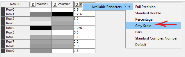
The second thing is already there If you right click on a column header, you can choose the renderer. If you select “Gray Scale”, this columns cells will be shown in - well - gray (black: max, white: min). Any normalization you would have to do beforehand, by adjusting the whole table (possibly adding a row for each the min and max values).
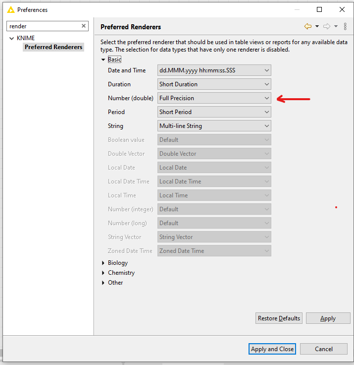
In File → Preferences, the renderer can be turned on by default, if you fancy it.
Hang on, @janina just introduced me to a great example on how to use CSS-Styling to color cells based on their value. I tried to build a view-component based on that, that uses the same technique to color the cells the “Table View” Node, see this example:
I’m sure this needs some refinement, but maybe you can play with that and adjust it to your needs?
Hi @LukasS, thanks for that. It’s nice to know that there is a hacky solution available at least! I’ll look forward to a less hacky solution hopefully emerging some day in the future.
 If you right click on a column header, you can choose the renderer. If you select “Gray Scale”, this columns cells will be shown in - well - gray (black: max, white: min). Any normalization you would have to do beforehand, by adjusting the whole table (possibly adding a row for each the min and max values).