Hello
I have an Excel file that displays my friends’ connections on Instagram in the form of who has an Instagram connection with whom.
This file is in the form of source and target, and I want to see it as an edge graph in the output of Naim.
Please help me to solve this problem. If possible, upload a photo of the workflow for me
The sample file is as follows.
sample.xlsx (8.5 KB)
Take a look at this similar example, based on LinkedIn Data:
Thank you for your good answer
Please send me a picture of the workflow with its nodes
thank you
You can download the entire workflow at the link location and explore it locally.
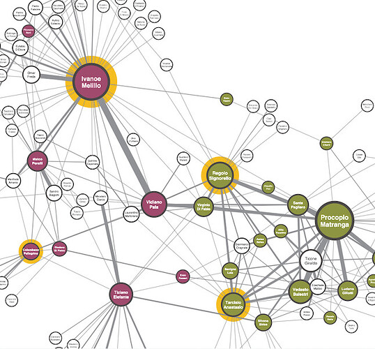
I want a graph that shows how many people are related to each other in the form of a linear graph when my input data, which is like the example below, is received in the input and output (relationship graph)
Friends already introduced me to a sample that showed one person’s connections to multiple people, which despite the usefulness of the chart I was looking for, didn’t show.
Again, I emphasize that the relationship of several people with several other people should be displayed in this chart.
Please pay attention to the Excel file that I uploaded so that you can understand it completely.
sample.xlsx (11.9 KB)
@alex1368 I merged your other thread into this one. Please don’t make multiple threads about the same topic.
Hello
I’m sorry, I don’t mean to be annoying or disorderly, and I don’t know why this happened, and no matter what I do, I can’t delete the extra post.
This sample file that is uploaded does not meet my needs. Can you solve my problem?
The graph and the graph I want is displayed above in the form of a photo
Hi @alex1368 , this isn’t my area of expertise but the closest I could find to your question from searching was this
See if you can adapt that to your needs and if not let us know how far you got and then if you have further questions somebody might be able to assist.
Hey @alex1368,
Maybe as another approach, we recently released our new Generic ECharts node with 5.2. This node comes with an AI functionality to help you create your custom plots. It might not give you 100% what you need, but maybe give you a great starting point. See the attached video for an example I created for your given dataset.
You can also have a look at the ECharts example gallery and check if they already provide an example for your problem.
Hope this helps,
Daniel
Thank you for your very good answer, it will definitely be very useful
I have only two questions
From which part should I enter the input data and what should be the format of the sample?
This topic was automatically closed 90 days after the last reply. New replies are no longer allowed.

