@DanGenEire I tried to build something that should do what you want. It includes three Refresh Buttons.
The component extracts all the numeric columns (for the chart) and all the strings (for the categories to select from)
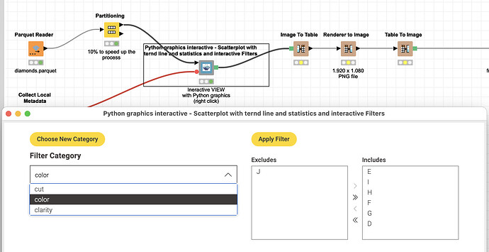
The first button will refresh the list of options to filter from. In this case if you choose “cut” (of diamonds) it will provide you with the list of options where you can select the ones you want (one or several):
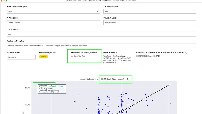
The chart will get updated and the selected filters are being displayed along a total number of rows used (to verify something has changed). The third button is for further adaptions (which numeric variables to display etc.).
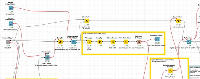
What happens inside the component is that the filter is being applied to the dataset and the settings are ‘recorded’ in order to be displayed (you could also save them for later, maybe with a timestamp if you want):
kn_example_python_graphic_scatterplot_diagonal_interactive_filter.knwf (918.7 KB)


