Description:
The new UI is good for starters and also experienced users might come to enjoy the more modern design.
I have a few ideas or questions regarding the support of large collections of workflows.
Ideas:
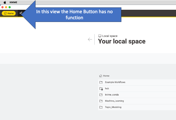
- make consitent use of the Home Button (home is home)
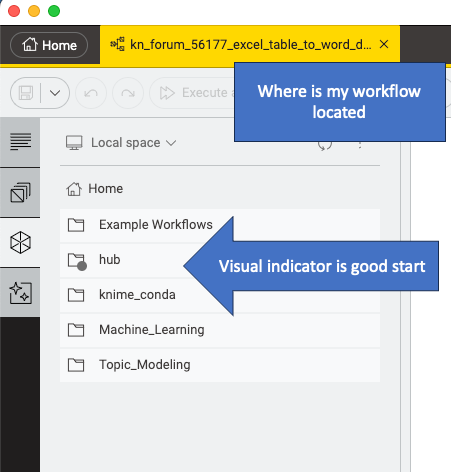
- option to show where an open workflow is located on the drive
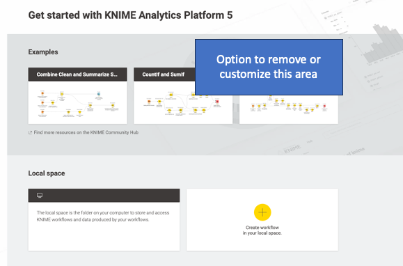
- option to remove or customize the example area
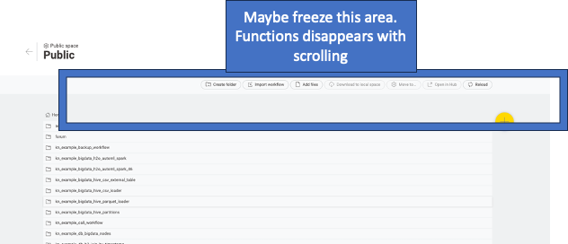
- freeze function headers in place (when you have very many workflows it gets crowded)
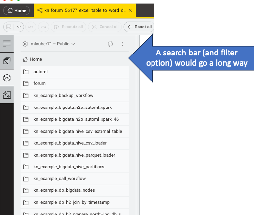
- offer a search function to sind and filter workflows:
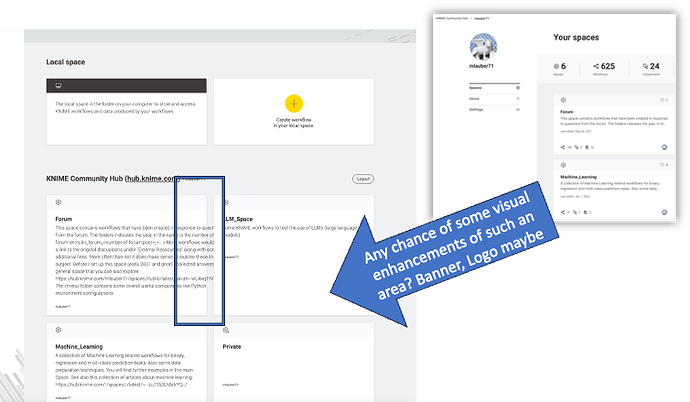
- Enhance the view of the spaces with a banner or a logo or something. Also text is not always wrapped correctly (have to write less text)
