Hi guys,
I have been using knime for about 6 years now.
The KAP, KS until 18 month ago, now also KBH.
This thread is not about the technical/functional evolution of knime, which I am very happy about - this is about (my personal) experience about the UI&UX.
Before I write pages and pages, I will try to keep it short and direct.
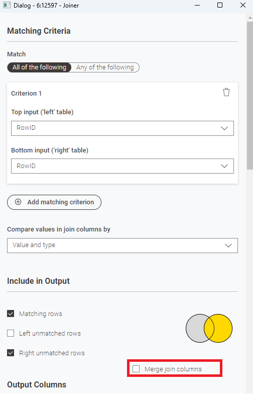
- Stop making everything bigger, rounder and more colourful. The new Joiner for example…The older Joiner: using joins on 3,4,5,6 columns was no problem to set up (I mean the settings). Nicely NEXT to each other, left on left and right on right. Now…everything top down. That also means a LOT more scrolling than before in the node settings. Not just in the new Joiner, essentially in all new nodes; everything is bigger (no compact mode anymore).
Please put the joined column pairs next to each Other again; remove the big borders, reduce the font size.
Please move the “merge join columns” up. Scrolling down every time to select it (that should be on by default anyway)…
Having the compare values by: why not use just 1 row with drowdown next to it, not under.
The usability/my UX is suffering quite a lot.
Where have the domain infos/default values gone? Old Row Filter, used on a string column with a few values…no more dropdown.
Column Renamer, no more default value (old column name) starting from the second selected column. No more twin value list for easy/mass selection, instead again dropdowns with 5? visible columns to choose from..again endless scrolling to reach column number 35 or something bigger. The same as the Joiner.
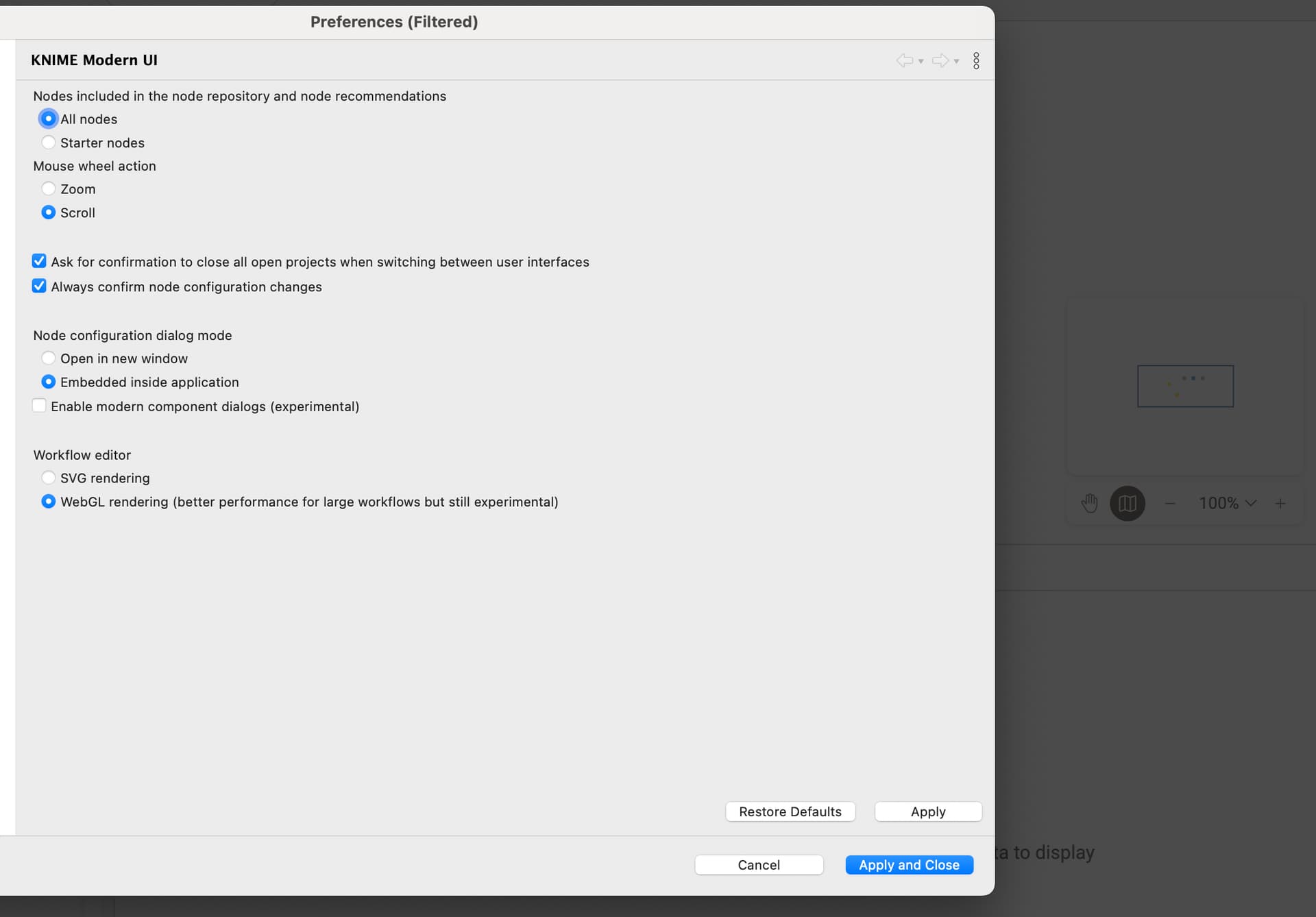
modern UI: where is the tree view of the workspace? single folders only…I need to jump between worfklows all the time (opening new ones). Of course they are organized in different folders. Using windows-explorer-like navigation without a tree view simply takes way too much time.
Where is the mini map? zooming in and out then jumping to other parts of workflows? no, thank you.
Can I turn off the default visibility of table outputs on the bottom of the screen? My key_shortcut for “open first table output” in new window does not work in modern UI.
As you might have guessed, I don’t use the modern UI
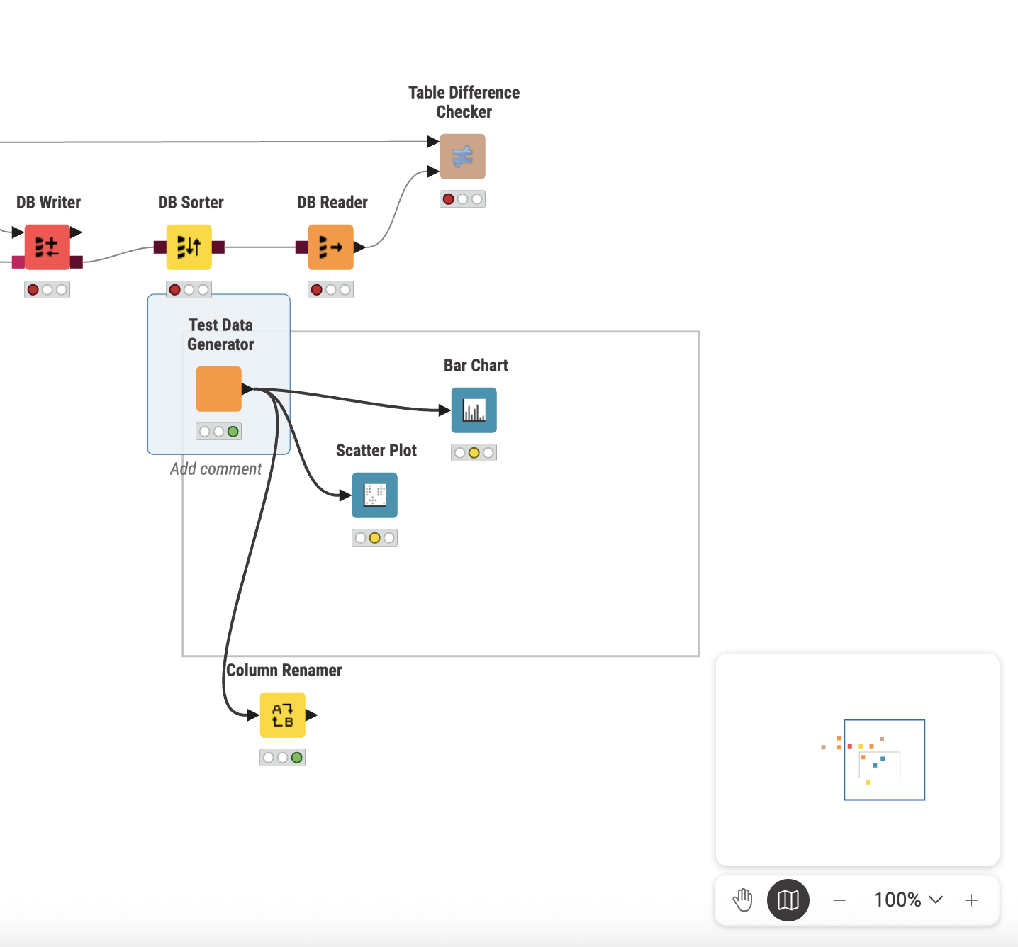
Real life workflows (not the ones used in presentations) are not maximum 1 screen big, not everything is in colourful boxes etc. (hold down mouse selection is still not possible in boxes?)
Workflows are bigger, sometimes a lot bigger, they can look quite messy - but that does not mean they aren’t readable or documented.
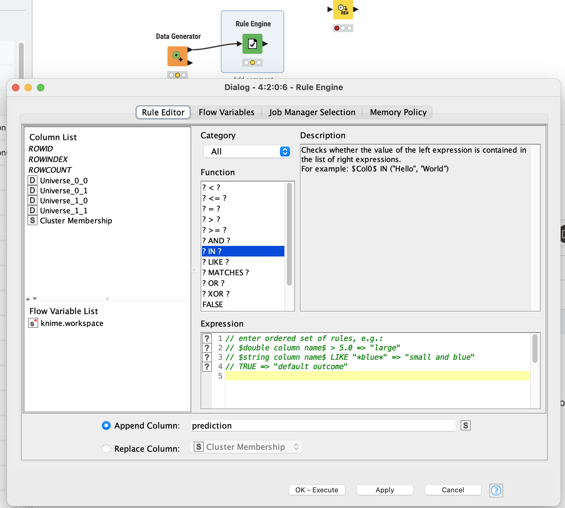
In my opinion, the UI/UX development does ignore the fact that not every workflow is tiny with a few settings and maximum 10 columns in any table. (default dropdown length is now 7 columns? Imagine having 50-100 columns…I am going nuts scrolling through that)
With that last few updates that number of times I need to use the mousewheel within settings has easily doubled, if not a lot more.
Configuring settings takes more time than before, sometimes a lot more time - that is NOT user friendly. Please stop doing that.
Alternatively, is it possible to have kind of compact mode for settings etc. (closer to the classic versions of the settings)
As said before, I am really glad about many new nodes in knime, but everytime a new major version is released, my UX with the UI drops.
Best regards!