I have a symmetric matrix which I modified a bit:
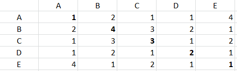
The above matrix is a symmetric matrix except the fact that I have added values in diagonal too (will tell the purpose going forward)
This matrix represents that how many times a person (A, B, C, D, E) works with other person on a publication. e.g. B and C worked 3 times together, similarly A and E worked 4 times together. Now the diagonal values represents how many times a person worked individually e.g. B worked on 4 publications (either alone or with someone else) similarly C worked on 3 publications.
Now I want to make a network analysis graph which describes relation between different person in terms of edge thickness and node size. e.g. the graph should look like this:
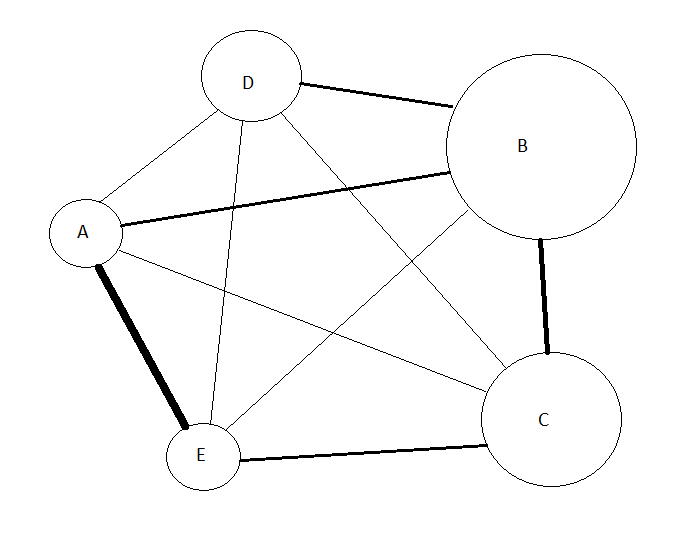
In graph, node circle size depends on number of publications a person worked on, e.g. circle B is largest as its diagonal value is maximum and A & E are smallest as they have lowest diagonal values. Also, the edge thickness between nodes depends on how many times they worked together, e.g. edge thickness between A & E is maximum as they worked 4 times together, compared to edge thickness (lesser than edge thickness between A & E) between B & C as they have worked 3 times together.
Is it possible to do it in Knime? Any leads would be highly appreciated