Hello,
first of all, sorry if the question has ever been asked. I feel like I’m so close to what I want to do ! I’m a beginner with KNIME.
I have a very simple table (see attachment), containing two columns R1/R2 (numbers) for which I wish to plot a histogram.
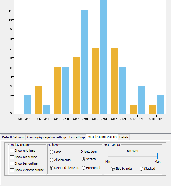
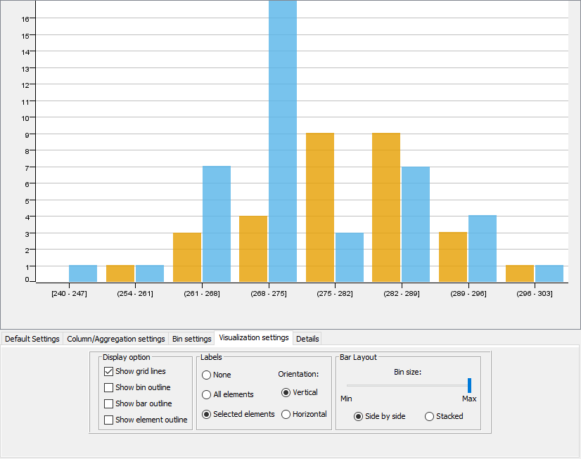
I know that I have two distinct populations of R1 and therefore want to color the values depending on a code (A/B string). My goal is thus to have a histogram of the values of R1/R2 where the columns are stacked or side-by-side, colored depending on the code they belong to.
I’ve been able to do what I want with the Interactive Histogram (legacy) and Histogram (legacy) nodes (see the two “goal” histograms attached).
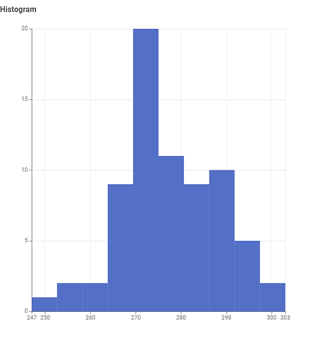
I want to do that with the Histogram node, just to have the same “graphical theme” for each of the charts (bar charts, scatter plots, etc.) I plot with KNIME in the document I’m writing. However, the color manager does not seem to forward the information to the node, since the only histogram I ever get is desperately blue and does not separate values according to the code they belong to (see histogram.png attached).
Would anyone know how to get my histogram to ressemble my goal histograms and get the Color Manager node to work with Histogram node ?
Thank you very much,
Best regards,
Properties.xlsx (11.2 KB)


