Hi,
I’m new to KNIME and still figuring some features out.
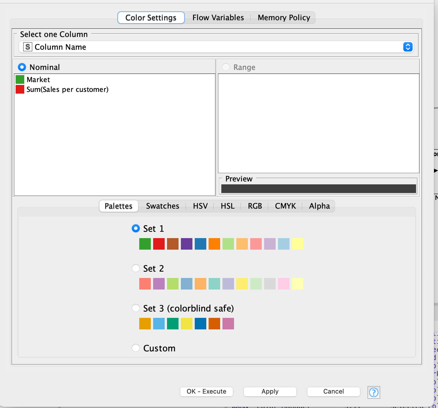
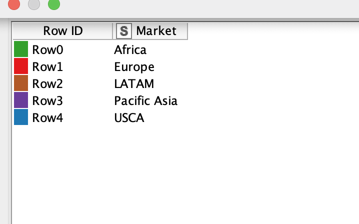
I’m trying to change colors form the Bar Chart. So far I tried the Extract Table Spec Node and Color Manager but somehow it is not working.
I would like that the Bar charts shows different colors from the values from Column “Market”. For Example Europe> Green, LATAM: Blue,…etc.
thanks for the help! I’m still having trouble defining the color. Since the different bars come form the same Column. How do I define the colors between the rows?
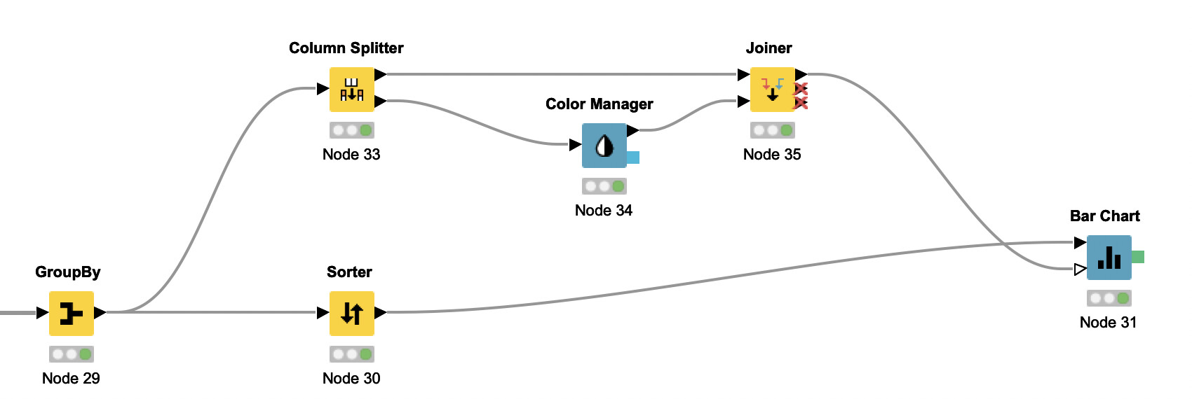
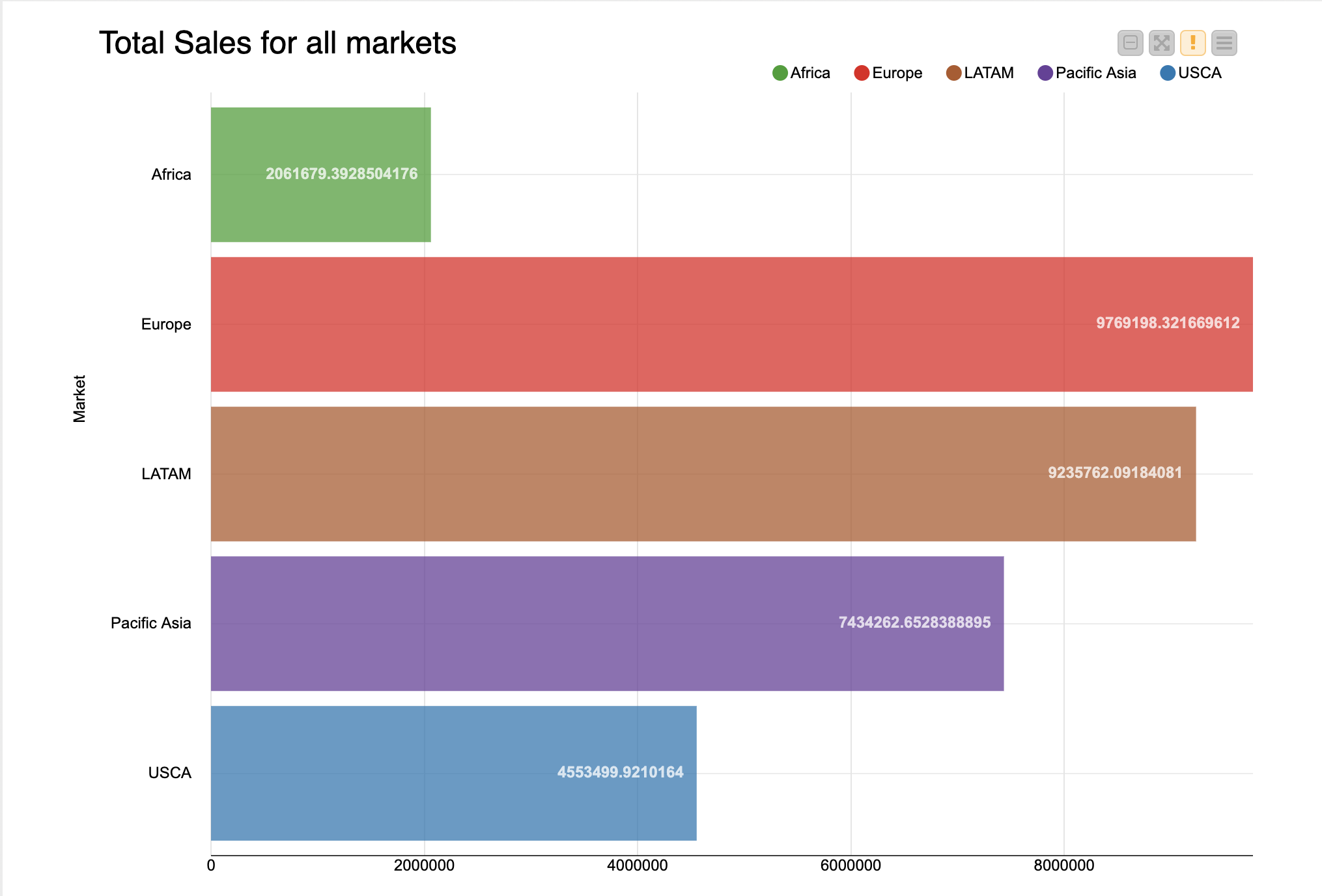
indeed it is a bit tricky to configure the Bar Chart as you envision. Generally, the node uses color to distinguish the different parts in a stacked bar chart. In consequence, you can shape your data as if it had multiple series to use color in alignment with the categories on the horizontal axis. See the attached workflow for how to achieve this using the Pivoting node. colored_bar_chart.knwf (16.5 KB)
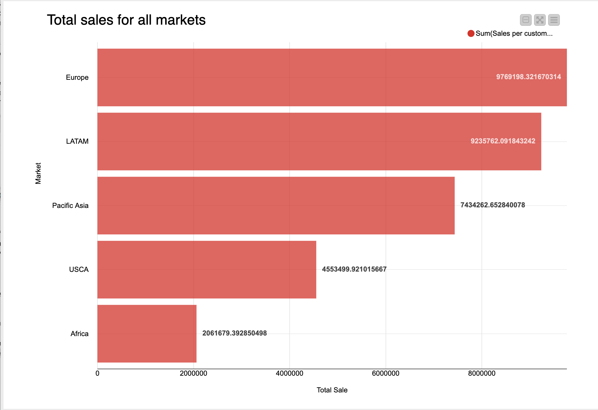
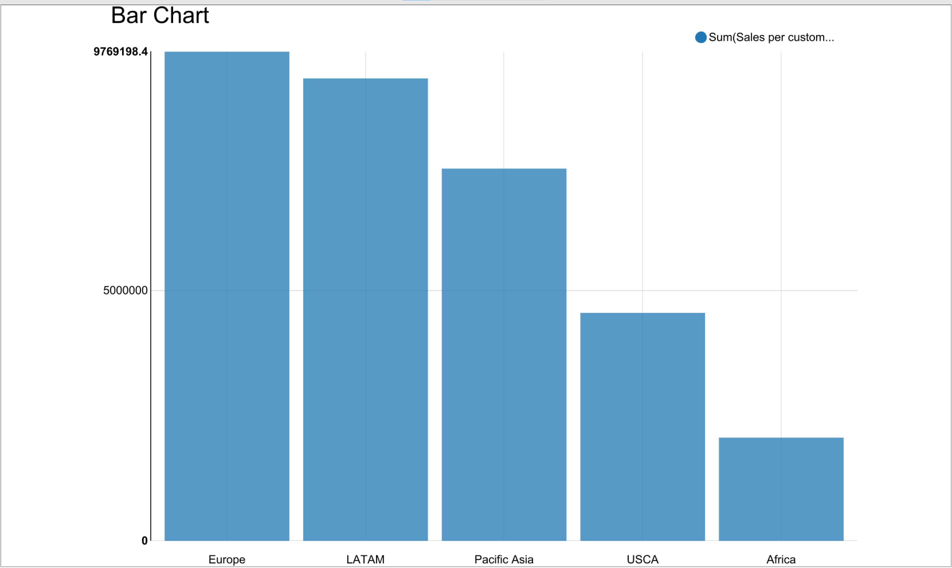
thank you so much! I tried it out and it works. I still have a little problem with the Bar charts. I used a Sorter node before applying the colors. But for some reason thee chart isn’t showing in descending. Why is that?
(sorry for some reason I can’t upload the workflow sucessfully )
thanks for the help!
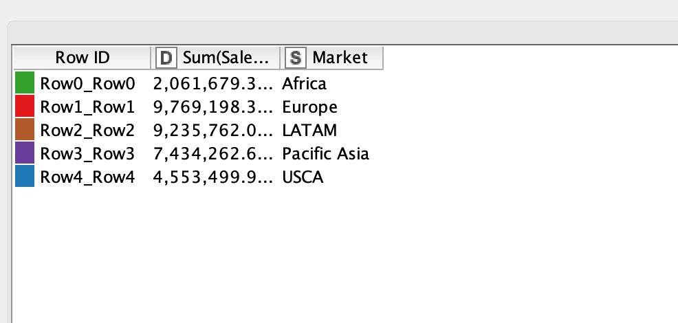
1.The Retain row order in the pivoting node was unchecked, but I changed it.
2. the box was unchecked.
Unfortunately, the chart didn’t change. It is still unsorted.
that is interesting. It looks like the bars are sorted alphabetically by their label. The best practice in this case would be to start from the Sorter node and check each nodes’ output tables in order to identify which node changes the sorting. Then inspect the settings of that node.