Dear Knimers,
Now I have a somewhat different situation. I’ve read the post Bar Chart examples
I’m trying to use this lighter version (cut from my larger working file with original 1,330,000 Covid cases in my State, during 16 months): GeneralCasesTable-AskForHelp-SumPops-1000FirstLines.txt (128.6 KB)
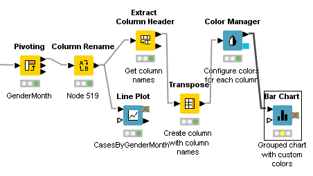
I want to group the cases by year-month (yyyy-MM) and by gender (0 / 1). In order to get this, I applied the Pivoting node, where I used “yyyy-MM” in Groups, I pivoted Gender, and applied one column with no missing values, using the aggregation method “Count”. Then I renamed the counting columns, and applied the last four nodes from the above link (Bar Chart for custom colors). At last, my last node (the Bar Chart node itself) appeared with no available columns. As follows:
Can someone help me to understand (and fix) my mistake?
Thank you so much.
Best Regards,
Rogério.
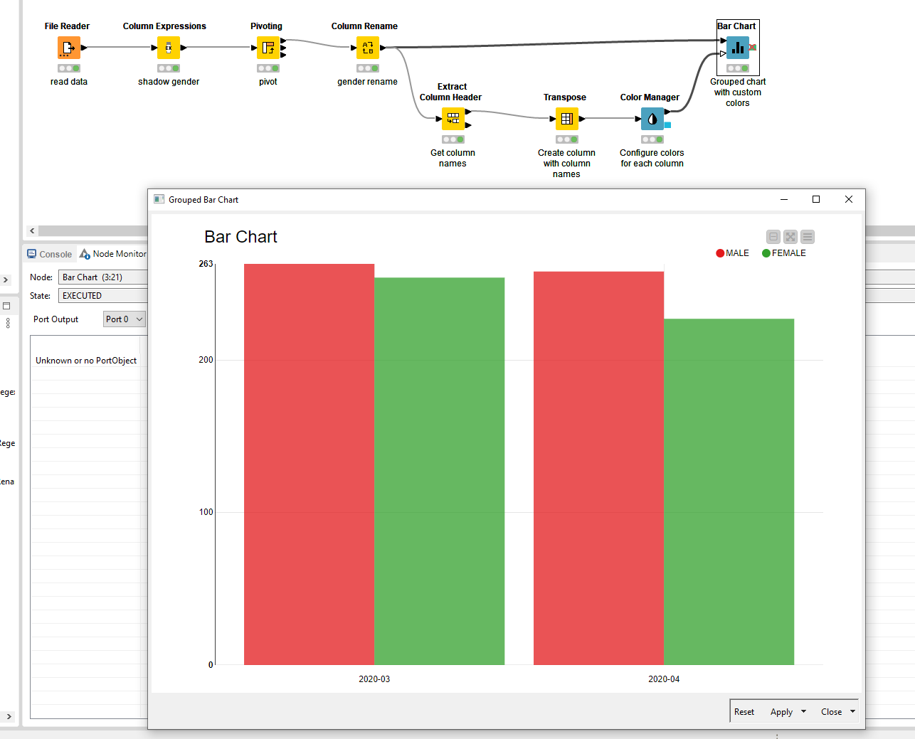
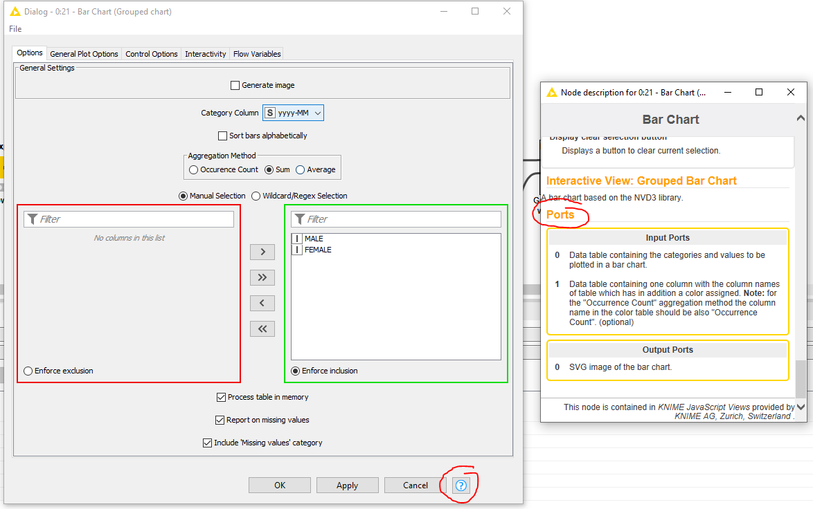
The mistake is that you are only feeding one data flow into the Barchart, the color schema. The actual data is missing which should be coming from the Column Rename. The example that you referenced also has this double input.
Dear @ArjenEX,
Thank you so much for your attention and solution to my problem, which was generated by my fault, and my fault alone, for not paying the due attention to that part of the workflow that you saw so promptly.
I re-executed the workflow incorporating it, and this part of my workflow is now functional.
B.R.,
Rogério.