Hi @suetus,
While I’m not a professional data analyst and lack formal training to decide which correlation type and sided variant to use based on the data distribution (so take what I provide you with a fair grain of salt!), here is one approach.
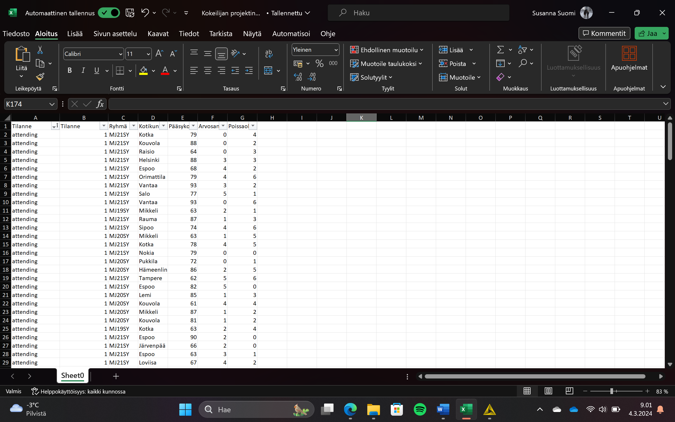
For simplicity, we ignore the group “Ryhmä” and municipality “Kotikunta” for now and accept the data is valid, has no missing values, each name equals one student etc… Though, I seem some values with zero are present and likely must be removed as it, so I assume means, “not taken” (i.e. because of illness)
The columns translate to:
- Tilanne - Status
- Ryhmä - Group: This could refer to the student’s class, cohort, or group designation within the institution.
- Kotikunta - Municipality/Home Town
- Pääsykoe - Entrance Exam: The scores or results from an entrance examination.
- Arvosana - Grade: This likely represents the students’ grades or marks as an average / median across all
- Poissaolot - Absences: Number of absences the
First, I remove the zeros to get a more accurate picture. The problem here, it makes up 46 out of 183 data point leaving only 137. This drastically reduces the significance of the results! So add a few table spoons of salt again. Removing those which have the status “attending” reduces this to 51 data point.
Using the Auto Binner to remove outliers by using the quantiles “0.0, 0.01, 0.05, 0.25, 0.5, 0.75, 0.95, 0.99, 1.0” helps us identifying the lower and upper one or five percent. Using the 5 % threshold the data set is further reduced to 41 data points, filtering out 45.
Note to myself, is what I am doing valid? Seems to make little sense filtering out so much data. Unfortunately doing a statistical power analysis to determine if the data set is enough goes a little bit beyond the scope and there is no node in knime handling that.
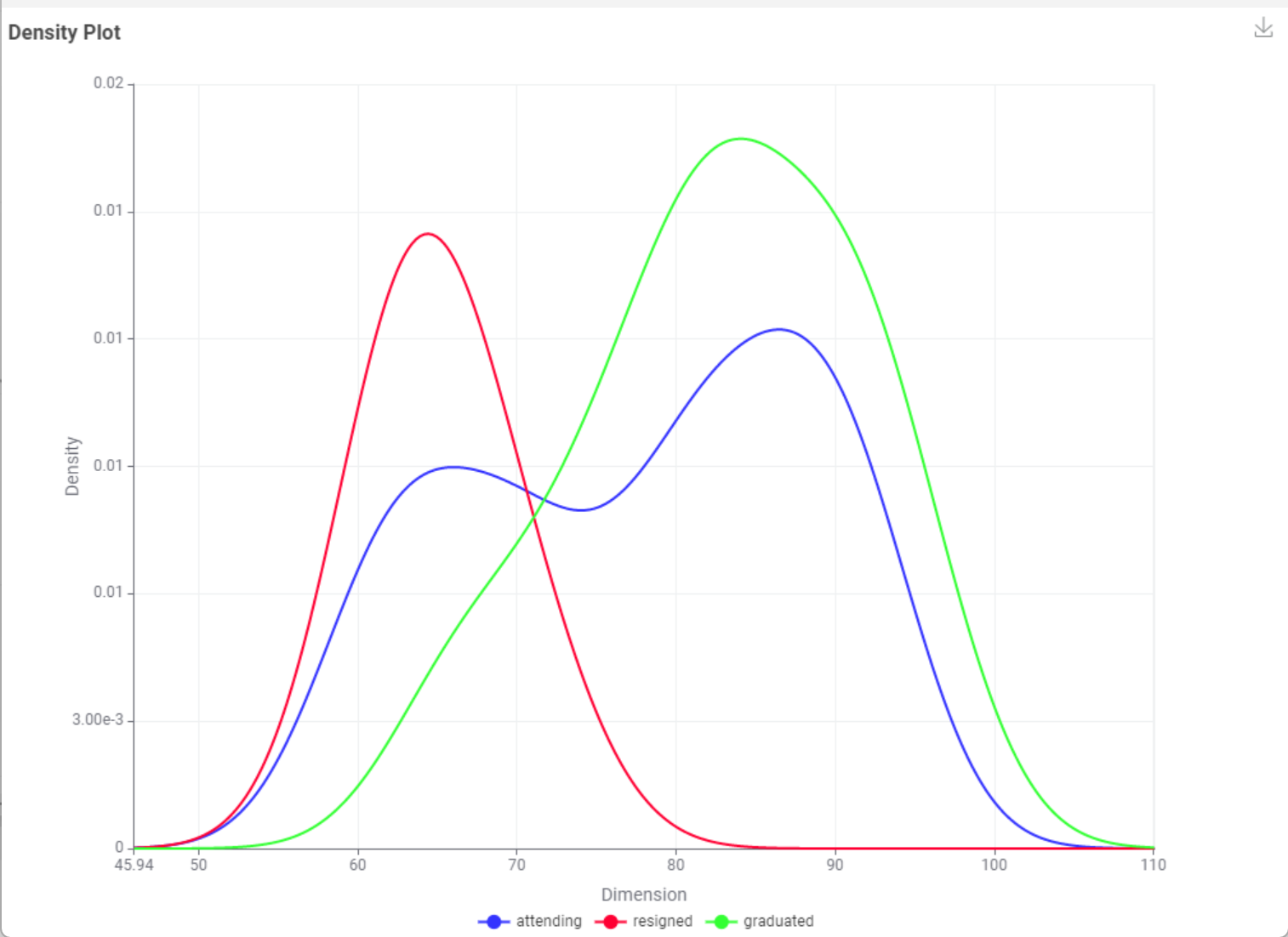
Checking the data distribution using a Density Plot – KNIME Community Hub node, we can confirm a normal distribution for resigned and graduated. Interestingly, those attending already tend to form two bulges.
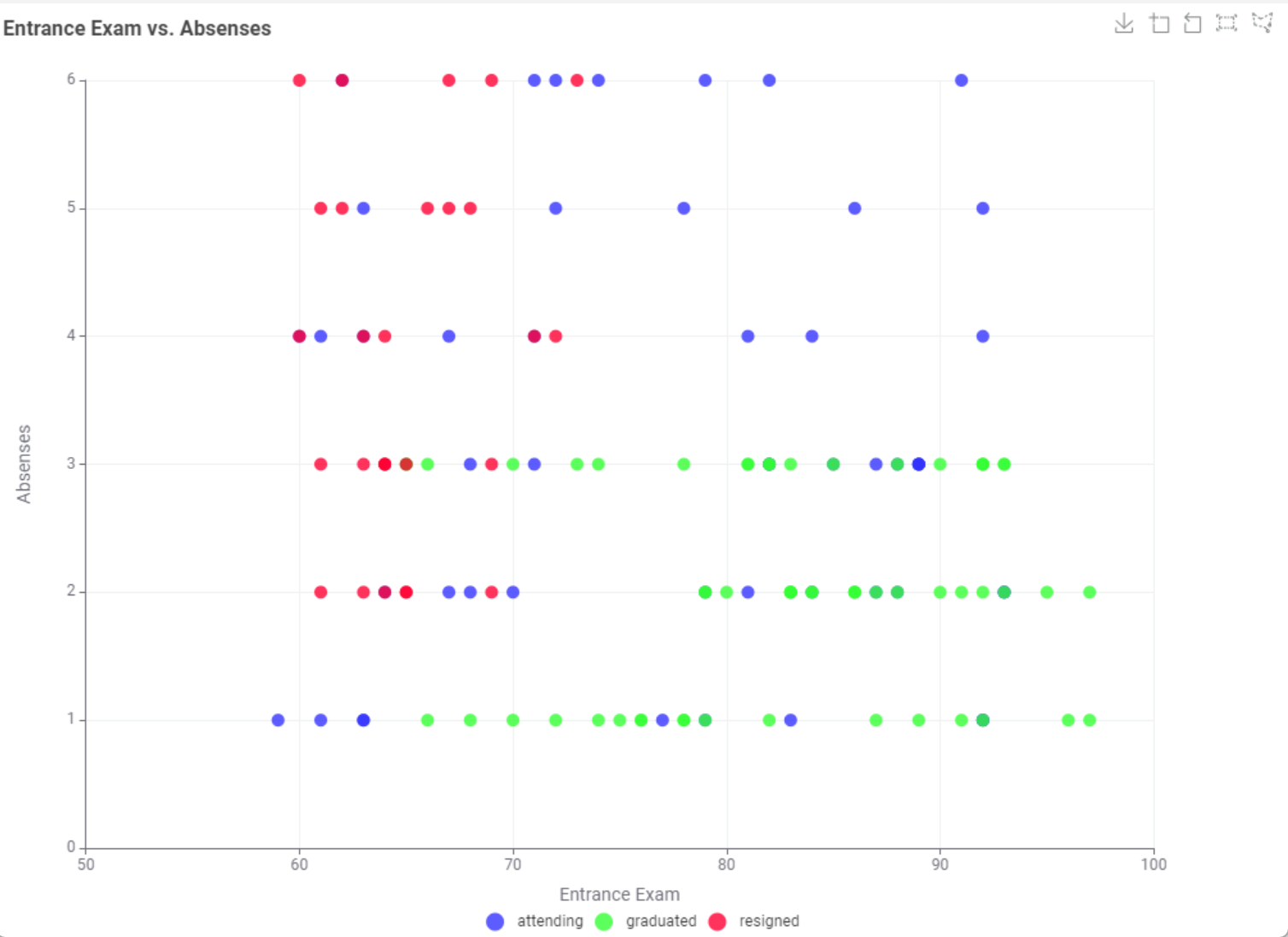
Plotting Absenses vs. the score during the entrance exam and coloring the status, there also seems a correlation between lower entrance exam scores and absenses amongst those who resigned vs. those which graduated. There is more interesting stuff to see but let’s not get distracted.
Knowing we have a normal distribution we can safely choose, using a Rank Correlation – KNIME Community Hub node, the Pearson correlation coefficient.
About the p-value calculation, let’s play dump for now and say we don’t know and are interested into any correlation of Pääsykoe, Arvosana or Poissaolot and the likelihood if resigning or graduating. Hence, chposing a two-sided p-value calculation.
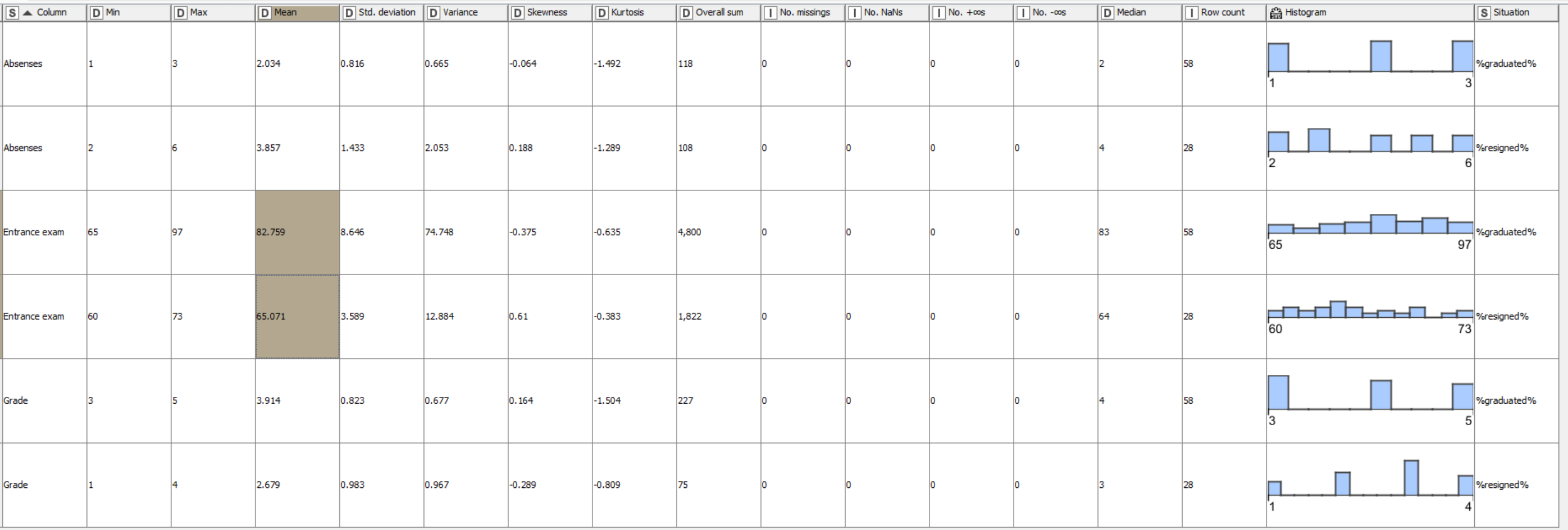
Furthermore, using a regular Statistics – KNIME Community Hub in combination with a Group Loop Start, you can get a quick low effort overview.
Using the quite reduced data set of just 41 data points, it is quite difficult to read anything the the stats. That seems to be confirmed by the low correlation values with moderate probability.
| First column name |
Second column name |
Correlation value |
p value |
Degrees of freedom |
Situation |
| Entrance exam |
Grade |
0.12 |
0.55 |
27 |
%graduated% |
| Entrance exam |
Absenses |
-0.14 |
0.48 |
27 |
%graduated% |
| Grade |
Absenses |
-0.14 |
0.47 |
27 |
%graduated% |
| Entrance exam |
Grade |
0.21 |
0.51 |
10 |
%resigned% |
| Entrance exam |
Absenses |
-0.14 |
0.68 |
10 |
%resigned% |
| Grade |
Absenses |
-0.32 |
0.32 |
10 |
%resigned% |
If that is correct, it means the data provided is insufficient to give a good estimate whenever a student graduates or resigns.
Factoring in the outliers, the histogram seems to indicate a correlation (not a causality!) between the amount of “Pääsykoe” (roughly translated to “Entrance exam”) and whenever students graduated or resigned. But, hence no causality, there is a skewed distribution to the left (higher count of Pääsykoe) amongst those still attending.
Checking in on the correlation data what was concluded before still seems valid. There is no correlation or the data set (statistical power) is insufficient.
| First column name |
Second column name |
Correlation value |
p value |
Degrees of freedom |
Situation |
| Entrance exam |
Grade |
-0.02 |
0.86 |
56 |
%graduated% |
| Entrance exam |
Absenses |
0.06 |
0.68 |
56 |
%graduated% |
| Grade |
Absenses |
-0.04 |
0.74 |
56 |
%graduated% |
| Entrance exam |
Grade |
0.27 |
0.17 |
26 |
%resigned% |
| Entrance exam |
Absenses |
0.09 |
0.64 |
26 |
%resigned% |
| Grade |
Absenses |
-0.05 |
0.79 |
26 |
%resigned% |
Here is the workflow:
At the very least I want to introduce you to an AI approach explained in this article containing a sample workflow. However, for more sophisticated approaches a properly sized data model is absolutely necessary. You could use data augmentation but … let’s not get too deep into the rabbit hole 
Final note - Please “roast” me
I am happy to learn more and challenge myself each day. If there is someone reading this and checking my workflow, please feel free to “roast” me … constructively
Happy “kniming”
Mike