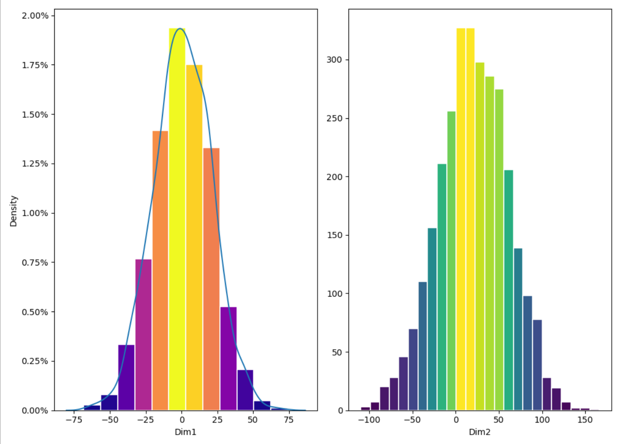
This is my third topic showing how to use -Matplotlib- in the -Python View- node in order to create visualisations. This time I’m sharing a workflow to plot 2 histograms, side by side, with different colours and numbers of bins. These parameters can be set in the component interactive view.
Sharing the code so it can be more easily searched for
import knime.scripting.io as knio

import matplotlib.pyplot as plt
import numpy as np
from matplotlib import colors
from matplotlib.ticker import PercentFormatter
import seaborn as sns
import pandas as pd
from io import BytesIO

# Get number of bins
n_bins1 = knio.flow_variables['Bins_Number_hist1']
n_bins2 = knio.flow_variables['Bins_Number_hist2']

# Get Data for the two histograms
x = knio.input_tables[0]['Dim1'].to_pandas()
y = knio.input_tables[0]['Dim2'].to_pandas()

# print(x)

# Create 2 subplots
fig, axs = plt.subplots(1, 2, tight_layout=True)
# Option if y axis should be shared: sharey=True #

# Deal with Subplot 1 Percentage option plot
# N is the count in each bin, bins is the lower-limit of the bin
if knio.flow_variables['ordinate_hist1']=="percentage":
    # We can also normalize our inputs by the total number of counts
    N, bins, patches = axs[0].hist(x, bins=n_bins1, density=True, label=False, edgecolor='white', linewidth=1.2)

    # Now we format the y-axis to display percentage
    axs[0].yaxis.set_major_formatter(PercentFormatter(xmax=1))

    #density
    sns.kdeplot(x, ax=axs[0], legend = False)
else:
    N, bins, patches = axs[0].hist(x, bins=n_bins1, edgecolor='white', linewidth=1.2)

# Print Column Name as x label is subplot 1
print(  axs[0].set_xlabel( x.columns.values[0]))

# Deal with Subplot 2 Percentage option plot
if knio.flow_variables['ordinate_hist2']=="percentage":
    # We can also normalize our inputs by the total number of counts
    N2, bins2, patches2 = axs[1].hist(y, bins=n_bins2, density=True, label=False, edgecolor='white', linewidth=1.2)

    # Now we format the y-axis to display percentage
    axs[1].yaxis.set_major_formatter(PercentFormatter(xmax=1))

    #density
    sns.kdeplot(y, ax=axs[1], legend = False)

else:
    N2, bins2, patches2 = axs[1].hist(y, bins=n_bins2, label=False, edgecolor='white', linewidth=1.2)

# Print Column Name as x label is subplot 2
print(  axs[1].set_xlabel( y.columns.values[0]))

# Color code by height
fracs = N / N.max()
fracs2 = N2 / N2.max()

# Normalize the data to 0..1 for the full range of the colormap
norm = colors.Normalize(fracs.min(), fracs.max())
norm2 = colors.Normalize(fracs2.min(), fracs2.max())

# Loop through bins in histogram and set the color of each accordingly
# Subplot #1
for thisfrac, thispatch in zip(fracs, patches):
    if knio.flow_variables['colour_hist1']=="viridis":
        color = plt.cm.viridis(norm(thisfrac))
    if knio.flow_variables['colour_hist1']=="magma":
        color = plt.cm.magma(norm(thisfrac))
    if knio.flow_variables['colour_hist1']=="plasma":
        color = plt.cm.plasma(norm(thisfrac))
    if knio.flow_variables['colour_hist1']=="inferno":
        color = plt.cm.inferno(norm(thisfrac))
    if knio.flow_variables['colour_hist1']=="cividis":
        color = plt.cm.cividis(norm(thisfrac))
    thispatch.set_facecolor(color)

# The same for subplot #2
for thisfrac, thispatch in zip(fracs2, patches2):
    if knio.flow_variables['colour_hist2']=="viridis":
        color = plt.cm.viridis(norm(thisfrac))
    if knio.flow_variables['colour_hist2']=="magma":
        color = plt.cm.magma(norm(thisfrac))
    if knio.flow_variables['colour_hist2']=="plasma":
        color = plt.cm.plasma(norm(thisfrac))
    if knio.flow_variables['colour_hist2']=="inferno":
        color = plt.cm.inferno(norm(thisfrac))
    if knio.flow_variables['colour_hist2']=="cividis":
        color = plt.cm.cividis(norm(thisfrac))
    thispatch.set_facecolor(color)


## Create buffer to write into
buffer = BytesIO()

# Create plot and write it into the buffer
fig.savefig(buffer, format='svg')

# The output is the content of the buffer
output_image = buffer.getvalue()

# Assign the figure to the output_view variable
knio.output_view = knio.view(fig)  # alternative: knio.view_matplotlib()