Histogram with multiple classes

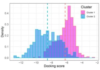
Continuing the discussion from Display two data sets in histogram: I am also trying to wrap my head around how to use the Histogram node to do a similar thing, i.e. plot 2 histograms in the same plot, showing the different data distributions (binned counts) for 2 classes. In this case I have docking scores (these should be binned in discrete integer bins by counting occurrences on the x-axis), obtained for ligands derived from 2 different scaffolds, similar to this image:

Screenshot 2023-05-16 105642

Cant really figure out how to format the data to do this with the Histogram node. I do not want to use any of the JFreeChart nodes because they produce unappealing graphics.

Any hints appreciated!

BW/Evert

Hello @evert.homan_scilifelab.se
I don’t think that you can represent this chart with the current functions of available histogram nodes.

The chart that you are showing can be achieved with the help of R or Python Script Family nodes.

BR

1 Like

Yet the Histogram (JavaScript) node icon suggests it should be possible :-).

I will put in a feature request for this.

Cheers/Evert

3 Likes

@evert.homan_scilifelab.se if you have a Python code (or R) it should be quite possible to do such a graphic with the bundled Python version.

Exploring the Power of Python Graphics with KNIME: A Collection of Examples

2 Likes

That’s nice but I use KNIME in order to avoid having to write code…

This topic was automatically closed 90 days after the last reply. New replies are no longer allowed.