Can we use this type of graph in Knime with native nodes ?. I have done it using R nodes, but I want to know if there is a way to do it with a native node from Knime without programming skills.
Hi @jodomofo
we currently do not have a native node which can generate this visualization. But we are constantly working on adding new functionality. That is why these kind of requests are very valuable for us. I will forward this to our product team, so they are aware of this need.
Would you mind sharing the R script you are using to generate? With this future readers of this thread could have a starting point.
1 Like
Of Course.
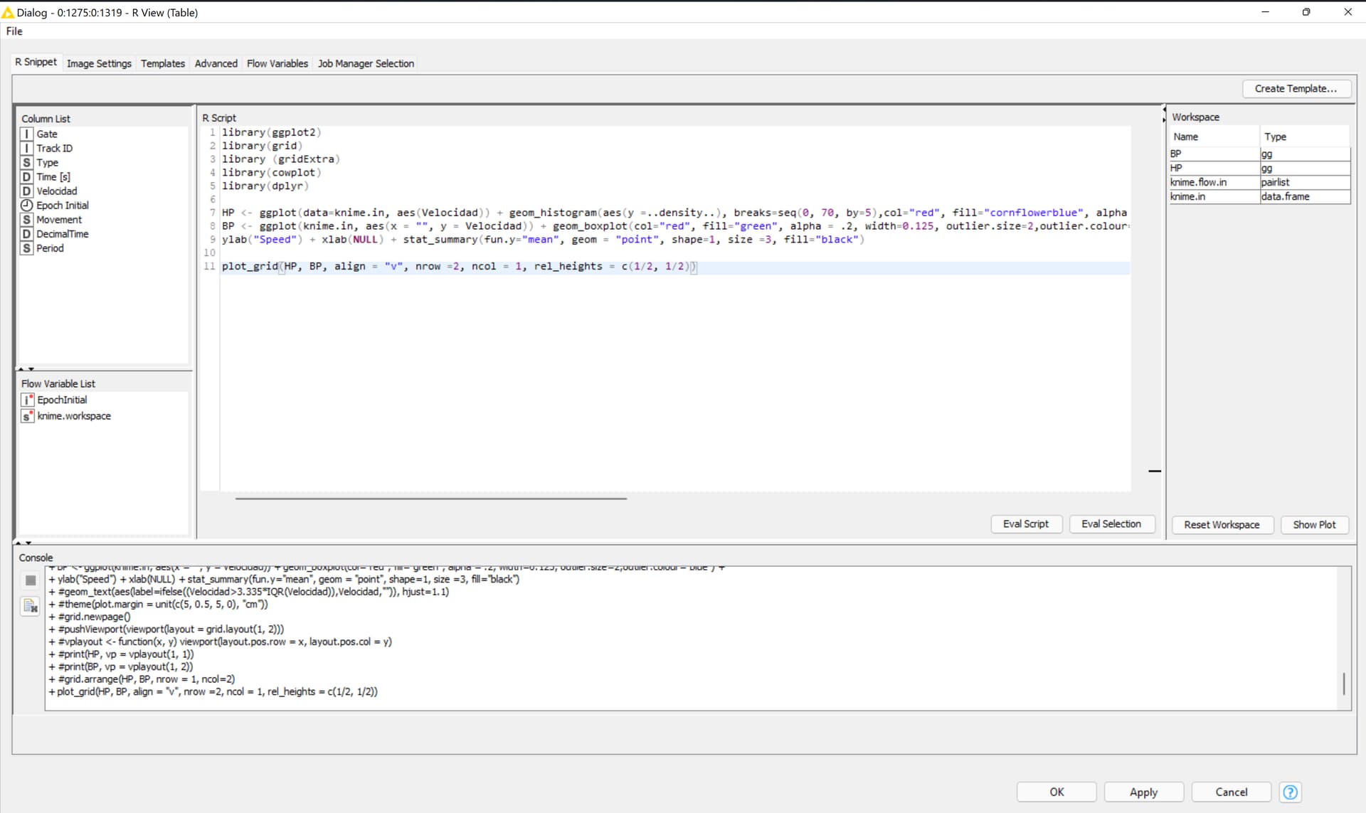
I used the R view node. Inside I modified an R code that i found on the net. Here is the code:
library(ggplot2)
library(grid)
library (gridExtra)
library(cowplot)
library(dplyr)
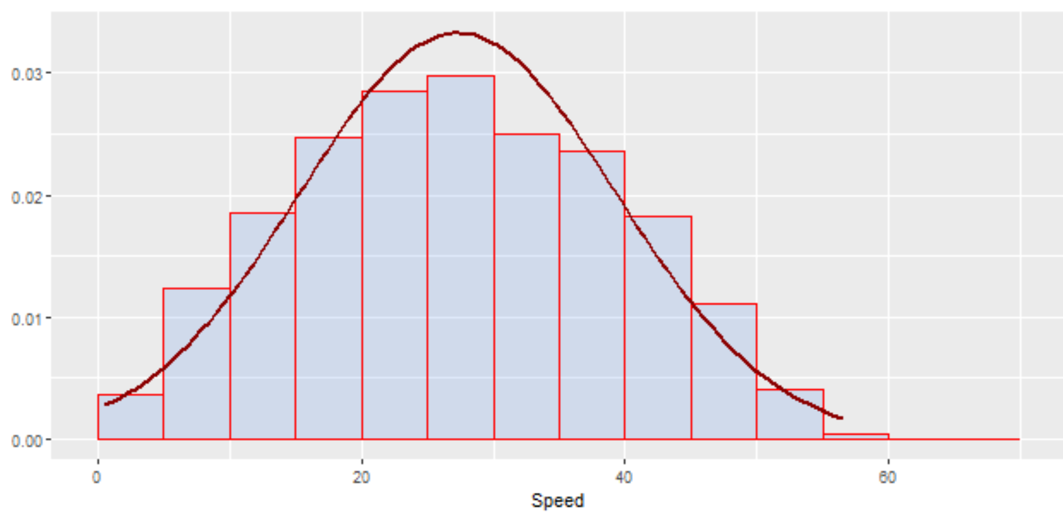
HP <- ggplot(data=knime.in, aes(Velocidad)) + geom_histogram(aes(y =..density..), breaks=seq(0, 70, by=5),col="red", fill="cornflowerblue", alpha = .2) +labs(title="")+labs(x="Speed", y="") + stat_function(fun = dnorm, args = list(mean = mean(knime.in$"Velocidad"), sd = sd(knime.in$"Velocidad")),color = "darkred", size = 1)
BP <- ggplot(knime.in, aes(x = "", y = Velocidad)) + geom_boxplot(col="red", fill="green", alpha = .2, width=0.125, outlier.size=2,outlier.colour="blue") +
ylab("Speed") + xlab(NULL) + stat_summary(fun.y="mean", geom = "point", shape=1, size =3, fill="black")
plot_grid(HP, BP, align = "v", nrow =2, ncol = 1, rel_heights = c(1/2, 1/2))
4 Likes
The basic idea here is to superpose of two distributions. One distribution was plotted with a histogram (representing the observed data), and the other distribution was plotted with a line plot (representing a theoretical probability distribution, like Normal Distribution). We can compare the two distribution.
This topic was automatically closed 90 days after the last reply. New replies are no longer allowed.