How do combine 2 string values (x axis) with sum (y axis)

I am currently working on the census report to determine age groups that earns <=50k or >50k.

I have used ‘Numeric binner’ to classify the age, and ‘colour manager’ to differentiate <=50k or >50k.

I will need a bar graph that looks like this (i drew the idea myself)

Artboard 1

My current workflow

What should i do to get result as expected?

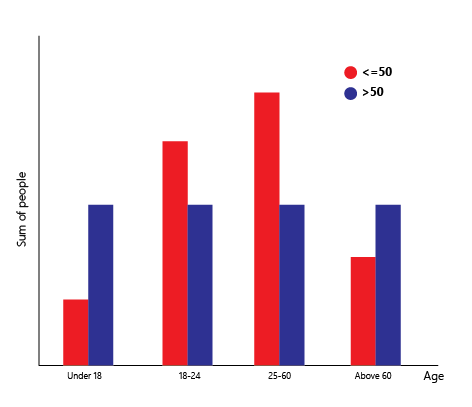
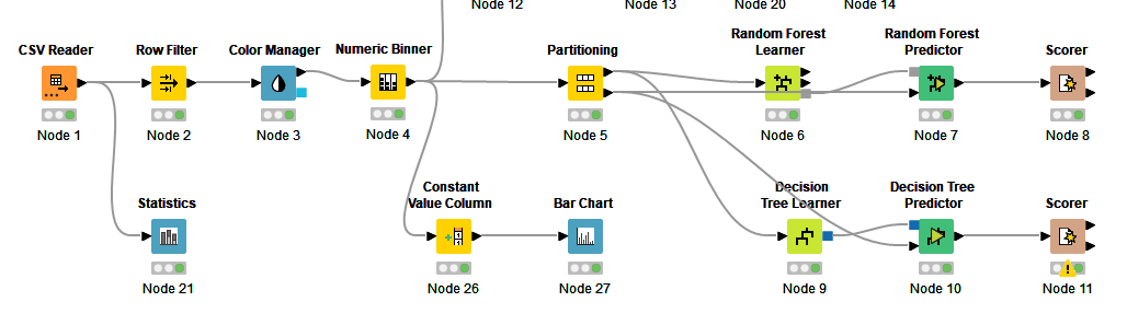
Take a look at this workflow, in particular the Bar Chart - Stacked section. You can change the option to “Grouped” in the node and it’s quite similar to what you want. The trick most of the time is to get the data in the proper format for feeding into the Bar Chart node.

This topic was automatically closed 90 days after the last reply. New replies are no longer allowed.