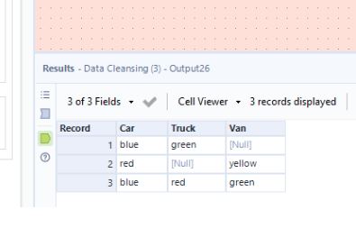
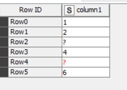
So as far as I know, in your KNIME UI 5.2.1 classic ui, you should be seeing literal “?” in black, and missing value “?” in red. I like your idea of being able to shade the background of missing values, or having them displayed in a custom manner, but I have personally not found confusion between the two because of the colour difference, but I realise that what works for me may not work for everybody!
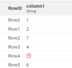
The very clear visual difference in modern UI “missing values” is an improvement in this regard though.
I wouldn’t give up totally on “modern”, as it is improving with every release.
I admit there are still times I drop back to classic, and there are aspects about Modern UI that are still missing.
I am using both KNIME 4.7.8 and 5.2.2.
I mostly use 5.2.2 in Modern UI but sometimes have a need to drop back to classic.
I have finally got to the point though that I (mostly) prefer Modern UI. Because I am now regularly using both, there are aspects I miss from the “other” UI, in both cases. I reckon that by the time we get to 5.5 and beyond, it will be pretty awesome, lol! True, it’s been (and still is) a bit of a journey, but I think it will ultimately be worth the trip.
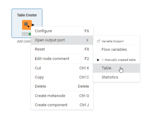
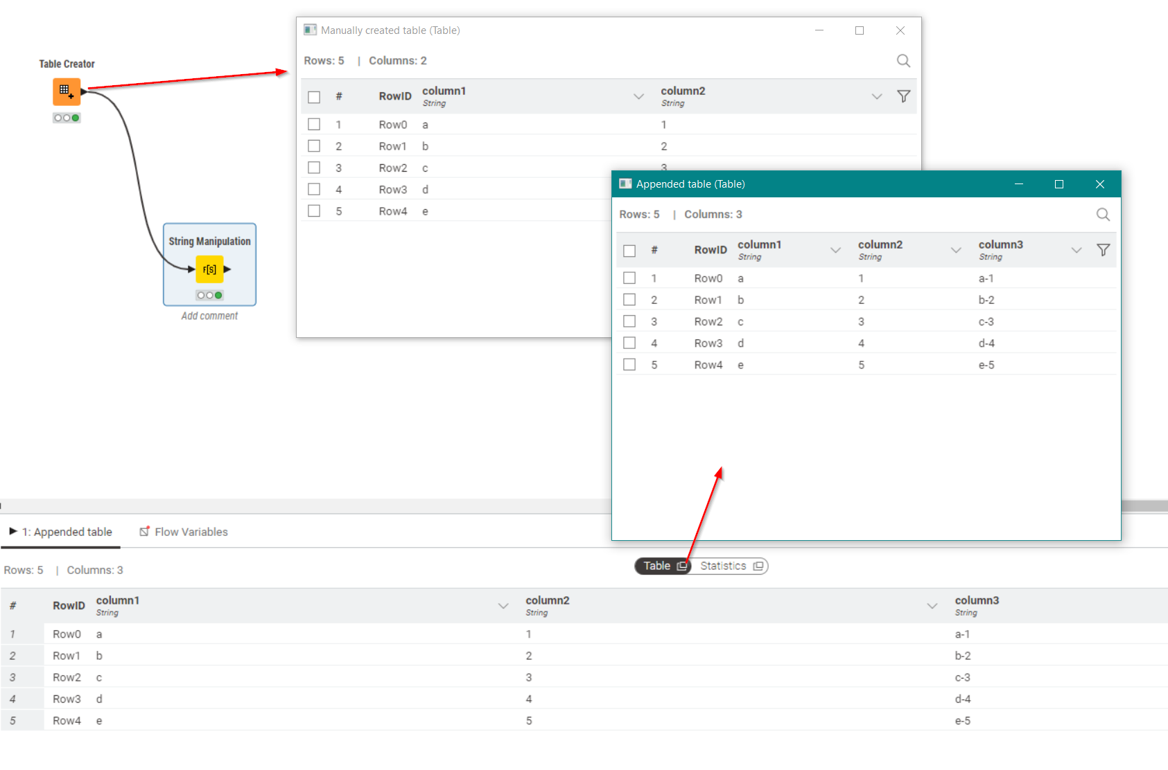
Popup data windows in Modern UI since 5.2.0
Funnily enough popup data viewing windows was one of the best features of KNIME when I moved to using it; I found it so much easier to work with than having to drop Alteryx Browser Tools all over the canvas, so I certainly noticed their absence when the first Modern UI releases appeared.
However, things are moving on and since the release of 5.2.0, popup windows have been made available again in Modern UI, without having to add other nodes to the workflow, via two methods:
Firstly via right-click (although I’d still like to see the return of a shortcut key for “open first viewport” as per classic, to reduce fine-control-mouse-movements)
But secondly, via the little (slightly disguised) “open in popup window” button of the data preview pane at the bottom: