I would like to extract the values from the a column and count how often the value has appeared. I tried Rule Engine Node and Column Expressions Node but it is not working the way I would like the result to be…
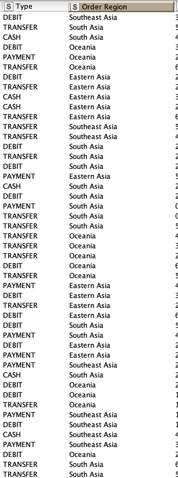
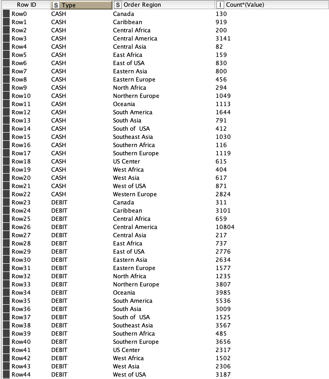
There are four different payment and I would like to count the numbers from the payments
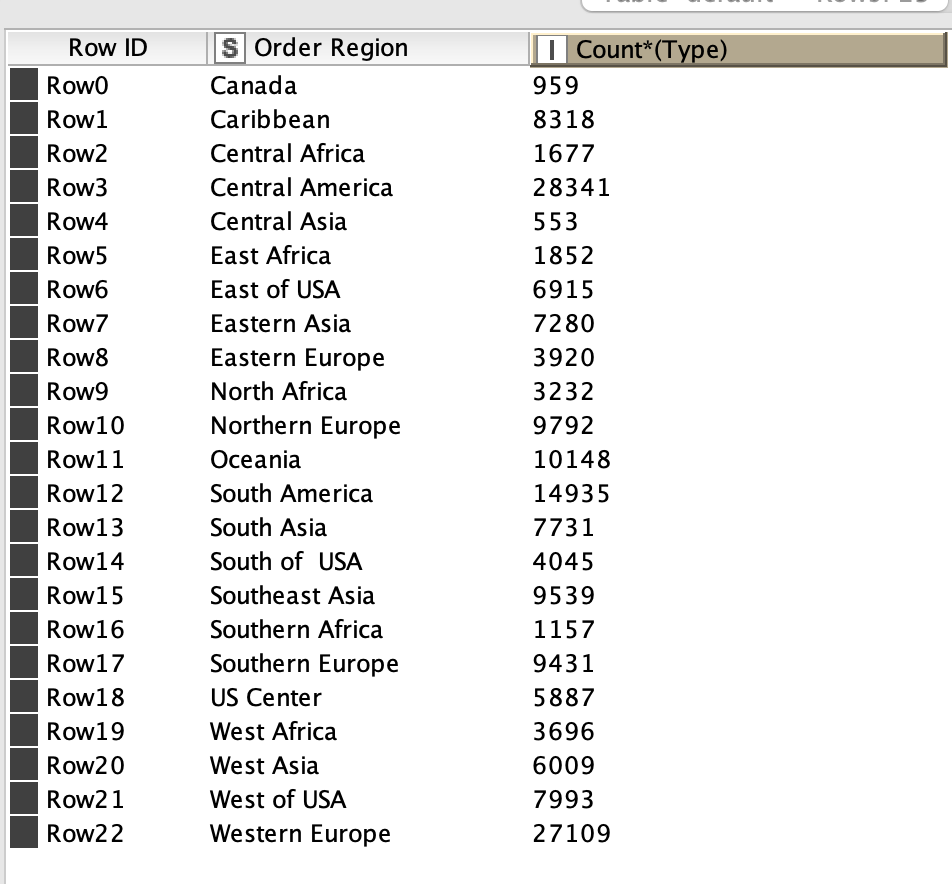
What I would like to figure out is how do I extract the values before I count them, so at the end it shows Region A hast used Type 1 for xxx times and Type 2 for xxx times and Type 3 for xxx times.
thanks for the quick reply.
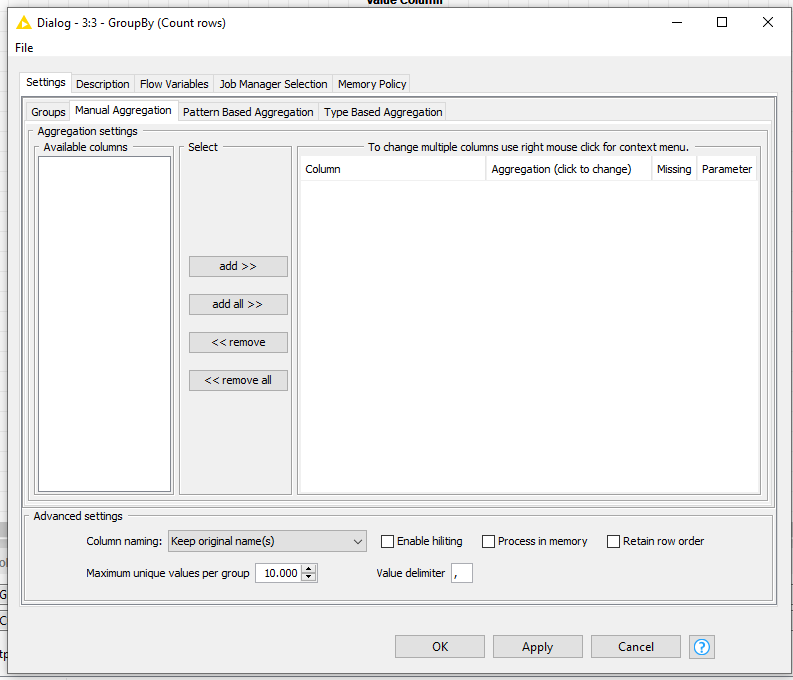
But I don’t get quit you mean, can you maybe explain it in another way what I should do with the constant value column Node.
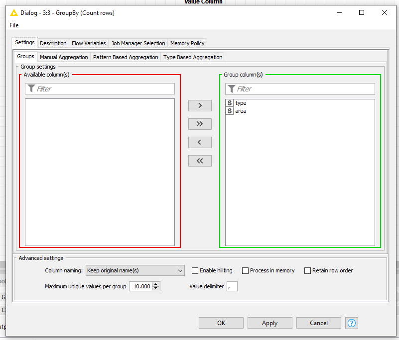
Do I just add it before the GroupBy Node with an append-Column?
Sorry for not being clear.
Here is a small workflow.
You said you have two columns, and if you use both in your “Groups” section in the group by node you are left with no column to make the count number of rows.
So, if we add a new column with a fixed value, you can use the new column to count rows. So, take a constant value column node and create a column full of 1s, then use the newly created column to count rows in the group by node
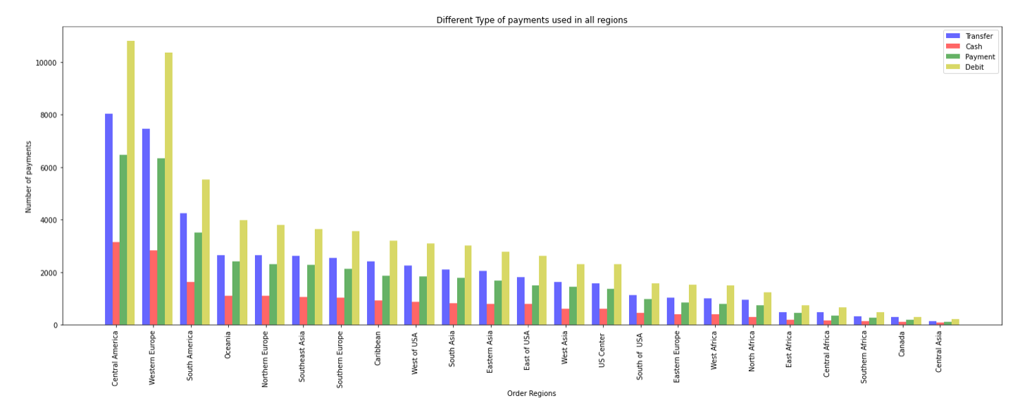
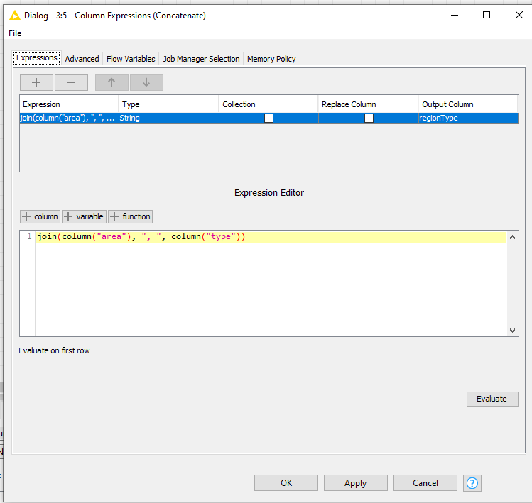
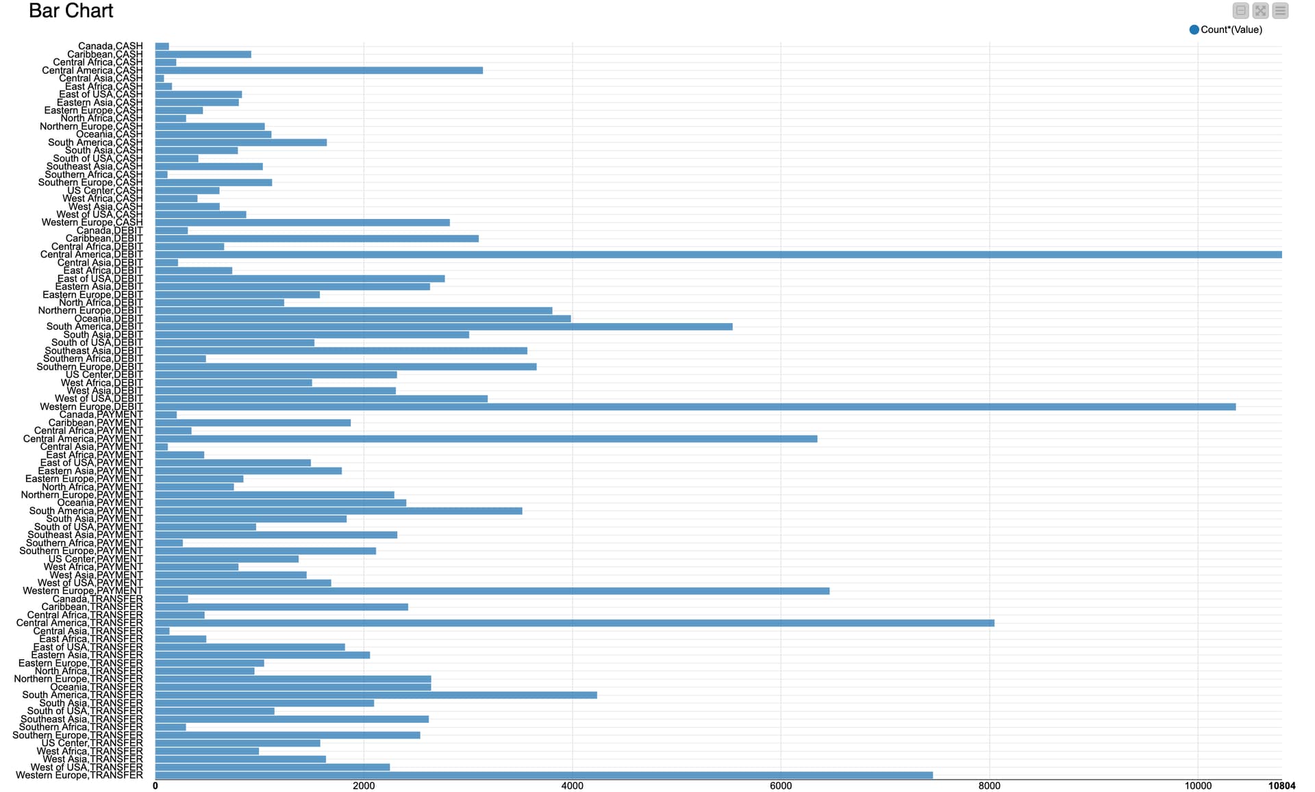
A further problem with the Bar Chart. Since I can only choose on Column as Category Column in Bar Chart Node. So it always shows either the count from Region or from Type? Do you have any suggestions what I should do to make them all shown at once?
For the bar chart problem, concatenate the two categories use the new attribute to make the plot.
Have a look at the workflow attached, I have updated it adding the bar plot.
I tried to create a new Expression with the two column “Type” and “Order Region” but I cant find the right function which this two Columns Can you help me out with it please?