I’m trying to create a plot like the following one:
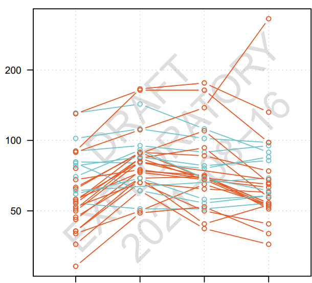
Every line is a person and the x-axes is a point in time.
The color (red or blue) is based on a value (1 or 0) in a column.
I’m completely lost on how to do this in knime.
I’m trying to create a plot like the following one:
Every line is a person and the x-axes is a point in time.
The color (red or blue) is based on a value (1 or 0) in a column.
I’m completely lost on how to do this in knime.
I’ll check it out, Thanks
Hi @aworker
That already does makes something that looks like it.
The parallel plot however has different Y-axes ranges. I would like to have only 1 range for all Y-axes.
Is that possible ?
Best,
Jef
That’s a good find by Ael, however it seems the Parallel Coordinates Plot uses categories as “x-axis”.
@Jef I don’t do any visualisation in KNIME with KNIME, because this is one of its few weak spots. I can replicate your example plot in R. You’ll need to have R and the R extension installed on your machine to use it though. If you don’t have it, but are interested to see it anyway, that’s fine as well.
If you want me to make that graph, can you share some example data for me? 
Hi @Jef
Maybe it just needs to be transposed before transferring it into the -Parallel Coordinate- node.
Could you please post here in CSV format an example of the data you need to plot ?
Best
Ael
@Thyme & @aworker
Problem is that is confidential information. I need to check how I could share. Will update you accordingly.
@Thyme
I planning to use R Plot – KNIME Hub to create instead. But I was wondering if there was an out of the box solution within Knime.
Thanks
Maybe you could generate some minimalist fake data, big enough to understand the nature of it so that we can come up with a purely KNIME solution from there. R is obviously a very good alternative solution but then you will be dependent on R. Is up to you 
Best
Ael
This topic was automatically closed 90 days after the last reply. New replies are no longer allowed.