How to Create a Timeline

I have an Excel database with columns:
Name | Start Date | End Date

A person can have more than one period of start or end dates. So, for these cases, I would need to “consolidate” these lines, identifying the start and end dates to plot a timeline.

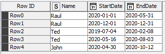
For example, I have two lines for Raul. The first line starts on 01/01/2020 until 05/31/2020. And the second line starts 12/1/2020 until 12/31/2020.

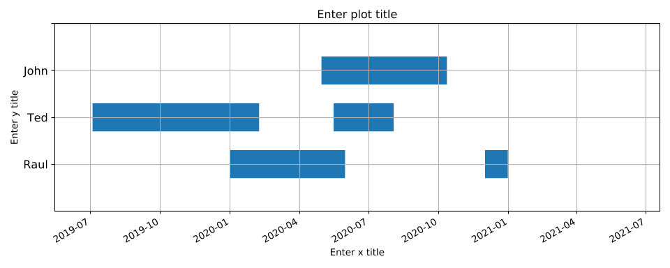
My goal is to consolidate these two lines into a single line to create a timeline, informing the respective person’s start and end periods.

I’m not sure I fully understand your question. Are you trying to identify the earliest start date and latest end date for a particular individual across different rows? In that case you could use a GroupBy node, grouping on name, and then using minimum aggregation for the start date and maximum aggregation for the end date.

If I’m not interpreting this correctly, could you post an example of what your expected output dataset would look like?

Almost that. In fact, I need to consider all the start and end dates and then “plot” a timeline.

In this example we would have:

Name | January | February | March | April | May … | August | … | December

Then a single line for Raul with markings in the months corresponding to it.

Ah OK. So, one-hot encoding for months in which a particular individual is active. Let me think about that a bit.

Yes! I really need this. I’m waiting. =)

Thanks a lot.

can you attach a sample file. Then it might be easier to help
BR

You can try this. It was a bit trickier than I thought it would be at first. I made some assumptions about your data input format so if that’s different (likely) you would need to tweak this. But maybe it gives you an idea of how it could be done. As always, there’s probably a more efficient solution, this was just my first stab at it.

OneHotEncodingDateRanges.knwf (27.9 KB)

Input:

2020-10-28 14_54_11-Manually created table - 0_438 - Table Creator (Read Data)

Output:

6 Likes

Thanks a lot for the help.
I will look at the flow to understand and study.

1 Like

Awesome work ScottF.
Thanks for sharing!

1 Like

Hi,

In you question I see that you want to plot the timeline. I put a branch in the @ScottF workflow with two more nodes to plot the data with broken barh plot (https://matplotlib.org/3.3.1/api/_as_gen/matplotlib.axes.Axes.broken_barh.html) and the result is this plot

Here is the workflow with the python code

OneHotEncodingDateRanges II.knwf (82.1 KB)

Hope it helps you in some way

4 Likes

Did we just accidentally make a Gantt Chart component? :sweat_smile:

1 Like

Very good idea, guys.
In the Gant Chart, for each period for the same person, can I change the color?

I still haven’t been able to study the flows and the other answers. I have other deliveries to make here at work, but I will look soon.

Hi @raulnmsantoro ,

Did you mean something like this?

Just add the colors you want in the code

ax.broken_barh(data1, (y_pos[row]-3,6), facecolors=(‘tab:blue’, ‘tab:green’, ‘tab:red’))
The colors will circulate …

OneHotEncodingDateRanges II - colors.knwf (37.3 KB)

4 Likes

This topic was automatically closed 182 days after the last reply. New replies are no longer allowed.