Hi,
ist there a way to optimize the “node usage and layout” for the view in web portal?
Today I have large white bars left and right shrinking the middle part. This shrink will create scroll bars at tables (outsite of view).
Is there any tutorial how to create good views? The default is not the best user experience.
can you elaborate a bit more on your use case or post some screenshots?
Per default the WebPortal is bound to a max size of 1600px - some margins for our grid layout, resulting in a max width of ~1450 px. This is a common thing for websites to prevent cognitive overload (I found this post very interesting explaining this topic). Nevertheless, there might be cases where you want the WebPortal to take up the full available space. This should be possible by overwriting the set variables via theming.
I hope this gives you a bit of insights.
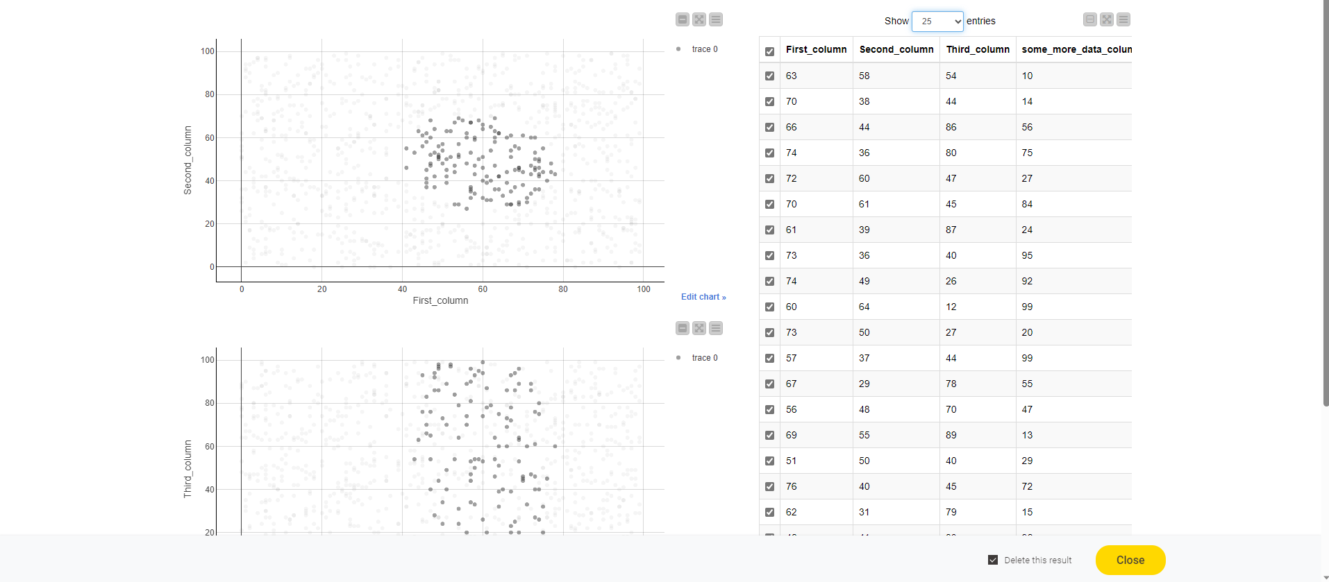
I just added a screen of a demo, unfortunately I must not share company content.
Use case would be have two linked plot with selection (plotly) and show selected points in table. As you might see, the table is cut and you ned to scroll down to find the scroll bar and indeed you need to scroll left and right to get all data.
I also tried to implement “next” buttons, which was not liked by users.
Cognitive overload I tired to minimized by putting the analysis flow visually left to right, i.e. first finding interesting points an left site (need prob to scroll up and down), then having table right to get more contextual info.
thanks for sharing the screenshots and I agree that in your case a wider max width would be necessary. As pointed earlier this is already possible if you put --grid-max-width: 1600px; in the WebPortal theme.css and replace the 1600px with some larger number. But keep in mind these two remarks regarding this approach:
it will change it for all WebPortal pages
it is not an officially supported variable and might change in the future
I created a ticket to solve this properly (internal reference UIEXT-1233)