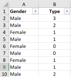
I have the following data.
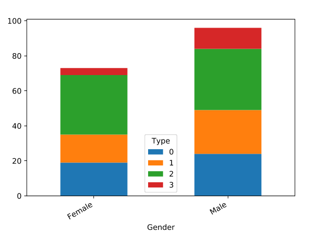
How do I create a stacked bar chart, and customise the colour so that it looks like this? (Tried using Bar Chart node, but couldn’t figure out how.)
Attached data. Thanks.
data.xlsx (10.5 KB)
I have the following data.
How do I create a stacked bar chart, and customise the colour so that it looks like this? (Tried using Bar Chart node, but couldn’t figure out how.)
Attached data. Thanks.
data.xlsx (10.5 KB)
Hi there @dixonchan,
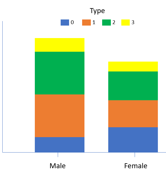
first you need to use One to Many node on your type column to get four columns with zero and one values for each type. If type column is integer use Number To String before it so you can use above mentioned node. Then see this workflow example on how to create custom colors and stacked bar chart:
Hope this helps!
Br,
Ivan
This topic was automatically closed 182 days after the last reply. New replies are no longer allowed.