How to interpret perplexity in topic modeling?

Hello everyone,

I would like to find out the optimal topic number by using the two-step perplexity method used in this workflow (“Block 2”):

Yet, I am not sure how to interpret the resulting charts correctly. Here is an example of how I would proceed:

Step 1 - wide topic range (2 to 80)


→ the “elbow” range is between 6 and 10

Step 2 - narrowing down the topic range (6 to 10)

Now, acording to the last chart, what is the optimal number (7, 8 or 9)? Is my approach correct at all? Thanks!

1 Like

Hi @MaxG ,

A warm welcome to the KNIME community forum!

First of all, your question is more about understanding how this perplexity score works. There is nothing wrong with that. But getting an answer on this specific result wont help you in long term. I would like to refer you to this medium article.

Evaluate Topic Models: Latent Dirichlet Allocation (LDA) | by Shashank Kapadia | Towards Data Science.

Also, the workflow you mentioned is created by one of the KNIME community members. If you scroll down on the page of the workflow on the KNIME Hub, you have the option to start discussing the workflow right there on the hub page as shown in the screenshot below.

Regards,
Temesgen

2 Likes

Thank you for your answer, Temesgen!

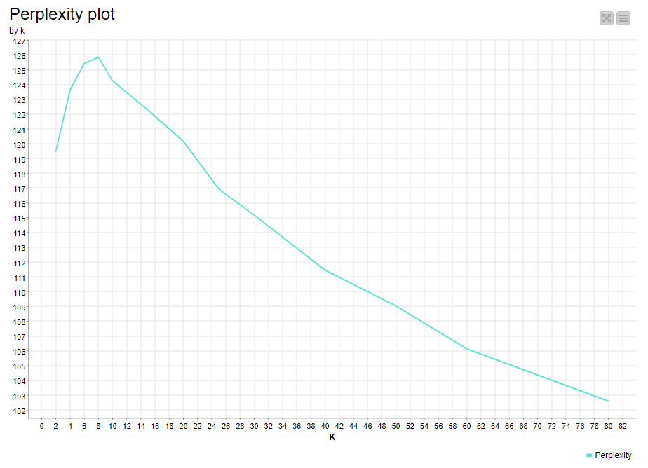
I think you are right! I am still quite perplexed because of the perplexity score. I admit I do not have a deeper technical understanding of this method, but as far as I could understand, the lower perplexity is, the better the model fit.

For example in a chart like this I would assume that the “optimal” topic number is 3 (right?):

Now, the chart in KNIME is a bit different and I am not sure how to apply the elbow method to it, but thank you again for your detailed answer!

This topic was automatically closed 90 days after the last reply. New replies are no longer allowed.