How to plot each cluster of K-Means??

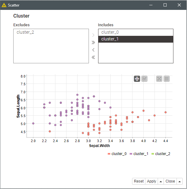
Hi everyone, I’ve clustered a CSV File into 3 clustering using the K-Means node in KNIME. I now need to visualise each cluster as a scatter plot e.g. plot1 for cluster1, plot2 for cluster2 etc. Does anyone know how to split the clusters to I can do this?

Many thanks

Welcome to the forum @factive.

The Row Filter node will allow you to filter based on the value in the cluster column.
You’d use one for each cluster, connecting them all to the clustering node.

Alternately you can use 2 sequentially connected Row Splitter nodes.

Hello @factive
Does a solution like this apply to your requirements?
A single plot with a filter to customize the displayed clusters in the view.

20220323_plot_clusters_scatterplot.knwf (27.7 KB)

BR

PS.- This plot doesn’t have a trellis option. But you can split the clusters as suggested by @elsamuel
and group three scatter plots into a component.

3 Likes

@gonhaddock , is it possible to use Table Creator as data sours. Current version do not have data.
Thank you

@izaychik63
Updated version with dataset reading from CSV

20220323_plot_clusters_scatterplot_v2.knwf (37.7 KB)

BR

Thank you, @gonhaddock. You can avoid RouID node if in Joiner use "assign new row key sequentially option.

1 Like

This topic was automatically closed 90 days after the last reply. New replies are no longer allowed.