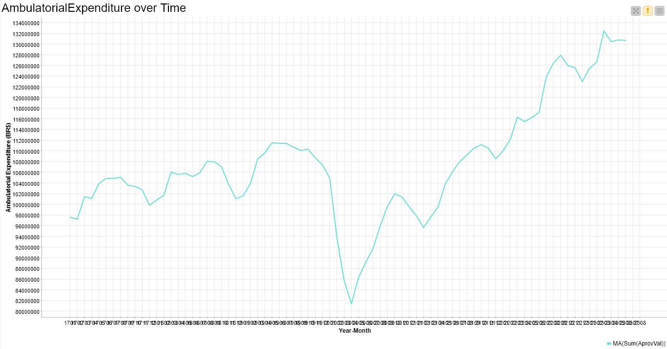
But I’m facing a legibility problem on the scale of the x-axis. Data are grouped by year and month (2 digits each) and are presented in the format YYMM. I couldn’t find a control button (or something else with an equivalent function) to allow me a rotation (e.g., 45° or 90°) of the scale of the x-axis. I need that in order to avoid the superimposition of one value and the adjacents.
Can someone help me with this (supposedly easy) task? But I need to do that just using Knime functionalities, but not external capabilities (such as written command lines, in Python or R, etc.).
Thanks anyone might help me with this.
B.R.
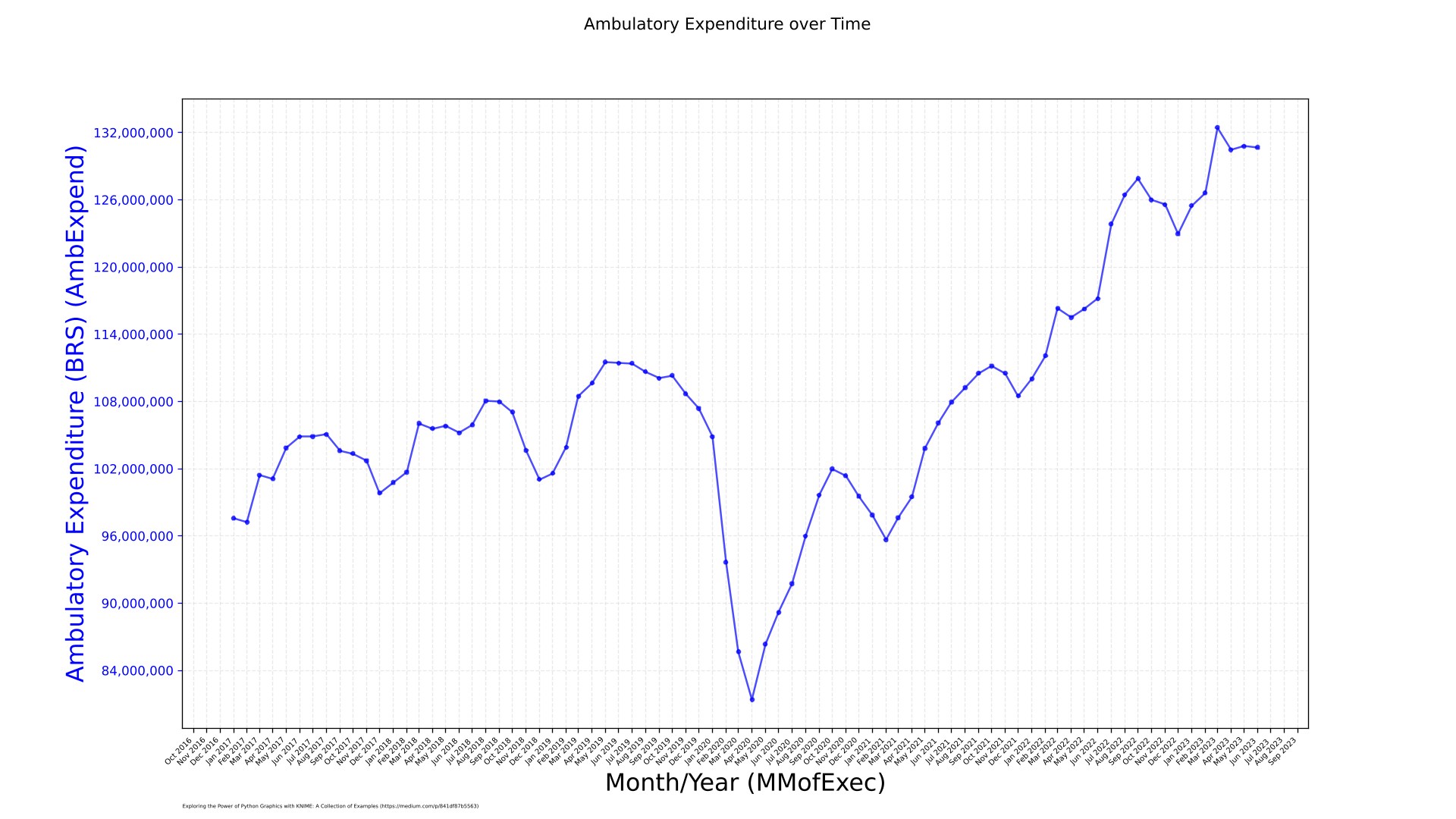
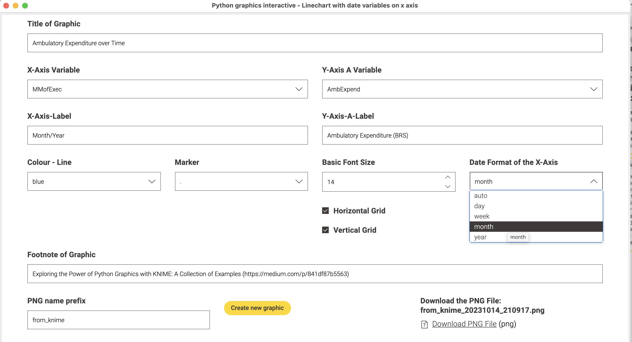
With the help of KNIME Data Apps one can create a GUI where you can select the data change settings in order to make this usable in similar situations:
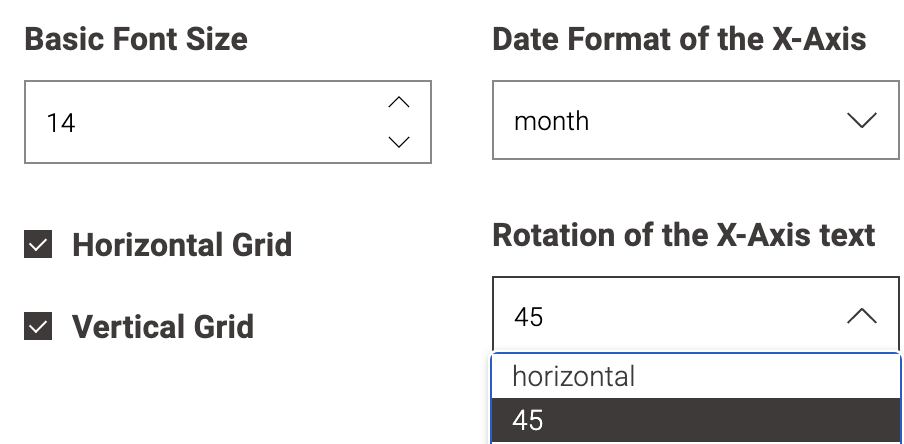
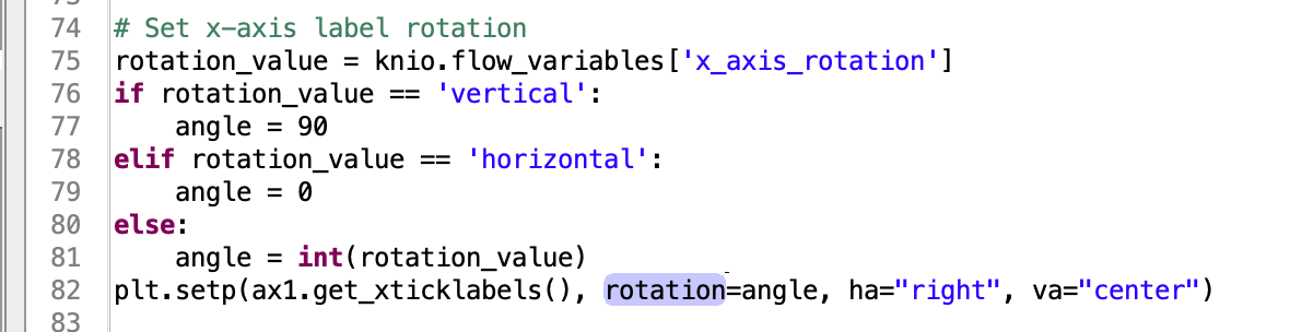
The settings will be converted into Python code. Once a framework is there you can change the settings - or even better ask ChatGPT to do it for you. Also let it explain the code. Here to steer the angle of the x-axis text:
Great as KNIME is, I think sometimes if you want more complex scientific charts with some individual settings you might want to use Python - but luckily you can integrate that into our favourite low code tool
Dear Markus,
Thank you (once again) for trying to help me. But I’m afraid I have no available time for learning how to learn (at the basics of) Python to implement it in my current project. My “deadline” has arrived… Later on, I promise you I will do my best effort to do so. But (for now), isn’t there a tool entirely in Knime (for rotating the scale of a graph (built with the Line Plot node))? I have no available time to take this “large step” right now.
Thanks.
@rogerius1st for now you can just use the GUI I have provided. No need to learn Python right now. If there are more things to adapt I could try and implement them.
The graphic should be there as a PNG file with the months rotated 45 degrees.