Holy cow !
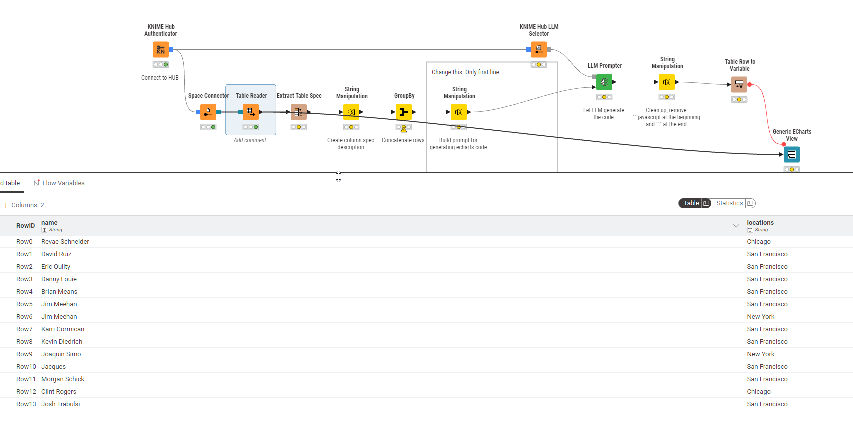
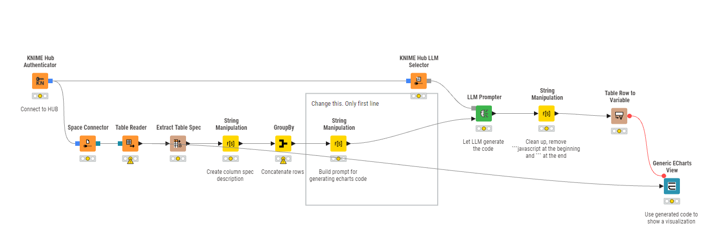
Dynamic ECharts – KNIME Community Hub
This brilliant idea just worked!
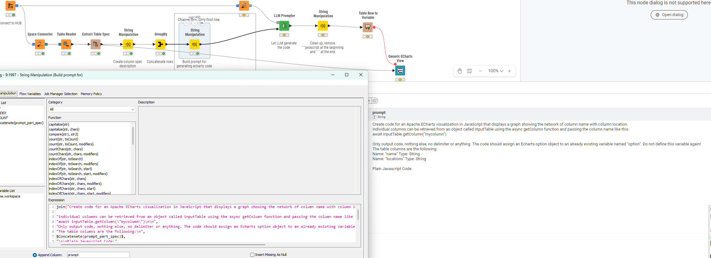
Create code for an Apache ECharts visualization in JavaScript that displays a graph showing the network of column name with column location. individual columns can be retrieved from an object called inputTable using the async getColumn function and passing the column name like this: await inputTable.getColumn("mycolumn")
Only output code, nothing else, no delimiter or anything. The code should assign an Echarts option object to an already existing variable named "option". Do not define this variable again! The table columns are the following: Name: "name" Type: String Name: "locations" Type: String
Plain Javascript Code:
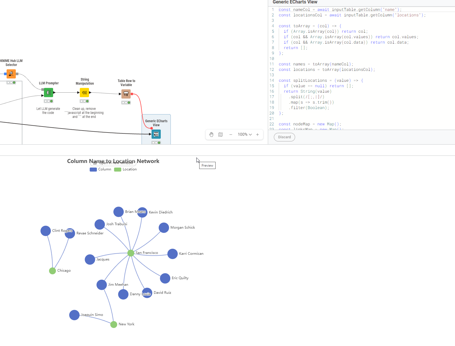
Code
| const nameCol = await inputTable.getColumn(“name”); const locationsCol = await inputTable.getColumn(“locations”); const toArray = (col) => { if (Array.isArray(col)) return col; if (col && Array.isArray(col.values)) return col.values; if (col && Array.isArray(col.data)) return col.data; return ; }; const names = toArray(nameCol); const locations = toArray(locationsCol); const splitLocations = (value) => { if (value == null) return ; return String(value) .split(/[;,|]/) .map(s => s.trim()) .filter(Boolean); }; const nodeMap = new Map(); const linksMap = new Map(); const addNode = (id, category, symbolSize) => { if (!nodeMap.has(id)) { nodeMap.set(id, { id, name: id, category, symbolSize }); } }; for (let i = 0; i < Math.max(names.length, locations.length); i++) { const columnName = names[i] == null ? “” : String(names[i]).trim(); if (!columnName) continue; addNode(columnName, 0, 36); const locs = splitLocations(locations[i]); for (const loc of locs) { addNode(loc, 1, 24); const linkKey = `${columnName}__${loc}`; if (!linksMap.has(linkKey)) { linksMap.set(linkKey, { source: columnName, target: loc }); } } } const data = Array.from(nodeMap.values()); const links = Array.from(linksMap.values()); option.title = { text: “Column Name to Location Network”, left: “center” }; option.tooltip = { trigger: “item”, formatter: (params) => { if (params.dataType === “edge”) { return `${params.data.source} → ${params.data.target}`; } const categoryName = params.data.category === 0 ? “Column” : “Location”; return `${categoryName}: ${params.data.name}`; } }; option.legend = [ { data: [“Column”, “Location”], top: 30 } ]; option.animationDuration = 1000; option.animationEasingUpdate = “quinticInOut”; option.series = [ { type: “graph”, layout: “force”, roam: true, draggable: true, data, links, categories: [ { name: “Column” }, { name: “Location” } ], label: { show: true, position: “right” }, force: { repulsion: 220, edgeLength: 140, gravity: 0.08 }, lineStyle: { color: “source”, curveness: 0.1, opacity: 0.7, width: 2 }, emphasis: { focus: “adjacency”, lineStyle: { width: 4 } } } ]; |
|----|