As a long time Knime user, I have built large workflows over the years. However, with the new releases, nodes now open as “Modern Ui” nodes. Not only do they take a long time to open, the Ui / Ux is worst. The range of the selection windows in column filter / renamer / joiner is very limiting.
I don’t quite understand why Knime needs a Modern Ui, the Classic Ui can be cleaned up a bit, but works very well for most.
It’s increasingly frustrating to make adjustments to workflows now as it is very time consuming. I manage a team of analysts using Knime and they have either downgraded or are learning new platforms to deliver projects on time. I hope this gets sorted soon.
Thanks for the feedback. We take this very seriously and are continuously trying to improve our Software.
We have already noticed the longer startup time of the new dialogs and we are currently investigating how to improve that.
One major driver of the modernisation of the Analytics Platform was/is to improve the Ui/Ux so I am very sorry to hear that you have the opposite feeling.
The most important for us now would be to identify and improve these problems. You already mentioned one, but I assume there is more?
I would be more than happy to jump on a quick call to discuss these problems. Let me know if you are up for that.
I have already mentioned several bugs / missing configuration features of the new HTML based nodes in contrast to the deprecated ones to support@knime.com .
Frankly spoken, it is annoying replacing the old nodes, reconfiguring the new ones and finding out that they are not sufficent and going back.
Is there a possibility to give an overview of the (configuration) features (old vs new) on a blog posting or in each new node?
I torpate this topic to add my concerns regarding the newest update and the switch to the new UI elements in the node.
I just updated to 5.3.0 and had several cases now where old workflows ran into new errors because of configuration problems. This errors happened because of the forced change / added functionalities in the node themselves. This could have been completely avoided with creating new versions of the nodes and by set the old ones to depcreated.
To name two examples:
One of our components had an error because of a missing column in the RowID node, even though “replace RowIDs” was not ticked and therefore the column was not used at all.
Another example is the new “Extract Context Properties” node that had new variables added for hub support, which resulted in another node later to fail because it was not expecting the new input.
Both of those examples were really easy to fix but could end in a lot of manual adjustments. Knime was especially strong and reliable in regards to backwards compability and I think it is losing a lot now because of the forced changes.
On top of the problems mentioned by the others, that the nodes with the old UI configuration often feel better and more adjustable.
I hope those changes gets adressed before the first stable release of 5.3.
And to end this “rant” with something positive: The workflow monitor is the best addition Knime has gotten in a long while and is the best argument to change to the newest version!
I feel like Knime has abandoned long term users by only developing Modern Ui. Many of the Classic nodes are gone and replaced with watered-down versions in the spirit “Modern Ui” with the user interface and user experience gone. Modern Ui is great for new Knimers and small workflows, but not for large workflows. I hope there are some stats on long term users switching to Modern Ui available.
First of all thank you very much for the feedback. Backwards compatibility is still our upmost goal and we have lots of test cases / test workflows and manual checks in place to guarantee it. Apparently, we still missed some issues and rest assured we will fix them before the first stable version and we will also investigate why we missed these and how to prevent such things in the future.
When it comes to why didn’t we deprecate the nodes, this is always a very hard discussion. We are carefully thinking about this for every node that we migrate to the new UI, but especially for these widely used nodes this would also put a lot of manual work on our users to replace all of these deprecated nodes in thousands of workflows and occurrences. This is why we decided to deprecate as little as possible and we were also confident (maybe too confident) that our modern versions are backwards compatible and an improved version of the old dialogs.
In regards to the dialogs themselves I would be very interested in the details on why the old UI configurations feel better and more adjustable. I am happy to discuss this in a short call. Will send you my mail adress in a private message let me know if you are interested.
Totally agree, the workflow monitor and quick nodes adding are my favourite features in modern UI.
we have by no means abandoned our long term users and we are not developing Modern UI only for new users. With Modern UI we are tying to make the UX better for all of our users and the fact that you describe it as easier for new users already shows that we at least already achieved that. Now the big question is why you think we now have watered-down versions in Modern UI.
We can only improve things that we know about, which makes threads like this so important for us. If you are up for it, lets hop on a short call and discuss these problems.
The classic interface of KNIME is “a classic Eclipse”. Many developers have been working with Eclipse for years and are very familiar with it. In addition, Eclipse is a very versatile and, even visually, customizable development environment. In my opinion, there was and is no reason for a “modern UI”. The “look and feel” can also be modernized within the “classic UI” if necessary. This has certainly already happened in recent years. For example, many glass and aero effects have been removed from the node icons. The functionality and stability of a development environment are much more important than adapting the “look and feel” to current fashion. With the switch to “modern UI”, KNIME loses a large part of the “Eclipse functionalities”, in particular real-time variable, log, debug and process monitoring. Some nodes (Table-Row-to-Variable-Loop-Start and Variable-Loop-End) are partially faulty, which I suspect is due to the inconsistent implementation of the loop start and loop end nodes from classic UI to modern UI. The separation of the configuration of a node and its variables, job manager, memory policy, etc. is very cumbersome and confusing. I have been working with KNIME for many years, almost since KNIME was launched. I have looked closely at “modern UI”. In my opinion, the development and implementation of “modern UI” is not only superfluous, but a major step backwards.
Hi @DanielBog, thank you for being so responsive. I appreciate you and the team being open to progressing Knime for all users. I say the Modern Ui nodes are watered down because in comparison to the functionality and UI/UX of the classic node, they have lost so much. One quick example, “Column Renamer” gets brought up a lot. We’ve lost the functionality to search, filter, see all of the columns, and even change their type. I’m not sure if the developers took the time to accurately understand the previous nodes before creating simplistic versions of them which are now standard for all users. There is no choice / option to use classic nodes.
Yes, Modern Ui is bringing on more users who are dabbling in data, but it’s not for long term users creating large complex workflows.
I feel Knime has been split into two with long term users getting left behind.
@DanielBog - I feel like platform updates are getting ahead of the bug / test / user feedback curve with the Hacking Days events, but node rebuilds (which are arguably much more crucial and impactful to our existing work) seem to be developed, polished, released with the older nodes deprecated without wider user feedback and testing to ensure that it retains all of the prior capabilities.
What about node development specific hacking days where a bunch of us users can install a test version and throw a ton of old workflows at a targeted node in development and report back errors? That way we could collectively help clean up missing capabilities before they release / deprecate the older versions.
While I still lean on the older UI pretty hard, I very much doubt that KNIME would be around very long if they locked their fate to remaining 100% Eclipse dependent, maintaining old nodes and only developing within Eclipse limitations. I believe that they are taking difficult development steps that will put KNIME in a position to thrive longterm (which will ensure we have access to the platform in the future). There are going to be bumps along the way on a difficult undertaking like that, but perhaps us forum users can help smooth them ahead a bit…
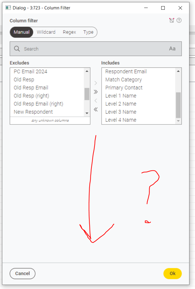
I agree that some of the ‘reworked’ nodes are a huge step backwards in terms of ease of use. Take for example the new Column Filter - it looks grey and blurry on a 4K monitor, it’s hugely wasteful of font vertical space and padding compared to the previous version, and for some reason you can’t increase the vertical height of the Excludes and Includes box. This means it’s only possible to see 7 fields at a time, which makes for an incredibly frustrating experience if you have a large number of fields to scroll down and pick from.
I just can’t understand how this has happened, and why the KNIME team haven’t realised the limitations of this new design. Do they not use the product too? If I could understand the design rationale it would make it easier to accept, but the sad thing is that the old versions of these nodes were better. Please can we have them back?
It’s sometimes so difficult coming from Alteryx where the designers just ‘get it’ - Alteryx puts users first, it looks good, it makes efficient use of the space, and I wish KNIME would at least install a trial version to give them some inspiration for how things could be done.
I feel that the Modern UI Row Filter node and the Classic Row Filter node are similar but different. The old Scatter Plot node can still be used as a Scatter Plot (legacy) node. I would be happy if there were the Row Filter (legacy) node available as well.
No, I’m satisfied with the new Row Filter, and I think the roadmap you’ve presented is excellent.
The reason I feel the new Row Filter is different from the classic Row Filter isn’t just due to the differences in UI functionality. For example, the available flow variables are completely different, right?
Since the specifications of the node are clearly different, I think there are users who would prefer to use the familiar classic Row Filter.
I believe that @KunalB86 's problems would be mostly resolved by retaining the classic nodes.
I totally agree with you that eclipse is one of the most versatile and customisable tools that I know. While this is awesome at the one end this also comes with some challenges on the other end. It comes with a lot of overhead and to be honest I use a minimal set of the customisability and perspectives that eclipse offers.
We did not create Modern UI to simply have a better looking version of the Analytics Platform, but we did it because it allowed us to improve the user experience from ground up, move to a new tech stack, which will help us a lot moving forward and of course also to modernise the look and feel of the platform.
I am not saying that it is perfect yet and I totally agree that there are things missing. What we don’t want to do is build a one to one copy of the classic UI. I agree with you that if that would be our plan, we could have just reworked the classic UI. What we will do is, to carefully investigate what it is that our users are missing and evaluate on how to solve this in the best way. Which brings me back to why this thread is so important to us.
Lets use this thread to discover what it is that you are missing and work out solutions that will make our users even more productive and happy.
You mentioned a few points that I would like to understand better:
what are the real-time variables you are referring to?
What debug and process monitoring functionalities are you missing?
What exactly are you using the log for?
We did not separate the flow variables from the dialog, but we moved them even closer to the dialog elements they are influencing
The job monitor and memory policy are still missing in the new dialogs and they will likely move into the new dialogs at some point
Can you elaborate a bit more on the faultiness of the Table-Row-to-Variable-Loop-Start and Variable-Loop-End node? This to me sounds like a bug and should not be related to the modernisation of the dialogs (maybe even a separate forum post?).
Sorry for the long post, but it is very important to us to understand what exactly it is that we are still missing and get to a point where no-one even wants to switch back to classic UI.
thanks for giving us more details. I get the point and we will soon make the dropdowns at least searchable. This will bring back the possibility to search for specific columns. In the dropdowns themselves you should also be able to see all the columns?
About the type casting we had longer internal discussions. While it is a very nice feature, it is also very unexpected from just looking at the workflow itself. Why should a column renamer change the type of a column? We always try to make the workflow explainable by just looking at the workflow and for us the typecasting was not obvious at all.
thanks for the suggestion. While I like the idea we also need a bit careful to not have too many of these events. It takes a lot of time from our users and also on our side to organise and evaluate these events. Nevertheless, I will forward the idea to the responsible KNIMERs and lets see what we can do.
rest assured that we are using KNIME heavily internally. We already have an internal ticket to solve this issue (internal reference UIEXT-1913). We probably underestimated the impact and I personally always use the search to find the correct columns. We will improve this soon.