Hi,
the recently added icons are quite tiny measuing only 11x12 px in size (incl the frame). Their actual icon content is even tinier.
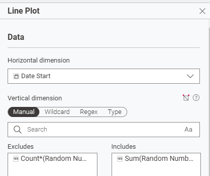
I would like to suggest, also to make Knime more accessible, to increase the icon size of the search icon (15x16 px). On that note of icon size, aligning them globally (refering to the help variable icon being 13x13 px) migth reduce visual clutter.
Best
Mike