Hi,
We all know the struggles in browsers if one has plenty of tabs or even many windows each having many tabs.
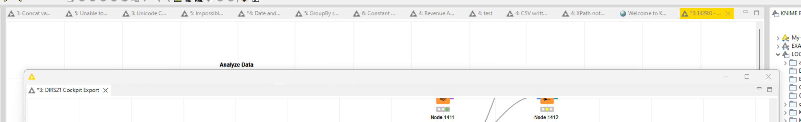
Being able to better manage tabs would be nice. Especially during startup the tab for the startup screen (Classic UI) appears presumably at an arbitrary position making orientation more difficult.
Adding to this, the number at the beginning of each tab is little meaningfull.
Important
I only speak about the Classic UI as the Modern one, despite looking polished, still lacks behind in many ways like:
- tabs gone missing when switching
- Unable to open multiple panes in parallel like Nodes, Workflow Explorer, K-AI
- Unable to individually position windows (Workflow area center, workflow explorer right, nodes panes left, workflow overview bottom with console output side by side at the bottom.
- Missing workflow overview
- and much more
Therefore I’d like to suggest to explore the following ideas for the Classic UI:
- Visually Group Tabs i.e. by applying color to tabs
- Literally Group Tabs i.e. in individual detached windows
- When detaching a tab, which opens a separate window, editing components should create a tab in that detached window but currently opens the tab of the component in the main app window
- More a bug: When detaching a window it always stays on top of the Knime app hiding all beneath
Best
Mike