I have a workflow with data that I would like to build an interactive dashboard for presentation purposes. I would like the data to be filtered and pushed to the table/charts.
My desired result:
Select which columns to include in the charts
2)Filter within each of those columns.
I’ve built 2 scenarios to which I’m not achieving the desired results.
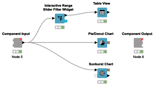
Sample Visual:
Interactive Range Slider Filter Widget is not pushing the filtered data to the charts. But it does filter the table.
Widget Filters:
I was using the Column Filter widget to determine which column to include and the Nominal Row Filter Widget to filter within those columns.
These filters appear to have no effect on the charts or tables.
**I admit, not sure if these widgets would work from what I read in other posts, but thought I would try anyway.
regarding your first scenario (Sample Visual component): You can simply connect your Pie/Donut Chart node and the Sunburst Chart node separately to the data table and not subsequently after the Interactive Range Slider Filter node (see screenshot).
Regarding your second scenario (Widget Filters): To have the effect of a selection widget (like the Column Filter widget node and the Nominal Row Filter widget node) on JS views (like Table view or Sunburst Chart), you need to put them in separate components. Currently the components don’t support live updates from selection widgets, but you need to make you selection in the component before and in the subsequent component you see you selections in the views.
I hope this helps. Let me know if you have more questions.