How to make python chart with same functionality as line plot node(adding a removnig displayed rows)
and custom axis labels but not like in Line plot node where is only one label.
Thanks
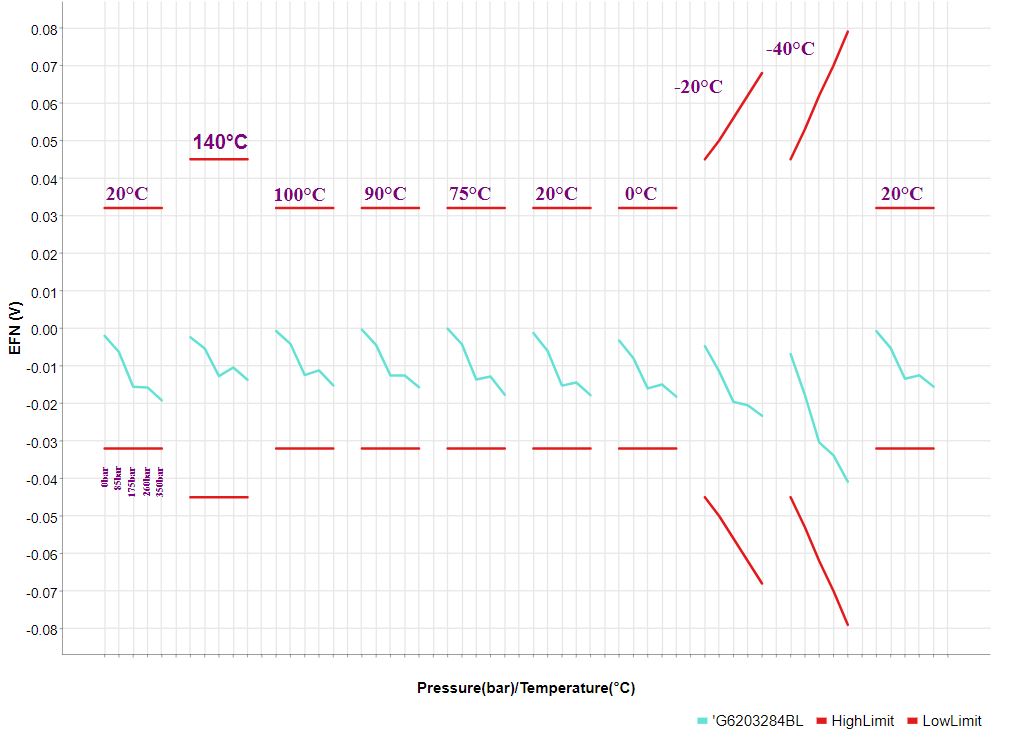
desired output:
How to make python chart with same functionality as line plot node(adding a removnig displayed rows)
and custom axis labels but not like in Line plot node where is only one label.
Thanks
desired output:
Hi @TomasProuza1981 and welcome to the forum.
I don’t believe this will be possible with the standard Line Plot node currently, although we are actively working on improving the capabilities of our visualization nodes. In the meantime, your best bet is probably to use Python code in a Python View node as a workaround.
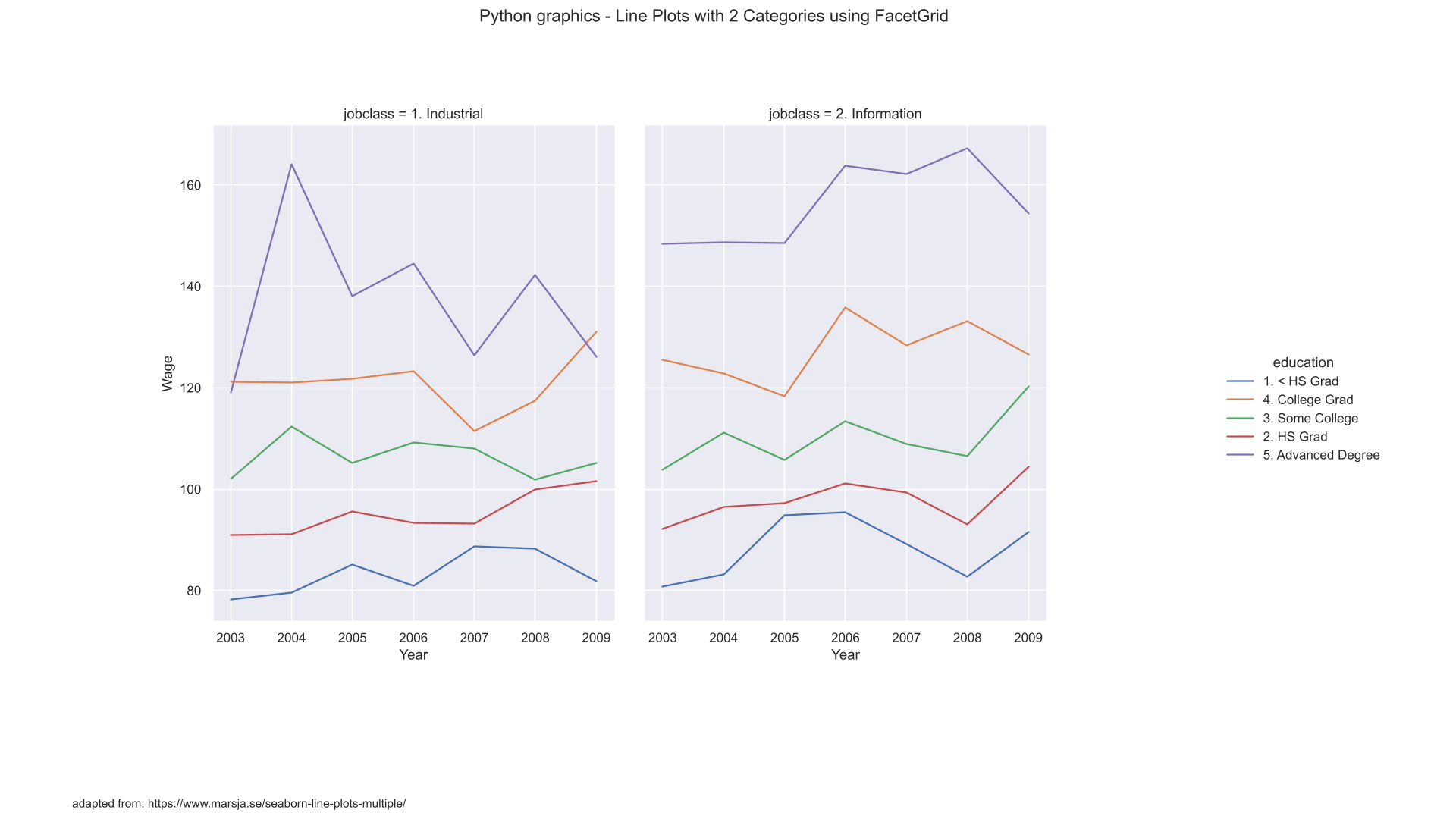
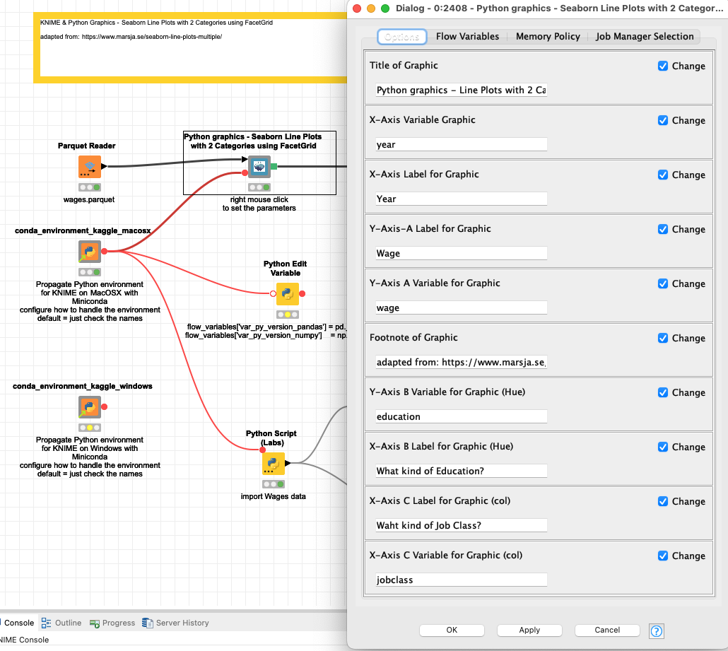
@TomasProuza1981 one idea could be too find a python graphic code and wrap it with a meta node like in these examples (an article about them is in preparation):
This example might look like a possible fit:
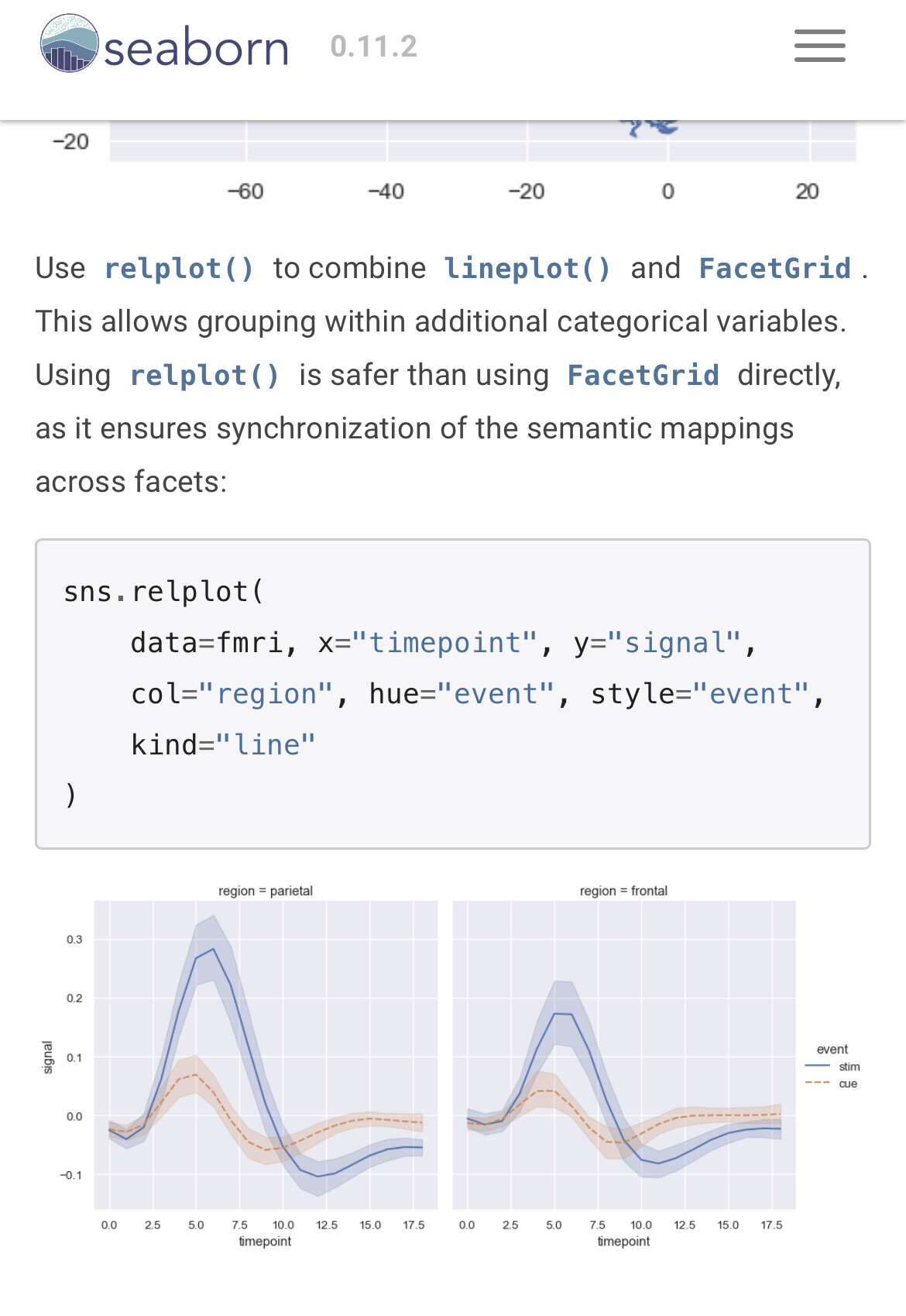
https://seaborn.pydata.org/generated/seaborn.lineplot.html
The combination of KNIME and python libraries gives you all the options you might need.
@TomasProuza1981 you might want to take a look at this example.
You might be able to adapt it either using the Component configuration or change the code to your needs.
The core of the Python code is not that complicated so you could make some adjustments.
g = sns.FacetGrid(input_table, col=var_y_c_variable, hue=var_y_b_variable)
g = g.map(sns.lineplot, var_x_variable, var_y_a_variable, ci=None).add_legend()
This topic was automatically closed 90 days after the last reply. New replies are no longer allowed.