Interactive Scatter plots after performing a Linear Correlation

Hi all,

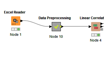
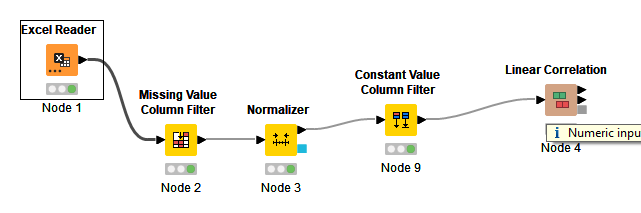
I want to build a workflow that allows me to have an interactive Scatter plot made after a Linear Correlation node. Basically, the objective would be to plot the data related with a given threshold of correlation…
Ive got the workflow ready up to the Linear Correlation node, but I’m stuck on the next steps…

image

Any ideas on how to do it?

Thanks!

Can you share some data and/or the workflow?
What exactly is the data that you’d you like to plot?

Hi,

The workflow right now looks like tghis (pretty basic):

image

The data looks like this (basic chemical parameters and analytical results from batches produced…):

Thanks!

It would be better if you uploaded the files so that we can work with them.

Also, you haven’t said what you want to plot.

This topic was automatically closed 90 days after the last reply. New replies are no longer allowed.