I’m having a bit of trouble understanding the visual outputs of the Decompose Signal component. I’m relatively new to time series analysis so I might just be confused, but I want to make sure that the outputs are indeed what they say they are.
The four signal plots look like this, using the sample data in the Accessing Transforming and Modelling Time Series workflow.
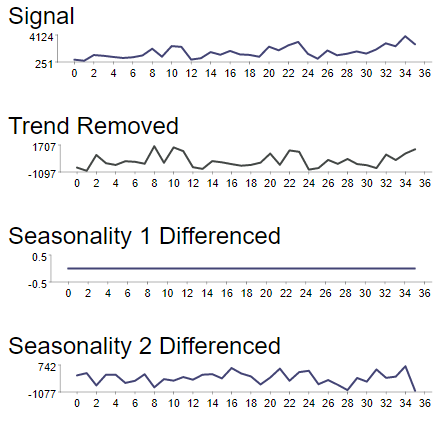
Signal and Trend Removed make sense – one is the raw data, the other is the difference from the trend line. Except that when you dig into the component, the ‘Trend Removed’ plot actually shows the ‘Seasonality 1’ values, which are the detrended values minus the seasonality-removed values (which I think would represent the ‘seasonality component’ of the time series?).
I would expect ‘Seasonality 1 Differenced’ to show the result of subtracting the lagged values at the first peak of the ‘Trend Removed ACF’ line. Except it actually represents ‘Seasonality 2’, which in turn is the ‘Noise’ of the first seasonality lag calculation minus itself (because there was no second seasonality lag applied).
I would then expect ‘Seasonality 2 Differenced’ to show the result of applying the second seasonality lag, if one was detected, but instead it maps to ‘Noise’, which is the result of applying the first ACF lag.
If nothing else, some further documentation in the component to explain the logic of these plots and labels might help to reduce confusion. I know there are at least two KNIME blog posts discussing this component, but neither of them go to this level of detail. I’d appreciate any clarification you can offer.