looking for a solution to the following issue in KNIME 4.6.5:
How to reproduce the issue:
creating a component consisting of:
- ‘Empty Table Creator’ node, settings not relevant
- ‘Generic JavaScript View’ node connected to a.)
- ‘Text Output Widget’, connected to b.), settings not relevant
in the component layout configuration the text widget is below the view node.
content of the Generic JavaScript View node:
var body = document.getElementsByTagName('body')[0];
var html = '<h1>test</h1>';
html += '<div id="outerdiv"><div id="innerdiv">'
html += '<label for="longlist">very long list</label>'
html += '<select name="longlist" id="longlist" size="5" multiple>'
for (var i=1; i<100;i++){
html += '<option value="'+String(i)+'">Value'+String(i)+'</option>'
}
html +='</select></div></div>'
body.innerHTML = html;
=> creating a list with many elements, showing only 5 at the same time
issue discribtion:
if the dashboard/component is execute/shown the following happens:
the ‘Text Output Widget’ below the generated list of the javascript view nod is drawn very far down. The distance depends on the item count of the list and the scroll position of the list, so if the list is scrolled down the following widget moves up.
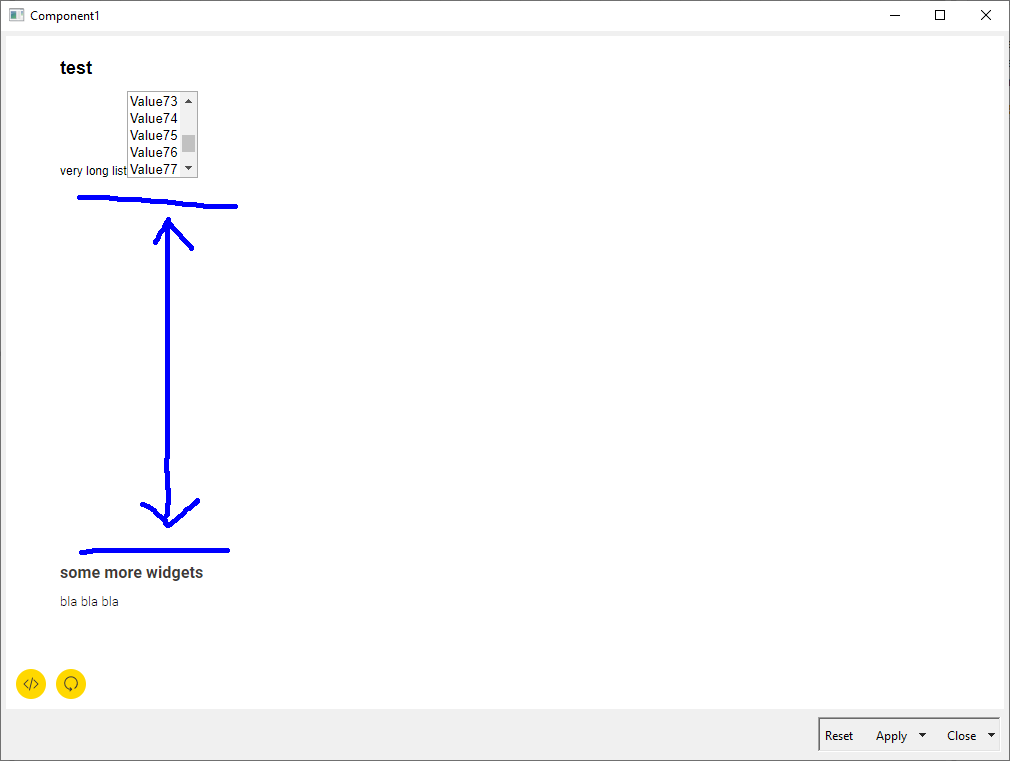
This leaves a wide gap in the dashboard.
How can the following widget drawn straight after the view node/list?
why the html overflow is behaving that strange?
solving attempts:
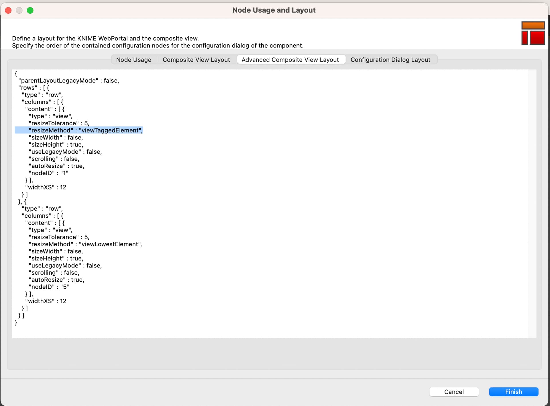
The JavaScript View node in the components “Usage and Layout” configuration is configured as a single column row with no change to the default auto size option, the height is set to min 300px. If this is changed to “aspect ratio” the gap is not present.
But as the JavaScript View Node content should grow with the window size the auto settings are required.
to add css overflow:hidden to the outerdiv; does not change anything
If I do it in pure html, Edge/Chrome are doing it as expected (without gap), even without any css
Background / target:
This problem is the compact version of the same issue occurring if you create a plotly.js diagram with a lot of series labels: the legend list is longer than the container of the plotly diagram, this triggers the generation of a scrollbar and the content/widget below the diagram is drawn with a wide gap, same as in the example above. The Dashboard gets almost unusable & user experience is very bad.
Thanks for your time & help
link to workflow: https://api.hub.knime.com/repository/Users/wsturmzfknime/Public/KNIME_Forum/ListOverflowIssue:data?version=current-state
link to html test:Test overflow behaviour of list