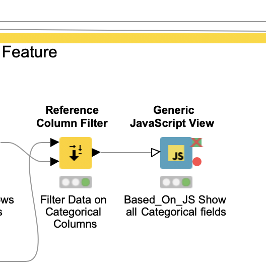
I try to build a component for data understanding. For this I would like to loop over columns and create bar charts for all numeric columns. I used the column filter node in the component and then selected the
Generic Javascript View node. But I struggle with the javascript code (I’m not as familiar with JS as it should be for this case. Did somebody have an example how I can use plotly in the Generic Javascript View to generate multiple Barcharts for each column in the KnimeDataTable?
My main goal is to have the output of these multiple bar charts in the interactive view of the component.
I created the workflow with the Generic JS View. But I’m not able to transfer the data js array to a group by element data set to feed it into a Plotly Bar Graph function.
In python it would be rather simple. But then there is no JS View Node which could be used for interactive view of the component.
Does somebody has an idea how to solve this. (Automatic generation of bar charts for the given columns without knowing how many it could be).
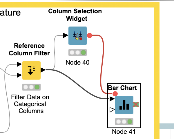
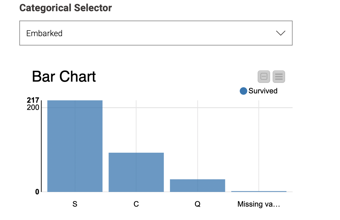
Or is there a possibility to show a barchart with a dropdown selection view in the interactive view of the component, to select the different columns?
How about Data Explorer node? On Nominal tab there will be histogram for each column showing the frequencies with which values occur in this column. Alternative is to create your own JavaScript view as current Bar Chart is not interactive.
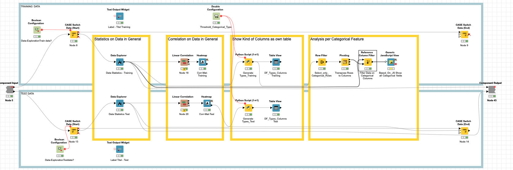
thanks for the info on the data explorer node. But I want to build a component that is similar to the pandas-profiling (https://github.com/pandas-profiling/pandas-profiling) library. Therefore beside the data explorer I wanted to build different kind of additional standardized charts on each feature. But have issues to loop over the features expecially if I do not know the amount of features before through the fact that the component should work on all input data frames.
My Problem is, that I’m not so fit in javascript and I do not understand how the data from a column could be rendered in a plotly javascript generic view so that I can use a loop or something similar. Therefore a example how to bar plot knimeDataTable.getColumn(0) in Generic view using plotly would perhaps help me.
I see. Seems Generic JavaScript View node is a way to go then. Don’t know much about it but you can look for templates on Templates tab of node configuration or workflows on KNIME Hub where it was used to find more about it.