Unfortunately, I find the rendering of fonts in Knime to be poor. The gray text, especially italics, is difficult to read.
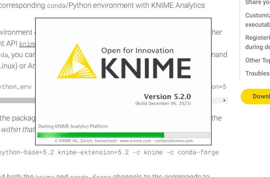
Here is the splash screen. Compare it to the text in the Chrome webpage in the background, which is much sharper.
I am on Windows with 2560x1440 resolution, text size 125%.
Thanks.
Hi @jpcarow, Thanks for reporting this! Does turning off/on Windows Cleartype change the look of the font (In the Windows Start Menu search bar, type “cleartype” and open the “Adjust ClearType text” app)? Kind regards, Alexander
This topic was automatically closed 90 days after the last reply. New replies are no longer allowed.