I’m using the lift chart to asses my neural network and decison tree models, however it is
asking me to supply probability column.
For some reason the neural network and decison tree model nodes aren’t showing the probabilities columns in their output data sets.
For example, when I look at the output of the decision tree predictor node I see “prediction (Dec tree)” column that classifies the cases either 1 or 0, but I don’t see a column for prediction values.
Any idea how to produce the probabilities and supply them to the lift chart?
Hi Paul, as soon as you enable the option “Append columns with normalized class distribution” in the Decision Tree Predictor node dialog, you get a number of additional columns at the out-port. Each column is named by the class values and contains the class probability. Now you should be able to select a column for the “Positive label (hits)” in the Lift Chart dialog. Regards, Thomas
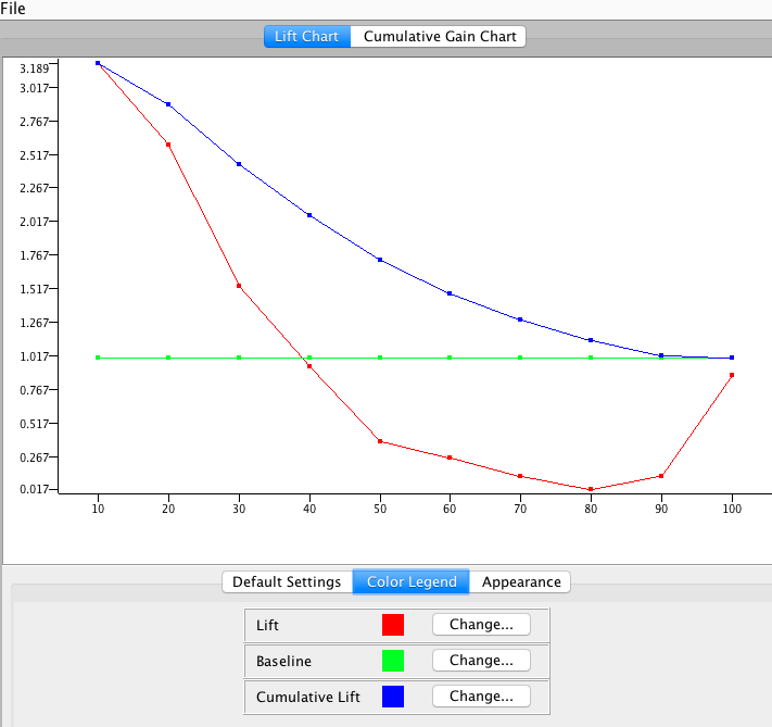
I’m used to seeing cumulative lift curve (blue color) in other programs and it looks familiar.
The first deciles have higher cumulative lift and the curve eventually reduces itself to the baseline at the end.
Now, I’m a little confused by the lift line in red color. Is it really possible for it to be below the baseline for that long? Does this red lift line look strange to you? Maybe, I’m not interpreting it correctly or didn’t run something right.
Hi Paul,
Sorry for being late answering your post here. Indeed the Lift Chart somehow looks strange, but might be caused due to two problems: Either the model scores poorly - please verify using the Scorer node, or the dataset is somehow unbalanced. That means in a two class scenario, one class contains much more instances then the other one. Does it makes sense?
Cheers, Thomas
Obviously, this topic is very old but I found it via web search…
I can’t see Paul’s original chart but I’m attaching one of my own. This is taken from the adult data set from the Beginner’s Luck book on KNIME. Like Paul, I’m confused by the red line.
I see that Paul posted the same question at Analytic Bridge and one of his responses was:
The graph is not explained properly in the legend. The blue line is the cumulative lift chart, which asymptotes at 1.00 at the 10th decile (100% of the cases). The red line appears to be the incremental or decile lift value. Sometimes this value is called the “Lift Index”, or just the “Lift”. The red line (decile lift) is greater than 1.0 only to about the 3rd decile, then is goes below 1.0 (the level of random expectation - via a coin toss). To the mass mail marketer (for example), this means that he should mail to only the top 3 deciles, or the top 30% of the scored list sorted in descending order. Beyond the 3rd decile, the model is not effective in predicting response at any level greater than the random expectation.
While this comment is directed towards Paul’s graph, I suspect his was similar to mine.
I’m asking to know if this interpretation of the red line is correct. Does it really represent the “lift index”?