Hi there,
I have a display issue which I need your help.
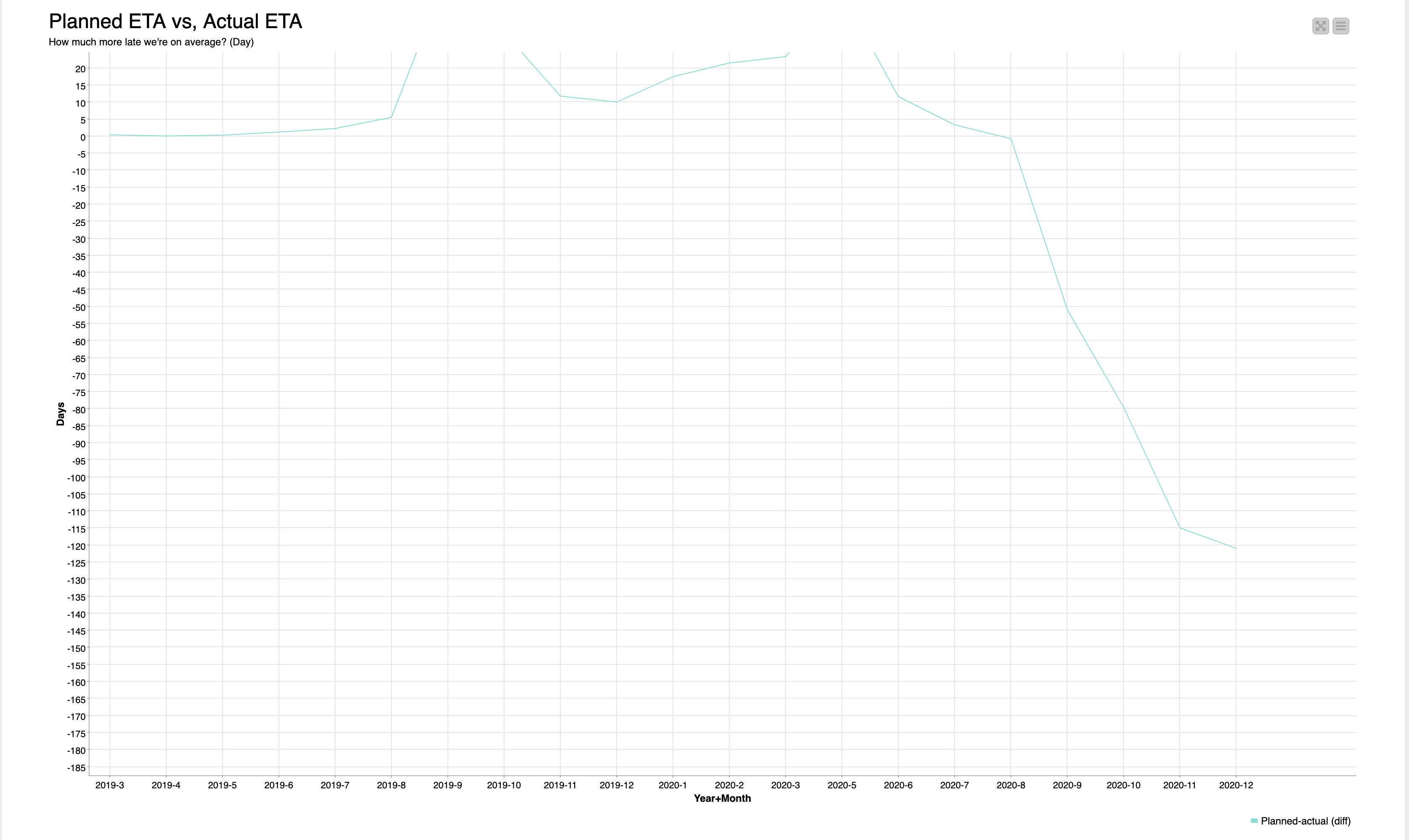
As you can see via screenshot the line is “kind of” out of the picture. Is there anyway I can change the y-axis value range. Currently it is 20 till -185. For the value I have 60 till -125 would have been better. I checked the settings from the line plot and couldn’t find a one which can change the display range.
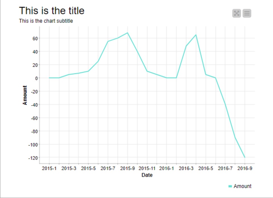
For the second issue as you can see, times have been mixed up. This is a screenshot which I took when the line plot is displayed with other charts in a dashboard. Any suggestions how I can fix it? Maybe only display the year once at the first moth which shows up?
About your first issue:
Is it possible that you have moved the data area of the plot (by dragging) and then saved it as default?
If that’s the case, you can just drag the data area down to make the line fit the area and then close and apply as new default to fix it.
About the second issue:
I’d suggest to use the Column Expressions node to remove the value of each second date value and save it as a new column to display in the line plot x-axis instead of the current column.