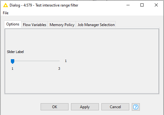
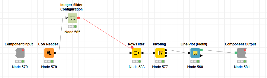
I have problems to understand how to change a line plot interactively.
I have several lines to be displayed on the same plot, but only those lines whose min and max values are within the interactively selected range. When I change the range and hit apply, I see that all the nodes following the Interactive Range Slider Filter Widget node are re-executed, and the Pivoting node renders the update output. The configuration options panel of the Line Plot (Ploty) node also includes only the columns with values within the range, but the view of the plot is not updated. When I go into the component and manually display the interactive view of the Line Plot (Ploty) node, it contains the updated plot but not the update legend.
So, there are two issues here:
1.- All nodes after the slider are re-executed after a range change, including the plot, but its view is not updated.
2.- A manual relaunch of the plot’s view updates its content but not its legend. This is a secondary problem because what I need is the automatic update.
test_interactive_range_filter.knar (18.5 KB)