I have been struggling for quite some time now to plot some laptime data, either from a pivot table or from a normal table and have on the Y-axis of the line plot mm:ss.SSS. Trying also to plot the actual time at which a car passes the finish line I have similar issues.
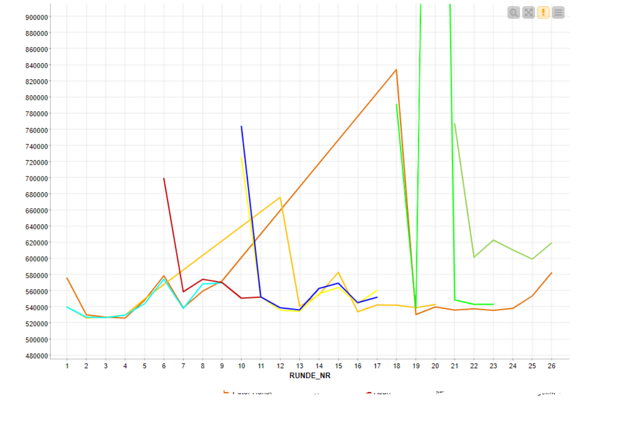
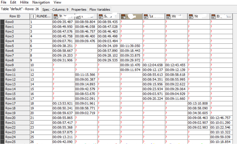
I have attached a screenshot of the table, which currently has laptimes in HH.mm.ss.SSS, also attached is the graph which shows the time -i presume- in milliseconds.
Any help getting the y-axis in actual time format would be highly appreciated!
Please find attached an example, I hope I have attached everything. It converts the laptime (mm:ss.SSS) into HH:mm:ss.SS and then pivots it for the individual drivers. In this example I took 3 cars as not to make the selection to large.
What I then would like is plot of these drivers the lap number vs laptime, where it would show “readable” laptime in mm:ss.SSS.
Thank you for any help!
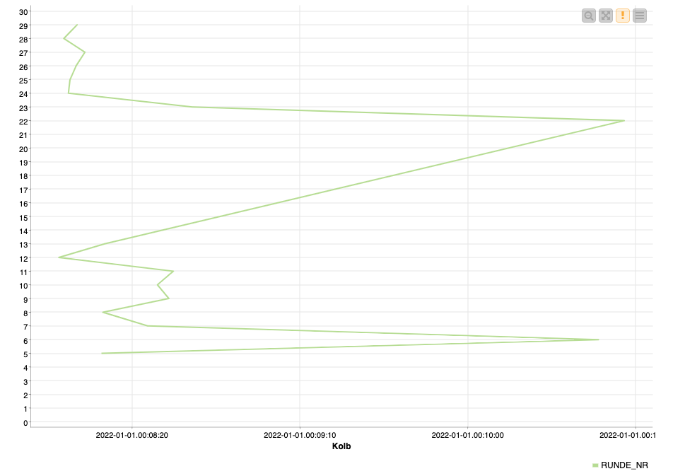
I have created an internal ticket for this as I also cannot get the date to displayed instead of the numbers. If you switch the X and Y axis, you can get the time to be shown (I’ve added a fake date to do so), but you can only show one person as a time.
I have found a solution to my problem.
It involves the python view node and some custom script.
I even took out the pivot table and put everything in python.
I mainly used the datetime class to put my timevalues in an array, after that plotting the results witg matplotlib.
@Stenley155 could you upload your solution maybe with sample data to the KNIME hub. KNIME sometimes struggles to make more complicated graphics but Python with matplotlib and seaborn among others is there to help so it might be interesting to have more examples.