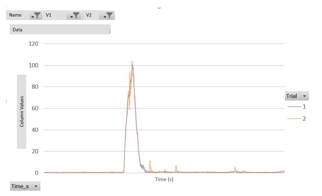
Hi. I am looking to create a line plot with interactive filters. I want it to be very similar to one I made in using Excel’s Pivot Chart tools. I uploaded a picture below for reference
The Line Plot has the option to dynamically include and exclude data. When you click on the upper right corner of the view a window pops up that allows you to select columns and those are then displayed in the plot (see below). Is that functionality helpful for your use case?
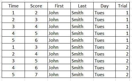
Hi. Thanks for replying. No that isn’t exactly what I am looking for. Let me try and explain better. So I have a dataset similar to this.
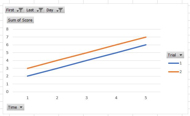
I want to graph score vs. time. I have variable columns of first names, last names, day of the week, and trial number. With Excel, I can create a pivot table like this.
I can use the filters on the top to select John, Smith, and Tuesday. Then, in the graph, I can see the scores for both trials.
In this example I would also have data for Mary Smith, John Willson, or John Smith on Wednesday. I only showed a small set of data. So there would be multiple names (first and last) as well as days of the week.
My data isn’t really this, I just used this example to show that I need to filter specific variables
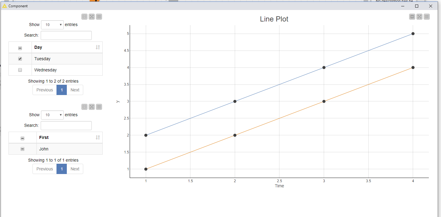
Unfortunately, there is no direct way to achieve this in KNIME. You could do a workaround in a component with GroupBy nodes (make sure to enable highlighting). With the GroupBy node you can aggregate over each of the attributes you want to filter, then display them in a JavaScript Table and enable selection. In the Line Plot you can also select “show selected only” which then allows you to filter for the selected attributes. I attached a quick workflow for this, it results in the following image:
Thanks for your help. I tried running the workflow you sent. I showed the legend and it looks that the scores for the trials aren’t actually being shown. Instead both score and time are plotted
To get the trial column in a shape that it can be easily plotted (one column for each trial), you can use the pivot node. Don’t forget to enable hilighting here too to ensure the interactivity. In the groups tab of the Pivot node I would use the time and the other attributes you want to be able to filter. In the pivot tab use the trial and in the manual aggregation select the value and aggregation method of interest, for example sum of scores.
Then you can display the result in the line plot.