Dear KNIME community,
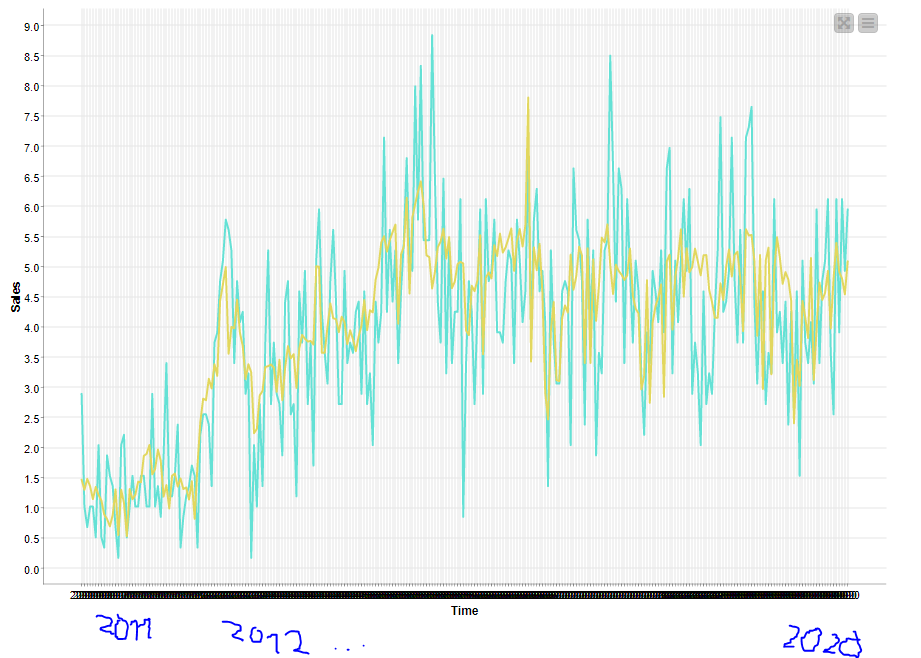
I am currently trying to enhance the perception of my line plot results, since the x-axis is pretty cluttered with time-labels.
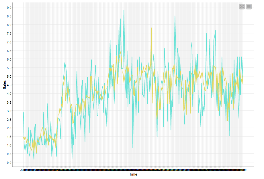
The black bar at the bottom of the plot is supposed to represent the time intervals in years.
I don’t know how to change the rate/width of the intervals, or if therer even exists such a configuration.
Ideally I’d like to have every year represented at the bottom of the chart from 2011-2020 (which is the time span of the data collection), without having to sacrifice data points.
Currently there are 272 data points represented in the chart, each of them labeled with a year column. The optimal solution would be to have one entry at the bottom of the chart, for all of the data points that occured that year.
Something alongside the beautiful writing I’ve added.
The workflow:
Annual MAE comparison.knwf (433.3 KB)
Best regards,
SL
