How do I loop through a variable number of columns in a Generic Javascript Node?
I am using Plotly to create a variety of charts for the WebPortal, but I’d like to add a user interface allowing for users to select the data points to include, leading to a variable number of traces.
Not entirely sure which data you want to manipulate, but I made a little mini app based on your Workflow which shows some different ways to interact with Plotly and also the KNIME Table in the Generic JS View.
Feel free to use this as a starting point for what you want to build. Let me know if you have any questions.
I really appreciate the clear comments in the code - it made it really easy to modify the code and build multiple templates from the initial node.
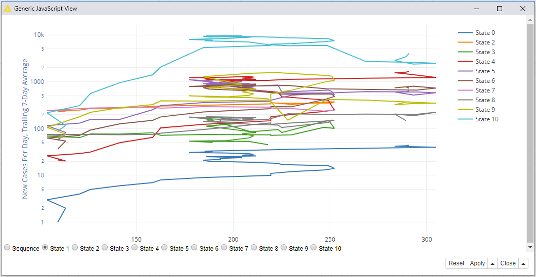
I’m not sure the buttons are working correctly though - clicking “Sequence” produces the initial chart, but clicking any of the state buttons produces the chart below:
Glad you were able to use and understand the example
The issue you’re experiencing with the buttons is something we expect due to the nature of the data we are working with. We are creating line charts which require the x-axis data to be ordered and sequential and the only chronological data we have is the “Sequence” column. When we click a button we are no longer seeing “New Cases vs Time”, but rather “New Cases for all States !== State X vs State X”. I hope this makes sense.
The example is a good place to start interacting with the Plotly and KnimeTable APIs, but it will require a bit of tweaking to create a truly interactive and useful chart. I’m still not entirely sure which feature you want to modify, but here are some possible next-steps you could do:
To toggle individual lines, click the name of the line in the Legend of the chart and Plotly will remove it from your chart automatically!
You could change the chart type in the “layout” object to something like a scatter plot and then directly compare features with modifies controls.
You can combine two tables based on different date ranges and re-map the controls to display different date ranges.
many more!
I hope this example gives you some ideas for what to do next!
Btw, have you installed the Plotly extension for KNIME? There may be some other nodes there which you can use in composite views to complement your project! Definitely check it out