in MUI i noticed that variations of icons which trigger the same functionality are used. The requires the user to remember more icons than necessary and decreases the usability.
I’d like to suggest to keep UI-Icons aligned which would also reduce the maintenance burden.
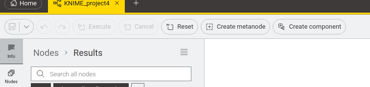
Also, some icons are too tiny to be recognizable and rememberable properly like the one for “Create component” which is too detailed.
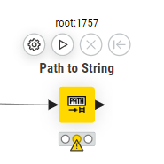
For the ports icon when opening the Info pane, I’d suggest to think about not using an electrical plug but a fork-icon with three lines to the right, each resembling the most commonly used port types.
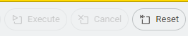
PS: Some icons like Reset vs. Reset All or Execute vs. Execute all are so vastly different from each other that I’d visually not recognize them as part of the same functionality group
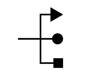
Hi @mwiegand , I can see what you mean, especially where there are different icons in different places that have the same meaning. I wonder though if your ports icon will be mistaken for “USB” (admittedly a port, and arguably the most commonly used port type of them all, lol) by some users though
(I knew it reminded me of something! )
btw, I’m not overly fond of the icons on the left panel in MUI representing Nodes, Space Explorer etc, as I don’t “get” the icons. I was actually relieved to see them becoming smaller, and a word being added in 5.4, but that said, as an English speaker that is great for me as it has immediate meaning, whereas I realise that the beauty of (good) icons is that they should be “universally” understood without needing to be able to read the word next to/below them.
Ha ha, nice one. I wonder what cam first, that USB icon or Knime xD
MUI is making good progress but I feel it still has lots of “nooks and crannies” or lets say construction zones. Though, I fully second your opinion about good icons.
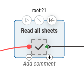
Yes, I understand that it was done on purpose as well. Maybe the example was a bit misleading. Here is a better one.
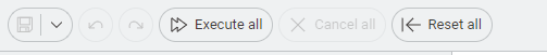
The purpose of icons is to explain complex things in a clean visual way. So processes that are similar you’d expect to share similar icons. Like Save Workflow vs. Save ALL Workflows.
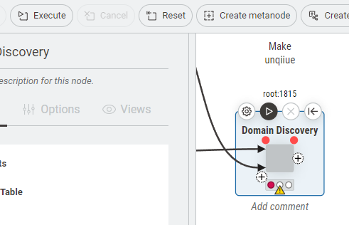
I think the underlying “problem” is that there are node-specific actions in the workflow toolbar. The toolbar is about the entire workflow, but suddenly you have things in there that only consider a single node.
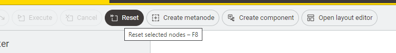
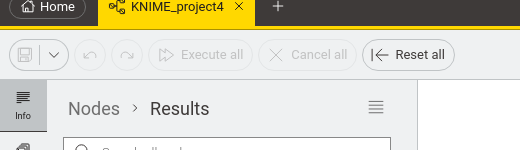
The icon in your second screenshot above is saying “Execute a node”, and it makes sense that it is different, because it is a different action than just “Execute”, which, in this context, would be understood as executing the workflow.
So I think if you want to have node actions in the workflow toolbar this still makes sense. You could think about not having these there in the first place, but based on user feedback and the best of our knowledge we made the choice that it’s better to have them.
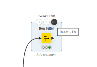
As observable, the icons for “Execute”, “Cancel” and “Reset” Icons in the menu ribbon vs. node icons have the exact same functionality, are displayed on the same condition, yet are vastly different from their counterparts.
Yes, but the context is different. The subject of the workflow toolbar on tob is the workflow, the subject of the node action bar is the node. The icons refer to the subject, they represent an action on the subject.
As I said, the problem is that having node-specific actions in the workflow toolbar, even though it’s actual subject is the workflow. To distinguish that, the icons have adjusted to try to reflect that their subject is in fact a node.
About “context” I can’t quite follow you. If triggered, regardless of the button in the node action or app toolbar icons, both actions have the same result, executing the selected node.
Do we both maybe have a disjoint because we exchange about screenshots? Just for reference, I always have a node selected.


 )
)
