I’m working on an EDA, and I was wondering if there’s an easy way to organize all the plots into a dashboard for a cleaner visualization.
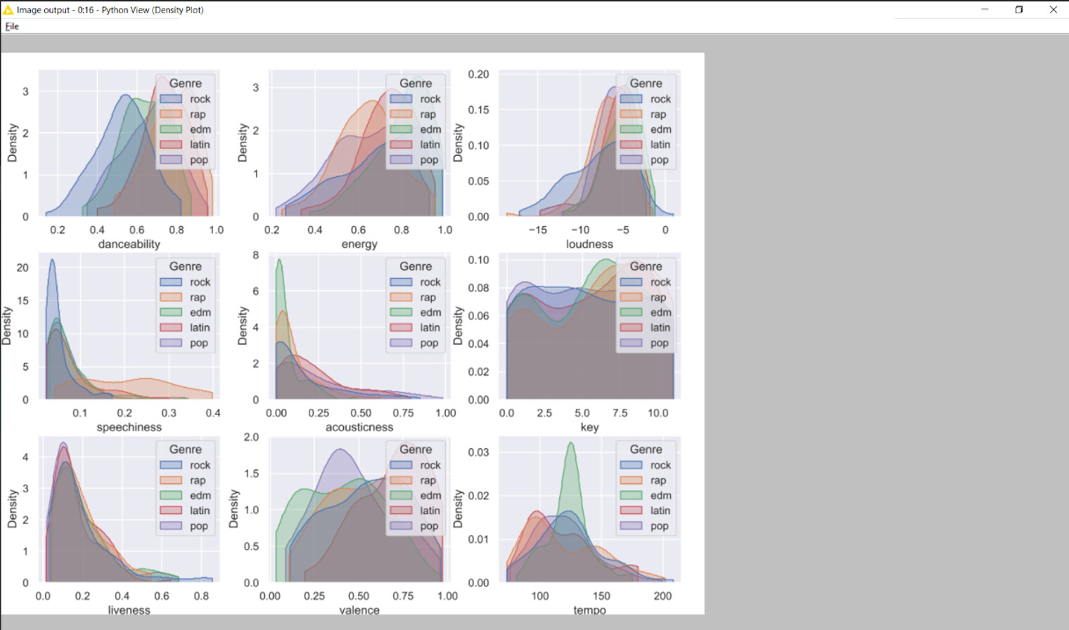
I’ve also noticed that even when I save the figures as “svg” in the “python view” node, they don’t seem to scale when you maximize the windows. I’ve attached a screenshot of what it looks like below. Is there any quick fix for this? I think this might be a problem when I merge the plots into one view.
The images and plots generated using the Python View node are static - that is, it’s not possible to automatically scale them when you maximize the window. To achieve the desired level of responsiveness, you would need to code your plots in JavaScript using the Generic JavaScript View node.
However, if coding your plots in JS is not what you want, you can keep the interactivity and responsiveness that JavaScript-based nodes allow with two possible options: the 2D Density Plot (Plotly) node (2D Density Plot (Plotly) – KNIME Hub) or the Conditional Density Plot verified component (Conditional Density Plot – KNIME Hub). You can then adjust the layout of the plots in the Composite View Layout (KNIME Components Guide) to meet your needs.
Alternatively, if you want to use the plots generated by the Python View node, you could nicely integrate them in a component composite view -hence generating a dashboard- by using the Image Output Widget node and tweaking a bit the image width and height to adjust it to your desired size. Finally, also in this case, you can adjust the plot layout in the Composite View Layout to meet your needs. While this solution is not interactive and does not resize your images as you change the window size, it allows you to display your plots nicely.
I’ve already tried that, but the problem was mostly as Roberto mentioned - The plots generated by Python View node are static - and I wanted them to scale for the view inside the Knime workflow.
It’d be a really cool feature if they could actually be generated as SVG or another vector format, but this will work for now.
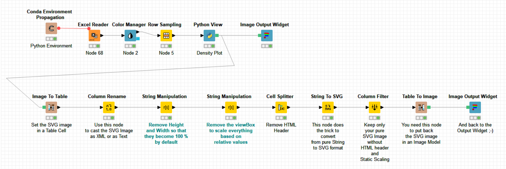
I’ve attached the workflow here with my temporary fix using the Image Output widget.
Although it doesn’t scale to view, it doesn’t show the grey area around the plot anymore when maximized, which I consider a big improvement.
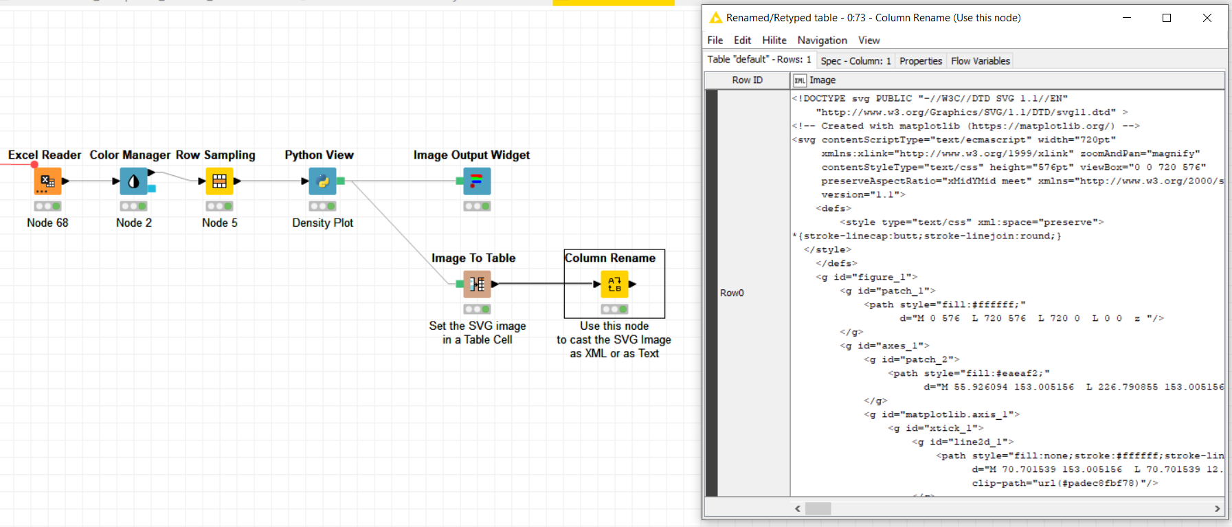
I do not know whether this could help to achieve your rescaling but one thing you could do is to recover the SVG code using the -Image to Table- node as shown here above. Would this help?
That’s a super interesting approach, but it seems Knime doesn’t support reading XML or SVG file back to Image inside the workflow yet. Looking at similar workflows, I think the most we can do is manually change values and manipulate XML files.
If you are happy with this solution, could you please validate my reply which contains the workflow so that people looking for the same solution can easily find it ?
Thank you very much for sharing the workflow, @aworker, that’s a great solution!
@Muzume if you are comfortable coding in HTML a bit, an additional option (for the sake of completeness) might be also to customize your image responsiveness by writing a bit of HTML code in the Text Output Widget node and tweaking a few HTML style attributes.
Thanks @roberto_cadili for your kind compliments and your complementary information. It is always good to have the choice of several solutions when possible !
Just a clarification about the solution. The way the image “Height”, “Width” and “viewBox” are detected and removed has been hard coded. I mean by this that I’m recognizing these XML fields based on their numeric values. I did this way for simplicity but one would need to replace it by something else, for instance regular expressions in the -String Manipulation- nodes, to make the workflow generic.

 so that people looking for the same solution can easily find it
  ?
?


 !
! !
!