I am trying to analyze some survey data I have. Specfically, I would like to 1) quickly visualize (bar charts and histograms) for N number of variables and attributes, 2) do a cross tab analysis, and 3) do a cross tab analysis for multi-select questions.
Here is some synthetic data I have created:
I’m new to Knime, and am happy to share my workflow, how would I do that?
Hey @dsweenor
-
The easiest way to “create” multiple bar charts is probably to use the data explorer. If you want to have a bit more control over bins etc. you could loop over the bar chart node and export the image into a table (would be similar to the data explorer). Notice that these plots are only useful for data exploration.
-
There’s a crosstab node in KNIME including test statistics.
Hope this helps. If you have further questions don’t hesitate.
3 Likes
Thanks for the insight, how would you do a cross-tab for a multi-select question? What is the best way to format and prepare the data. See the synethic data example I shared. For example, how would you cross tab Job Level with both of the happiness factors which are split into multiple columns?
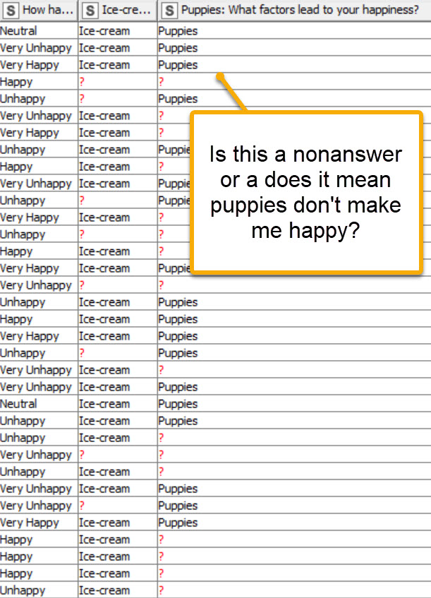
For this synthetic data set, the happy and unhappy questions were a select the top 3. So, if it is a blank, it means that it was not in the top three. Also, note that for the unhappy questions, I reduced the number of people who even answered that so the sample size will be different.
You didn’t answer my question. Is a missing value a nonresponse or a negative answer?
It means that it was not selected by the survey taker, so it’s a nonresponse.
You need to think about structuring such a survey. Normally you’d ask "Do puppies make you happy? Yes/No. A blank would be a clear non-response. In your hypothetical case its fairly indeterminant.
Ok, the format of this is based on actual survey data I received. I didn’t design it, just in charge of analyzing it. But, I’ve done a fair amount of survey design in the past and a question asking to select the top 3 most important of N items is a common survey question.
See if this is of any help. Its pretty crude, but may get you started.
1 Like
Very cool, this is helpful…thanks!
I added a Sunburst Chart after the first Groupby node. I think this will be helpful to visualize this type of data output. I also cleaned up the missing values.
1 Like
Here’s another version. It provides no new functionality. It adds the columns used in the Starburst chart as the subtitle so its a little easier to see the whole picture.
Very cool, thanks for your help! I did have a random question that is unanswered in the form. How do I open a metannode? When I try to right-click on it, nothing happens. Double-clicking simply says there is no config for the node.
You are actually double clicking on a component, not a metanode. To go inside, the easy way is to hold control (or command on Mac) while you double click. You can also right click the component to navigate inside using its context menu.
1 Like
I’ve spent some time creating a more “professional” workflow. You can’t use the KAP Crosstab node for more than two columns. The Starburst chart and accompanying table are the best approximation I could think of. There probably is way to create a statistics table, but I haven’t given it any thought so far.
Scott - thanks, the right clicking does not work for whatever reason but the double-click trick worked. Thank you so much, this was driving me crazy!!!
What version of KAP are you using?
1 Like