New Chart Nodes: CSS Support, define Axis Value Display, Column Name always displayed, Colors getting lost etc.

Hi,

while creating a report for a client I recalled that, with the introduction of the new chart nodes, it was promised to extend their function i.e. in terms of:

  1. CSS i.e. to slant axis labels
  2. Allow to set Axis Value display (i.e. scientific vs. as is notation)
  3. and more

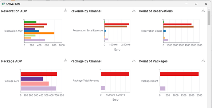
It seems CSS Support is still not given and I also find no option to set how the values on the axis should be displayed. Currently it’s scientific notation which is difficult to understand for clients. It also seems impossible to hide the column name.

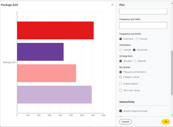
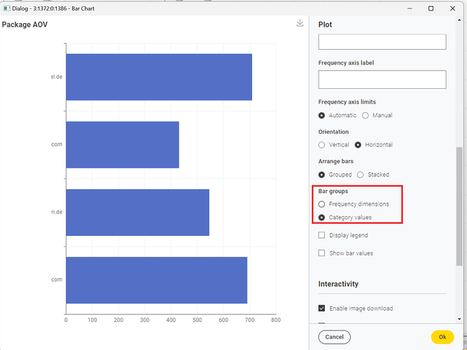
Adding to this, when Bar groups > Category values is set, the colors getting lost despite the same values being displayed.

What are the plans for the new chart nodes?

Best
Mike

Hey @mwiegand ,

glad to see that you are using the new views.
Regarding your points:

  1. It is not yet clear if this will be set via css or via a native dialog element. There is an internal ticket for the later (internal reference: UIEXT-1506), but it is not yet done
  2. We introduced a node to handle number formatting in general (Number Format Manager), but we still need to connect it with the new views. But with this node you will be able to customise the format of the labels.
  3. What else is missing?

Custom CSS is not yet supported and we are still unsure if we will enable it. It might be that we find a more user friendly way or solve it with a general theming. Currently still under investigation.

For your bar chart the color is not lost, but if you change that setting you also change the format of the underlying data. One is row based while the other is column based. This also means that you have to adjust the color manager to assign colors to either the whole column or individual entries of the column. We therefore, introduced a new dropdown entry in the color manager to color entire columns.

We have a lot of plans for the new views, which include adding new views, enhancing the existing views and of course also fixing bugs for the existing views if something comes up. It is just a matter of capacity to when we will be able to tackle the different points.
With 5.2 we also added the Generic ECharts node which lets you customise everything in the views.

Greetings,
Daniel

2 Likes

I’d definitely vote for something more user friendly than CSS. Its a royal pain.

Hi @DanielBog,

thanks for your quick response and nice to chat with you again. Adding a configuration option for every possibility, color, size, rotation, nth-child magic etc. I believe will be impossible.

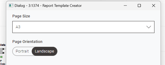
CSS Support would, I believe, be a good sweet spot, though. Other things which are missing, also from my perspective related to CSS support, is the ability to fit the charts into the given space.

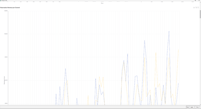
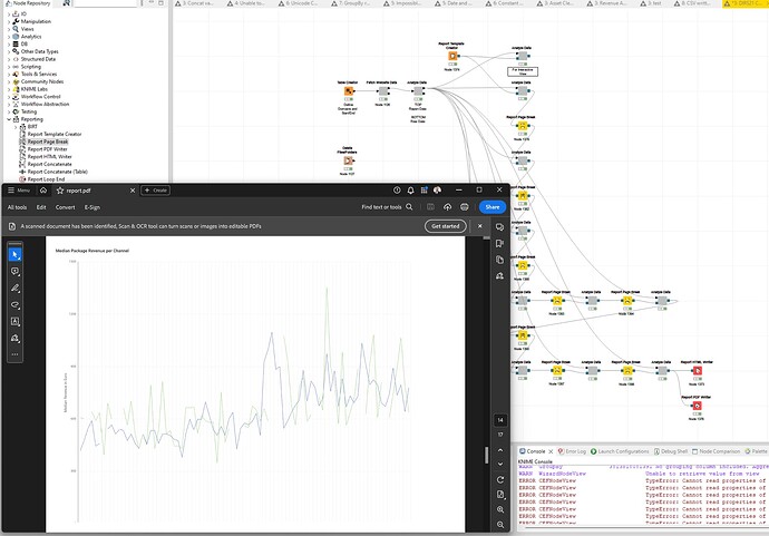
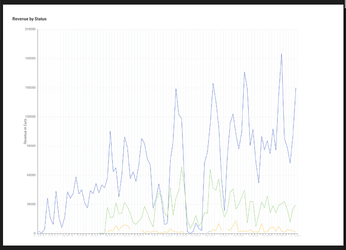
I.e., regardless of using the interactive view or generating a PDF, note that I have some chart line breaks instated, the chart scaling always exceeds the view port.

Interactive View

PDF

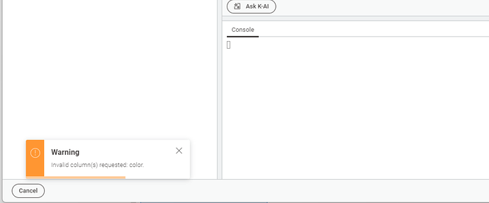
The Generic EChart looks quite capable but K-AI is struggling a lot to simply use the colors from the data, the warning about the wrong color thrown is not appearing in the console and when asked to flip the axis, no result was given. The Generic EChart are more a contester for some tinkering later on or if one would like to go nuts on charts :wink:

About the many exiting plans, may I suggest to provide a better orientation as it seems there is a plethora of visualization options which all offer different functionality. Personally I feel the Java Script View Nodes are the most intuitive. They offer the ability to adjust and save in one go while viewing, support CSS, support listening to filter events, sizing of the chart and more.

Contrary, the new charts lack many of their features since they got introduced many version back. Again, thanks for your feedback and consideration.

Cheers
Mike

Hey,

I agree exposing everything that CSS offers is not possible or will simply clutter the dialogs too much, but there are other solutions to this problem (for example direct manipulation on the charts, a separate “chart-themer node” similar to this one here Theme Builder - Apache ECharts, …). CSS is for sure very powerful, but also very complex.

Regarding the scaling of the views, they should behave very similar to the JavaScript views? What settings have you set up in the layout editor?

What do you mean with Personally I feel the Java Script View Nodes are the most intuitive. They offer the ability to adjust and save in one go while viewing? The new views should have the advantage that you can iterate much easier on them, as they provide a preview next to the dialog.
We will move forward with the new views and the JavaScript Views will be deprecated at some point. The JavaScript views bring a lot of problems which is why we introduced the new views.
I agree that there are some features still missing and we will continue to work on them.

Greetings,
Daniel

2 Likes

Ho,

maybe my passion for CSS comes from my roots. CSS is one of the best understood and semantically self explaining language. It’s efficiency in combination with browser APIs (and a few lines of JavaScript) can work magic.

About the scaling of the views, I basically only set the format but the aspect ratio of the charts I believe doesn’t cope with DIN formats. I tried other settings but none yielded acceptable results.

That’s why I “begged” for CSS support as it would allow to precisely tune the sizing, spacing etc…

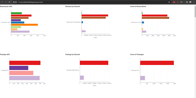
Or, some of the white space to the right respectively the (forced) column names to the left are squishing the chart which in turn pushed the legend to the bottom and cutting off the x-axis.

About the JavaScript views. You are right, the new ones have the edge over them in terms of rapid styling / configuring. What I meant were the options available where the JavaScript views nodes have a clear advantage.

About the deprecation process. The Selenium nodes have an update / migration procedure which I really love. Though, an automatic copy (if not done already) would be a nice to have. That would ease the transitioning from one node to another while keeping compatible settings and easily comparing the two workflows. Is there something like this planned?

PS: About the “forced” column named here is an example where the bar chart gets crunched by it diminishing the “message” it should convey.

PS: @DanielBog I tried to understand the functionality behind the new chart nodes. Checking, if that was the correct file, the files under "knime_5.2.0\plugins\org.knime.dynamic.js.base_5.2.0.v202311071034\nodes\barChart" I noticed CSS is in use. However, I cannot overwrite it which leads me to assume the charts are SVG images generated via JavaScript. Is that assumption correct?

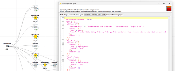
I.e. I tried to invoke CSS via the CSS node but also through the “backdoor” using the Advanced View Composite Editor smuggling in some inline styles like so:

{
  "parentLayoutLegacyMode" : false,
  "rows" : [ {
    "type" : "row",
    "columns" : [ {
      "additionalStyles" : [ "border-bottom: thin solid grey;", "max-width: 90vw", "margin: 0 5vw" ],
      "content" : [ {
        "type" : "html",
        "value" : "<style>#title, title, .knime-x, .knime-y, .knime-static-bar-value, .nv-x.nv-axis .nv-axis-label, .nv-y.nv-axis .nv-axis-label { color: #ffffff !important } text.knime-tick-label.knime-selected {color: #00ff00 !important;}</style>"
      } ],
      "widthXS" : 12
    } ]
  }, ...

Cheers
Mike
Hey Mike,

About the forced column names, I see the problem and we will think about ways to solve this (truncate labels…).
The file you mentioned is the old barChart node, the source code for the new views is not yet open source, but we will publish it in the future. Internally for the new views we are using a library called echarts and are currently using their canvas implementation. Which also explains why you can’t style any of the SVG elements.

Greetings,
Daniel

1 Like

Hey Daniel,

thanks or the details. So Apache ECharts is the new kid destined to become king? Meaning, “you” will put all cards on that technology going forward?

Best
Mike

Hey Mike,

More or less, yes. With the rewrite of the new views we implemented the technology in a way that it would be “easy” to replace whatever charting library we are using, but as long as we don’t see the need for it we will stick with echarts. As a well maintained, open source, apache library it still feels like a good decision.

Greetings,
Daniel

1 Like

Good morning @DanielBog,

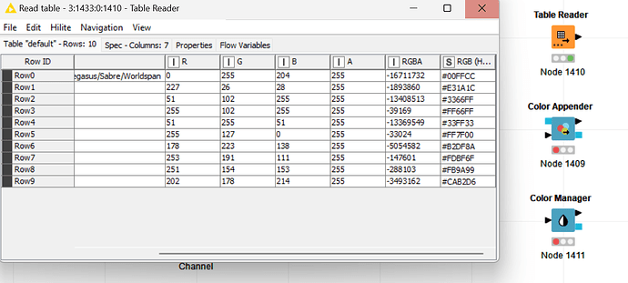
the EChart seems to be unable to leverage the color information added via Color Manager. Asking K-AI it inserted this code which indicates EChart requiring a separate column.

  itemStyle: {
    color: function(params) {
      // Assuming the color information is in a column named 'Color'
      return inputTable.getColumn('Color')[params.dataIndex];
    }
  }

Though, that might mess up the data and introduces the challenge to keep the color information persistent i.e. when transforming via GrouBy. Any recommendations?

Best
Mike

Hey Mike,

that is true, the generic ECharts view does currently not support the provided color information. I will create a ticket to add this.

For the time being you could use a Extract Color-node to get the color information out of the colored column and then KAI is probably correct with its code.

Greetings,
Daniel

2 Likes

Hi @mwiegand,

I recently cobbled something together for another forum user who wanted custom bar chart colors. Maybe it helps for a specific use-case of yours: Forum-77567-BarChartColors – KNIME Community Hub

It uses the node that Daniel suggested and sets it as the itemStyle just as K-AI recommends.

Thanks @hotzm, I had something similar in mind and now passing the extracted color data through the entire workflow. I tested extracting the color data, saving in a table in the temp workflow directory and loading it on demand.

However, the once extracted data cannot be leveraged by the color appender and manager both cannot ingest the once exported color data.

Dear KNIMErs (and especially from the product team),

I must add to @mwiegand 's point: Number format (despite a lot of other things) makes the new bar chart node basically unusable. I can basically explain this to no one, why this is possible since ages in manual tools like Excel, PowerBI and Tableau but not in KNIME. And when I try, the response is usually: ok, maybe KNIME is not made for visualization. Not having even the simplest charting options (like a sufficient bar chart node, where I e. g. could highlight one outstanding value, where I can have numbers in a custom format like (2,000k USD) just adds to this point.

If you allow a comment: maybe you should focus on correcting some of the ‘errors’ instead of constantly introducing new nodes. There is so much wrong with the new UI that I personally can only see this as a kind of ‘beta version’ and do not recommend to anyone in my org to use it at all. To a certain extent, the new charting nodes - at least for me - count also to this new UI.

Thanks @kowisoft for your reply. I fell that for some reason there are lots of options to visualize like the JavaScript nodes, JFreeChart, Plotly, the legacy nodes and Report builders like BIRT, Interactive View or the Hub.

Consolidation with a clear commitment on what is required instead of introducing the new nodes which were said to follow 80-20 pareto principle, might close the gap to the competitors but also help the Knime community to know which node “to bet on”.

Too many nodes, no providing some sort of migration process or guideline to do it manually, only incurs a dept to the future and make code management for Knime a chore. I hope this improves in the not so distant future.

PS: You might also like to vote for:

Best
Mike

1 Like