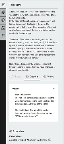
I’ve finally taken the plunge and moved from KNIME 4.7.5 to KNIME 5.2.5 and very disappointed in the new-style node dialog panels.
- Why can I no longer just click a button to get the node description? Written to be read as a whole in most cases!
- Why is the default size of the panel almost the full height of the screen, but very narrow - certainly no more than 20% of the screen width?
- Flow variables - now so hidden as to be almost unusable
- Radio buttons - why have these been replaced with a weird, difficult to interpret ‘blob’ e.g.
 ?
?
Another really disappointing “development” away from usability, and the text considerably more difficult to read than in the old-style dialogs too
Steve
Hey @s.roughley,
sorry to hear that you don’t like the new style of the the dialogs.
Let me try to give you some insights on why we did certain things.
- It is still possible to see the whole node description if you click on the node description panel on the top left. It currently is just not possible to read the whole node description if you are in an open dialog. Therefore, you get the description right at the place where you are interested in them. I find it very cumbersome to open the whole node description and find the right section for the setting that I am currently interested in.
- The default size of the dialogs is narrow as we plan to embed these dialogs into the workflow editor to have a browser compatible workflow editor. But I guess the bigger problem is that you have to re-adjust the size every time you open one of these dialogs?
- The flow variables are more hidden on purpose. Flow Variables are more of a power user feature and as a power user you know where to find them. We believe that it is also much more valuable to have them right at the place where you need them compared to a list of technical names you have to map to the corresponding setting. Aren’t they now always at the same place for settings and therefore much more findable?
- I guess this is mostly subjective taste. For 2 values I partially agree that radio buttons might be cleaner, but as soon as yo have 2+ options, value switches are easier to understand.
- Why is text harder to read in Modern UI compared to Classic UI?
Greetings,
Daniel
2 Likes
Hi,
1 - Yes, they absolutely always need resizing
2 - I’ve no idea where the flow vairables settings have now disappeared to and can’t find them anywhere - that’s not a “power user” feature - that’s a fundamental part of how KNIME works for anything other than the most simple use case
3 - I would say the value switches actually get even harder with 3 or more values - it’s not even clear where one value ends and the next begins.
The loss of tabs grouping related options together is a nonsense - the Joiner node is great example - I have to scroll and scroll… and scroll… and scroll… to see all the options (and many of them are simply no longer there at all in 5.3) - nor do I want to click a button to show “advanced” options - when many of those are also fundamental to the node function.
This is now so bad that we are discussing whether we can simply stay on AP v4.7.x and port in features we need
 ?
?