Hi everyone,
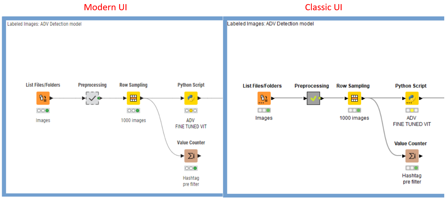
The main reason why I haven’t switched from the old to the new UI yet is that in the modern UI the visualization seems less defined and a bit blurry to me, especially the fonts. Below is an example…I know, it’s not night and day, but everything seems less in focus in the new UI and after a while it disturbs my vision.
Due to the use of distinct technology stacks, the modern UI and the classic UI will render differently. Of course, this is certainly a problem, and I’m just talking about the source of this difference.
Additionally, I’d like to inquire about the operating system you are using. If it’s a Mac, this discrepancy may be more pronounced.
Thanks for the answer! Yeah, I’m pretty picky about software UI The point is that I work a lot with Knime, it’s really important to me to have readable and non-fatiguing fonts.
BTW, I’m using a Windows-based laptop with an Inter Iris Xe video card.