I’m blown away… Your turn to do a webinar @iCFO… Would love to see this rig in action!!!
5 Likes
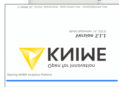
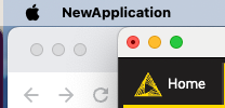
Hi my dear KNIMErs, for KNIME AP 5.1.1 on macOS Sonoma 14.0 on an Apple M1 their are two issues I noticed:
- splash screen is sometimes upside down and mirrored (hard to reproduce and capture)
- KNIME is labelled as New Application after installation
Minor things but I know your attention to detail ![]()
mM
1 Like
Thank you @mmedzihradszky for reporting this,
We have already 2 tickets regarding the mentioned issues: AP-21089 & AP-21237
2 Likes
Am I the only one who thinks the “KNIWE” splash screen that comes with noisrev 5.1.1 looks quite cool ? ![]()
3 Likes
KNIME should do a focus-group with some of the power-users. ![]()
5 Likes
I’m new to KNIME and I’m loving it compared to tools I’ve used in the past. It’s been less than a year, so I didn’t have much of a chance to get used to the old interface before the new one showed up. Tried both and I hate to say it, but I do like the old one much better. I’m seeing a lot of the features I like disappearing or at least being obfuscated in the new UI. I know it’s early days, so I hope this will change over time. The new one definitely shows all the latest hot trends in UI including lots of color and white space and pretty pictures. But the interface is too static and not customizable. Having the node repository, KNIME explorer and workflow on the screen at the same time is a bare minimum for me. Plus easy access to the console. And I think having pictures of all the icons on the screen is a waste of space. Just the names would be fine, perhaps with a more sophisticated search capability, including a functional search (so, for example, searching for “union” would return the Concatenate node). There are other things I’d like to see added to both UIs including the ability to customize the node repository and have a place to keep nodes that are used all the time, but that’s for another message. Don’t get me wrong, I think this is a great start and looking forward to seeing how it progresses, but for the short term at least, I’ll stick with the old UI.
2 Likes
Hi Armin,
Is there a possibility that the classic view of the UI will be removed in KNIME in the future?
Thanks in advance.
Let me chime in here and answer this. There is a possibility that the classic view will be an optional extension to KNIME Analytics Platform (AP) that you can (un)install. Currently it’s not the case and both UIs are packaged.
Before this happens we still need to work on some items. A lot has happened in the recent 5.2 release in December but there are still some pieces we need to work on (node repository (tree) representation, some sort of console, hotkeys, see also our release notes).
Also note, the new UI is built on web technologies, so it can be used from a browser (it actually runs in a local browser instance in your current KNIME AP already). The old UI doesn’t allow that due to technology limitations; it can only be run in a local desktop environment. We are also working on making the workflow editing available through the browser, e.g. peeking/debugging/editing workflows located on the Community Hub without launching a local KNIME AP instance. That naturally will only work in the new UI since it runs in your browser.
Hope this helps.
– Bernd
5 Likes
I think that’s a major catastrophe waiting to happen.
The current new UI is very fragile, unintuitive and a waste of a huge amount of resource.
Along with the python-based extensions which are causing endless issues 2 seriously bad decisions
3 Likes
Ok, so I am adjusting to the new interface and it has really helped me.
Still would like 3 things:
- Dark Theme… I get migraines.
- Search Box in Space Explorer.
- Right click in empty space brings up the node search list rather than the run commands.
That’s all for today.
3 Likes