Hi Everybody,
may be I’m missing something or my installation is not working.
I updated to 5.1 version ( Apple silicon version ) and in my regular job seems to be ok.
It’s a good job for the future ( even if is still very “young” and for sure needs some more fixing as I red in some posts here) and so thank you.
Actually my choice is to keep the old UI for production and give a try to the new one on a test machine.
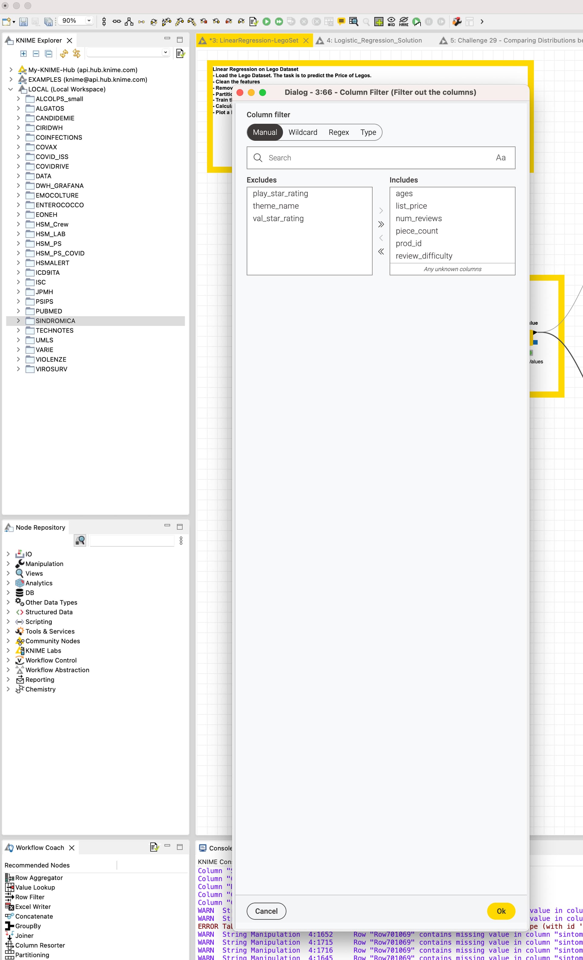
In the production mac I noticed that some nodes ( eg Column Filter, Duplicate remover, Concatenate … ) have the new UI even I selected the old one.
They also open a quite big configuration window ( see picture ) and even if you resize it nothing change next opening. The new UI in these configuration windows is missing some tabs, I understand that flow variable are available in a different way.
I have also noticed this, and it’s annoying. It works both ways: in the “modern” you see classic node dialogues, and in the classic you see modern ones.
Whilst I understand that we’ll all move to the modern one in time, it’s strange that we have a mix sometimes; wouldn’t it have been cleaner to have them separated?
Perhaps the reason is that some nodes have been totally rewritten (like the Column Renamer – even the name has been renamed), so there simply isn’t a classic one to show?
It doesn’t work for me…
Even in old workflows KAP “convert” old nodes…
If I open configuration it shows the new web UI…(regardless of KAP old UI choice)
For some everyday jobs i share with my colleagues is very frustrating ( and not for these nodes only …for sure…)
I’m very close to downgrade to 4.7.7 for … but I’m afraid to fall in a “bad loop” with flows format …
Let me quickly jump on here and try to explain it. It is correct, there is currently no way to use the old UI for some of the nodes and the reason for this is exactly what was @ssq expected. These nodes were entirely rewritten and there is no old UI for these nodes anymore.
The idea is also that we don’t need to maintain two modes of the nodes, but rather have the new dialogs be at least as useful as the old ones, but hopefully of course even better.
For that let me quickly summarise what I got out of this thread and feel free to add additional things that are currently missing/ misbehaving:
Dialogs open a tall window but column filter uses only little space of it
Flow variables are not adjustable in this window (will change soon )
that depends on what exactly you are referring to. The flow variables are now editable in the new dialogs. Dialogs still open in a tall window and the dialog components do not take up all the available space. This turned out to be more complex and we couldn’t solve it for this release. Is there anything else you are missing?
in column filter node (and it’s a very used node ) interface is still not fixed, if you have lots of columns is very difficult to scroll and find what you need … and in new UI disappeared the column type ( eg… [S] …)
Is this a bug? any fixing?
Still thinking that the old UI is a little bit more PRO…