Not the X and Y coordinates per se. The ROC curves are generated by calculating the ordered sensitivity and specificity for the records in the test dataset, based on the the normalized class distributions generated in the preceding predictor node.
You could calculate these manually, I suppose, and then plot them in a custom chart. In what ways do the existing ROC Curve visualizations not meet your needs?
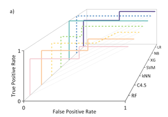
I’m producing a reporting quite a few ROC curves, so to avoid making a chunky ESI, I wanted to group a bunch together like so which requires the X, Y data.
Since posting, I’ve managed to cobble together a python code which pulls out the curve from the SVG to get what I need, but wasn’t sure at the time if I was missing a native node that might do the same.
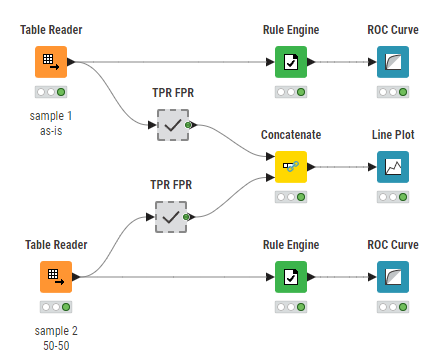
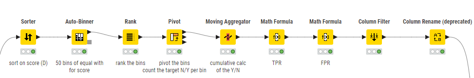
You can create multiple ROC curves in one Line Plot. For this you have to calculate the True Positive Rate and False Postive Rate yourself. This is done in the components.
I created this wf calculating ROC.knwf (542.0 KB) a long time ago (modified it a little bit for answering your question), so check it out to see if it meets your expectations.